There’s a not-so-new bakery brand in Los Angeles. You’ve definitely had Cadoro’s bread – whether stacked with avocado at La La Land Kind Cafe or loaded with fillings at Fat Sal’s. You might have met the owners at the Santa Monica Farmer’s Market, or picked up their loaves at your neighborhood Bristol Farms. But until now, you haven’t seen what the masters of baking do when given the chance to create the whole culinary experience. They’re now making sandwiches, toasts and dips of their own for the new Cadoro Cafe.
Taking an established B2B business and creating a whole new bakery brand that spoke to consumers was our mission in this project – capturing the intrigue of a bakery’s own cafe and converting it into a craving for breakfast sandwiches strong enough to draw people to a quiet corner of Inglewood.
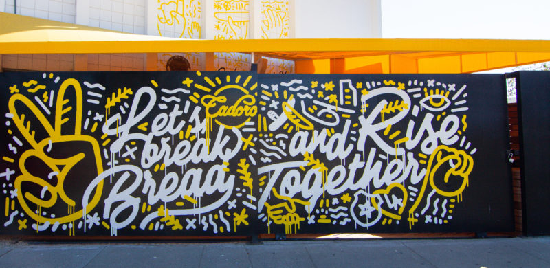
We strategically created this bakery brand extension from start to finish; starting with the oversized sliding gate turned billboard. Taking inspiration from the Inglewood neighborhood that has been home to Cadoro for twenty years, we loaded it with bold, bright graphics that meld street art, pop art and, of course, bread. It’s familiar, but reimagined, and started building anticipation for the cafe from the first stroke of paint. (Shout-out to Hattas for taking our design to reality.)
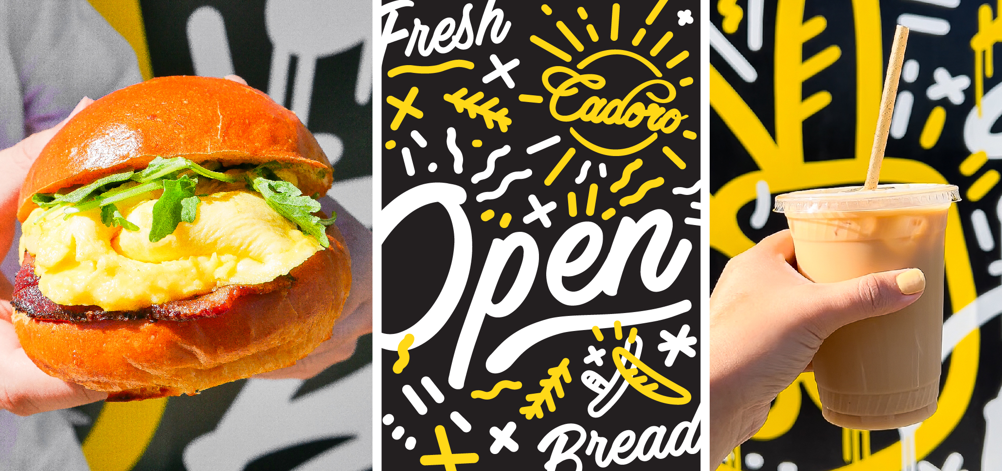
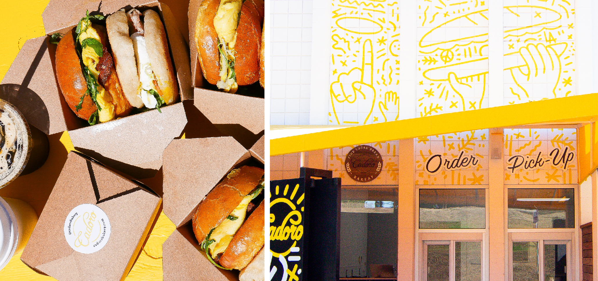
From the gate, the new bakery brand extends to every guest touchpoint. Our graphics climb the walls to create even more neighborhood visibility, make their mark on menus and packaging, and spread to the digital platforms. Our social photography is as bright as the branding – showing the food you want, mouth-watering, over-the-top and on-the-go.
The bold, iconic graphics of Cadoro’s new bakery brand create a unified experience for guests. From the first glimpse of the gate that tells you you’re in the right place to the moment you post a photo of your sandwich on social, the bright designs are a constant, friendly companion. It’s a bold new mark on Cadoro’s long-time neighborhood.
Let’s be honest – you can get a good taco anywhere, and we love living in a world with a taco truck on every corner. But there’s a big difference between leaning over a well-sauced taco in a parking lot and the vacation-in-a-single-meal experience that you can get at Sol Cocina.
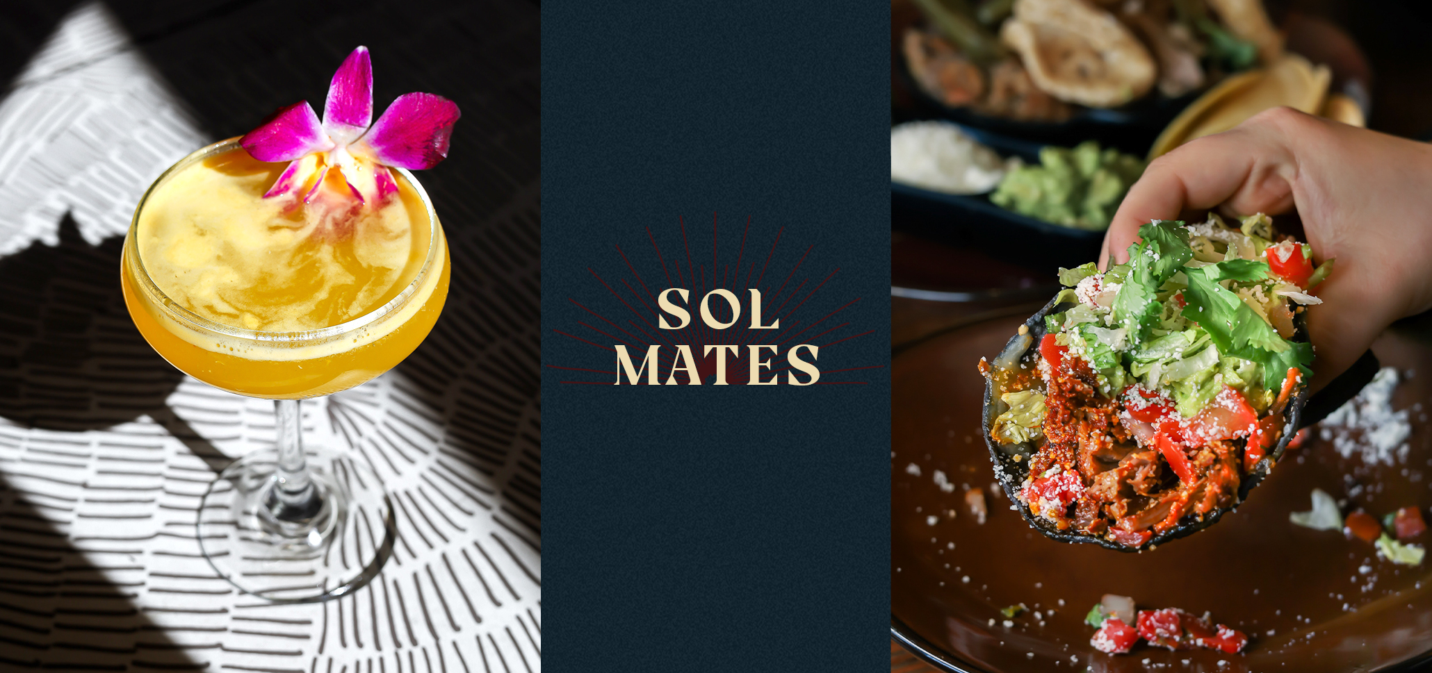
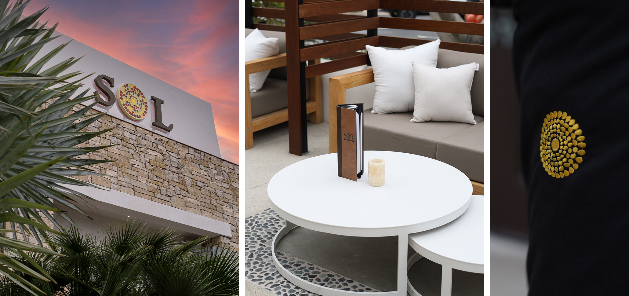
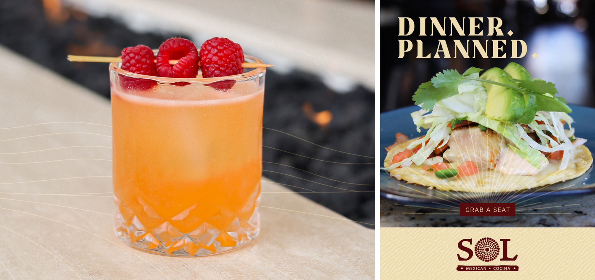
Everyone needs an escape these days, and we did a restaurant rebrand for Xperience Restaurant Group’s growing mini-chain Sol Cocina with that in mind. After a strategic brand session with their team, we captured the effortless elegance of a high-end Baja resort, no passport required. At the heart of our rebrand: the interplay of shadow and light at the Baja coast. The shadowed places created by bright sunlight, the golden glow of flickering firelight, and the way day-drinking blends seamlessly into dinner when you’re on vacation.
Our restaurant rebrand transformed Sol into a place to see and be seen; a place to shine. Hand-drawn icons, glamorous photography, and intricate typography capture the immersive restaurant experience, and now Sol has a story to tell.
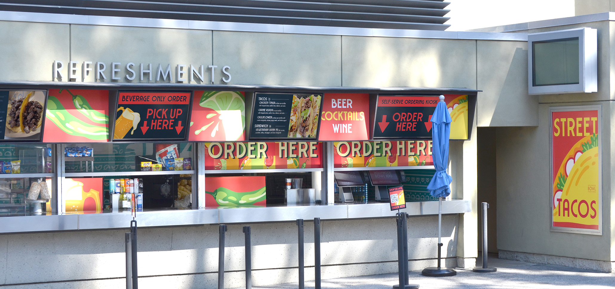
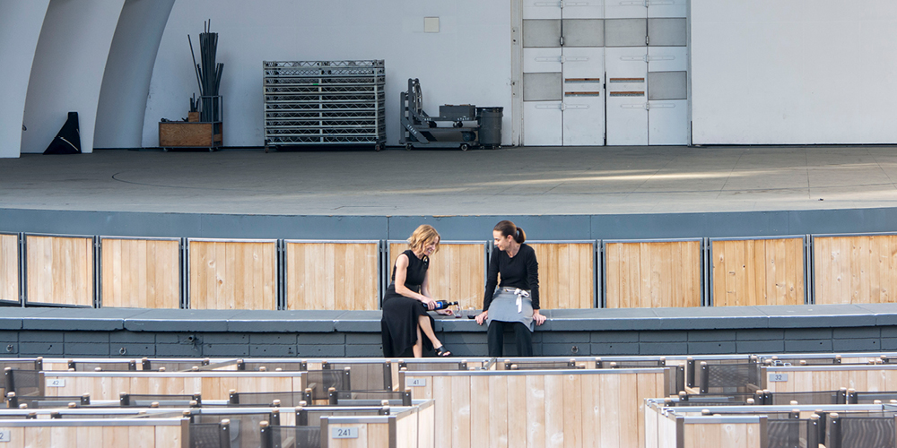
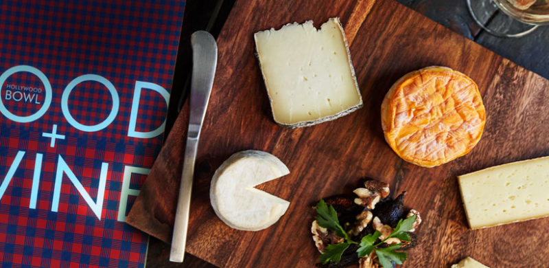
The Hollywood Bowl celebrates its 100th anniversary this year, and LA’s favorite summer destination has never looked better, thanks to fresh new branding for the Food & Wine program.
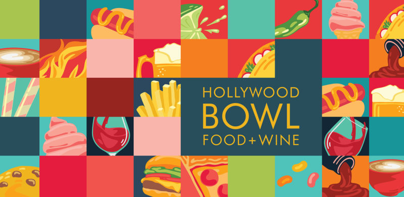
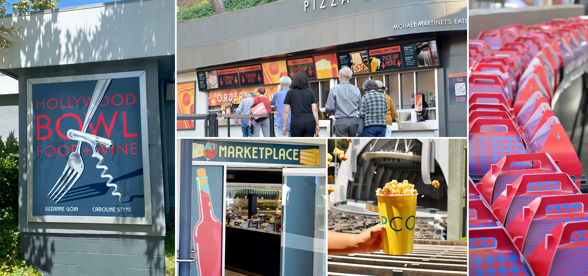
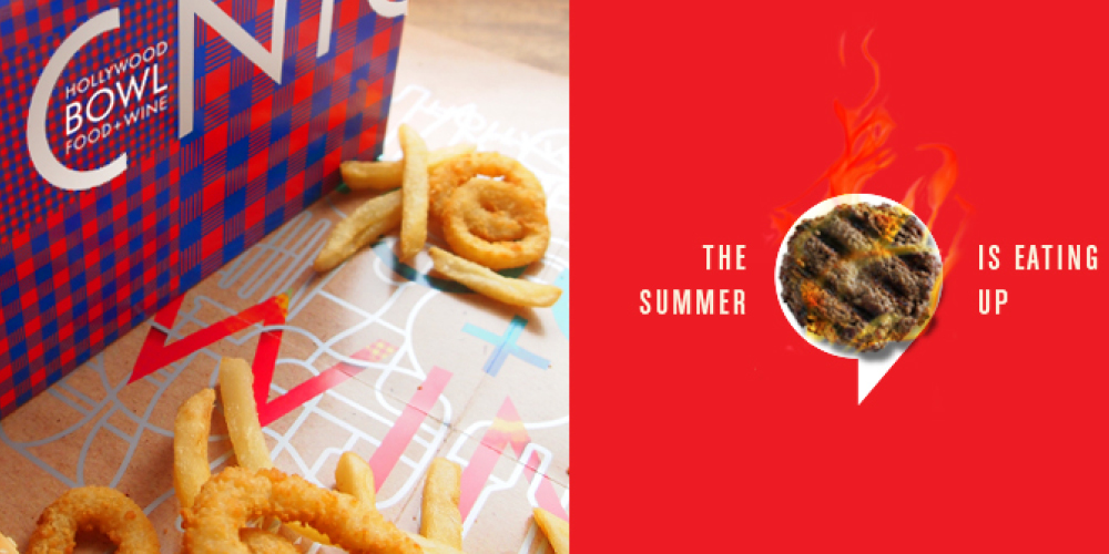
Five years after Carolyn Styne and Suzanne Goin took the helm of the Bowl’s extensive food, wine and concessions program in partnership with Sodexo, it was time for an update. We were brought on to reimagine the look of the food and beverage program. From wayfinding signage down to the fine details like napkin dispensers, we created a unified visual identity for the program that allowed each of the locations shine.
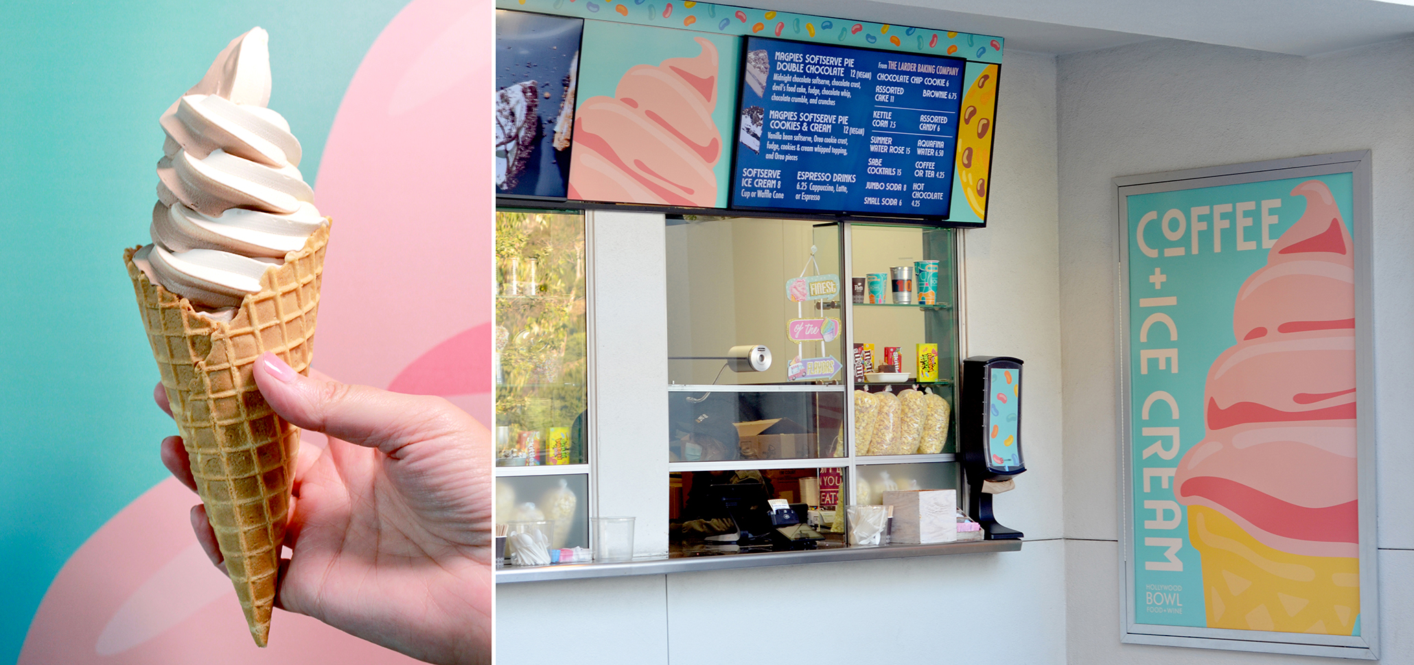
Appropriately for the 100th anniversary, we created a brand that is bright, joyous and celebratory. Simple illustrations have a vintage feel, evoking iconic WPA posters of the last century, but the close-up cropping and vibrant colors modernize the designs. A broad color palette works together, while allowing enough range to complement everything from pizza to ice cream.
We created a unique design for each concession stand, within the overall property branding. Large hero posters, menu board graphics, ordering kiosks, and equipment overlays all share a bold color palette and key graphics to bring them together.
Of course, at a venue as big as the Bowl, there’s always another branding project to do, so we’ve also been shooting video, taking photos and editing Reels, and we’ll be creating new signage throughout the season.
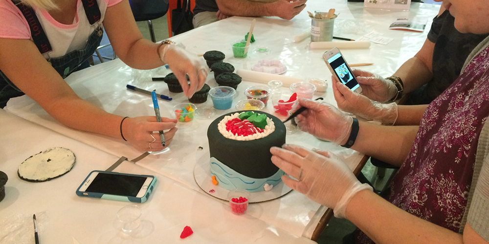
Happy Birthday Hollywood Bowl, hope you like the cake!
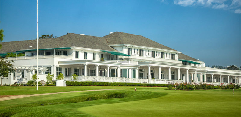
This past weekend, the 46th Walker Cup returned to California for the first time in 35 years, teeing off at the Los Angeles Country Club. The legendary golf match is a biennial team competition that pits USA against Great Britain and Ireland— three countries that sure do love a good lawn mower. The Match is held over two days as 20 amateur players vie for the team title and national pride.
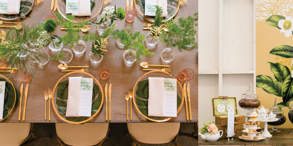
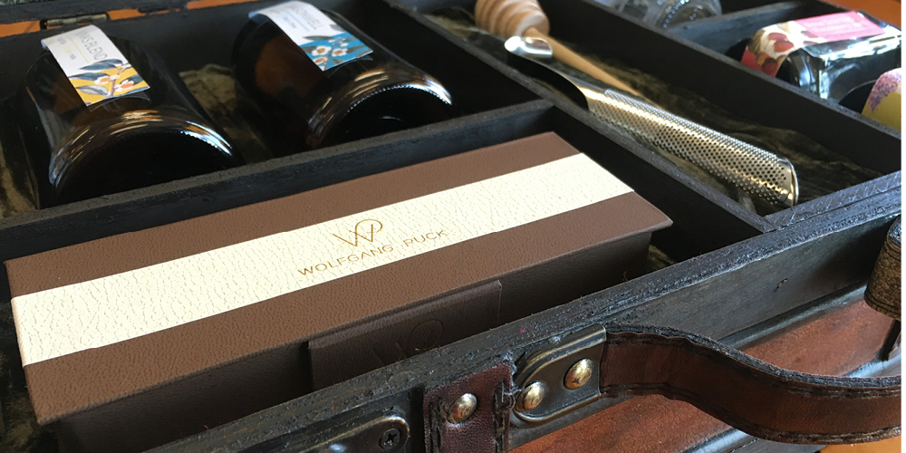
The impressive grounds of Los Angeles Country Club North demanded an impressive and refined dining experience for fans and participants alike. Wolfgang Puck Catering won the dining contract with a strong proposal last year. Can you guess which LA marketing agency helped them with it? Yep, Six Degrees LA at your service. As the event drew near, we joined the marketing team to make sure the signage and print elements were also up to par.
We don’t want to brag, but we’ve had plenty of experience in both special event branding and venue branding.
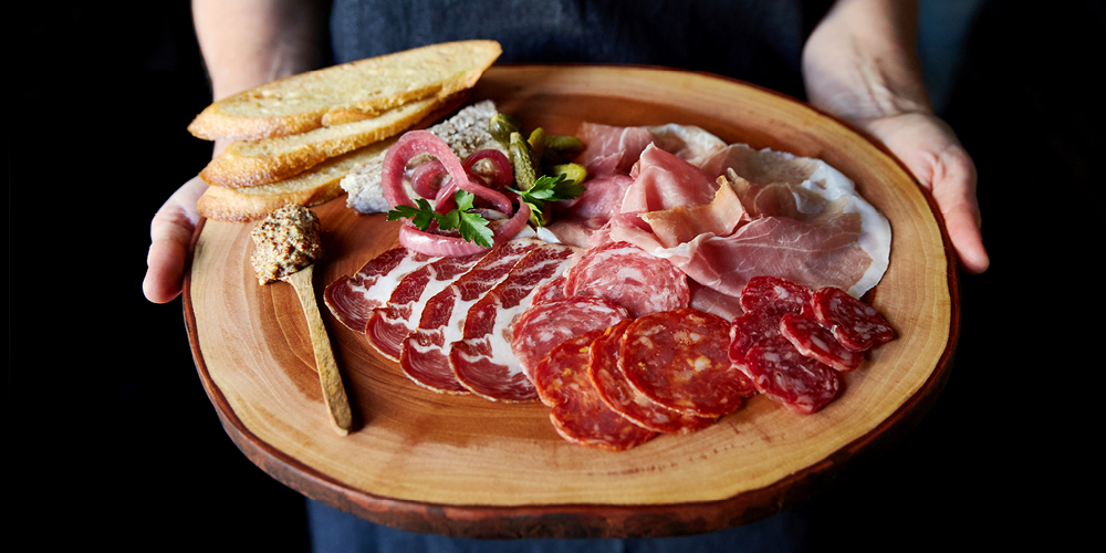
Our design sensibility led us to create clean graphics for each of the food stands; the menus were packed with flavor synonymous with California and Wolfgang Puck, including wood-fired pizza, street food, and farmers market staples that showcased LA’s rich cultural core to the rest of the world. Our work kept things simple and straightforward so attendees could get back to the action on the fairway.
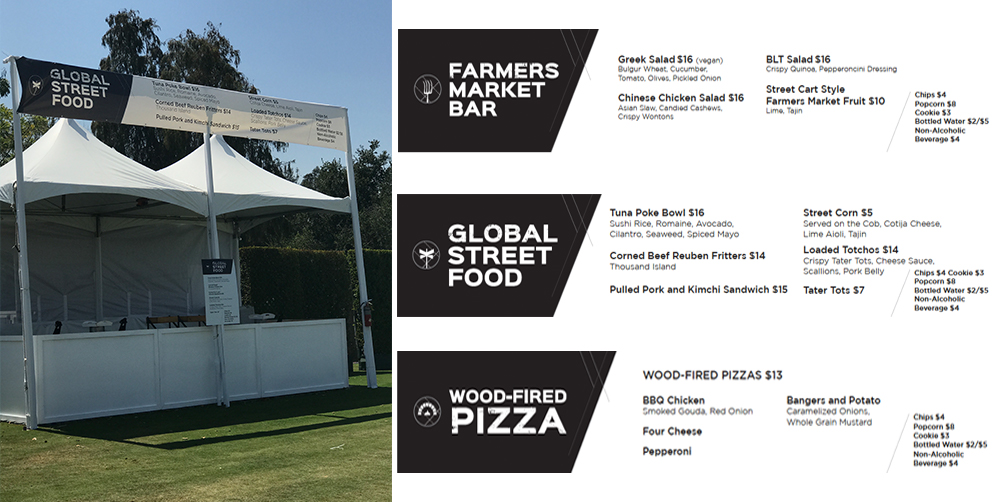
The trick for big events is understanding the flow of space and the variations of deliverables needed to fit it. Experience teaches you how each piece fits together, in order to drive the customer towards the product. The job of a restaurant marketing agency like us is to take the list of food offerings from Wolfgang Puck and create print-ready materials.
For this event, we created menu boards, menus for tent posts, and a brochure dining guide that helped people find food options on site. Our font choices and unique icons reflected the local, fresh energy and helped the food experience at the Walker Cup feel very SoCal— even with the sound of posh accents all around.
The weekend wrapped up with a resounding win for Team USA, bolstered by efforts from several California players, including a La Cañada native. We’d like to think we were part of the victory–maybe catching sight of our menu boards helped them feel right at home.
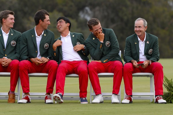 Photo by Harry How
If there’s one thing we recognize at Six Degrees LA, it’s that feeling good about where you eat is a must for all people. Shockingly, food tastes better when you’re not having an identity crisis and guilt isn’t choking you up! It may seem simple, but during our many years in restaurant branding, especially as a LA marketing agency with a whole range of clients, we’ve learned time and time again that the dining choices customers make reflect their emotions, desires, and yes—sometimes politics— rather than simply deciding on a food price point. To help make this more complex call, they rely on a perception of a brand from start to finish.
This past week, big restaurant branding headlines coming from Tom Colicchio’s Fowler & Wells in Manhattan and Brad Greenhill’s Katoi in Corktown, Detroit have brought the issue of naming and social responsibility to the forefront. As the NYT and Eater reported, both restaurants have come under heavy criticism for problematic monikers; their historical and cultural implications weighed on the conscience of customers and critics and, ultimately, lead to a need to re-name in order to remain loyal to the brand vision .
And then of course there’s the grumblings over Dunkin Donuts, who are playing the name-game in their own corporate way. Sometimes it’s hard not to throw up your hands and roll your eyes (Come on guys, you sell donuts— everyone knows you sell donuts), but this news cycle just confirms that ethics, ethos, and the bottom-line all drive choices to try and better represent a restaurant to a customer.
We won’t get political and dwell on whether motivations are always pure (because it’s a Monday and no one needs that kind of suffering) but as a LA marketing agency we know that branding extends beyond a name and into skills we’ve mastered— like restaurant logo design and photography revamps— and each element must reflect the brand identity. Usually the situation isn’t as extreme as the issues getting recent press attention, but our role is the same.
Clients come to us when they recognize a disconnect between where they see themselves and where customers see them, and we use strategy, aesthetics, and brand messaging to help create an experience that each guest can feel good about.
Don’t get us wrong, the big name on the sign is important. The one moniker lives beyond every medium, making it the single lasting impression of a brand. But if picking a whole new name feels like an insurmountable logistical nightmare (To-Go bag reprint? Legal footer EVERYWHERE? Bartender pocket squares, anyone?), that’s where we step in and help make adjustments to a brand identity through a whole spectrum of elements. We’ve helped with everything from VIP fundraisers to community murals to sticking logos on Magic 8 balls.
If you have the slightest inkling that you may want a name change, it should be addressed immediately. “Sooner-rather-than-later” couldn’t ring more true (Tom Colicchio and Brad Greenhill would agree, we think). There are tools we can employ to explore the possibility, from market research to guest surveys. Analytics + our instincts can help you be sure your company is making the responsible call.
Can’t wait for the data? Check out our “When Restaurant Branding Should Happen” infographic that takes our signature tongue-in-cheek approach to answering the pesky question.
In any case, fixing a perception problem starts with finding a partner that can handle the logistical and creative heat. Let’s talk— before the angry tweets roll in and well before the pain of chiseling out logos on all those beautiful engraved maple cutting boards.
Pop the champagne and toss some confetti! We’re celebrating a huge milestone with our friends at Black Angus Steakhouse – one million subscribers to their email Prime Club. That’s nearly double the number from when we updated their branding a little over three years ago. We found the sweet spot of success by connecting with Black Angus loyalists about promotions, celebrations, and a consistent flow of news about what’s going on at each of their 45 locations.
Over 200,000 members signed up in the past year, after we launched a brand new Black Angus website. When you have 50 years of steak-making history, it can be a challenge to bring your guests into the digital age with you, but we’ve proven that email is an effective way to connect restaurant guests. We see up to a 17% increase in sales in the day following a key email blast!
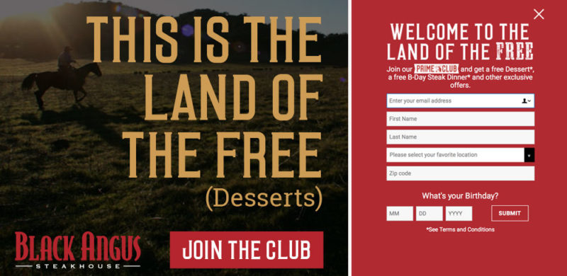
Our homepage redesign focused on putting the Prime Club front and center for our daily visitors and making the sign-up process simple. We designed a pop-up that was to the point – sign up for the Prime Club and receive free goodies, mainly a free birthday steak dinner. (Of course, with a sign-up offer that good, we’d be remiss if we didn’t also mention that in-store sign ups are also going strong.) It’s a bold offering, and one that many marketers would tell you would lead to a low-quality list, but the results say otherwise. Not only do the sales jump after each blast, but the list has low attrition and strong engagement.
To keep up the momentum, we completely revamped the design of the emails, staying on-brand with direct messaging but with a fresh photography style and bold graphic elements. We diversified our promotions, from traditional coupons and LTOs to celebrating National Hamburger Day and highlighting our newest cocktails. We successfully expanded our appeal from the everyday Black Angus diner to include a newer and younger audience (you know, that elusive millennial everyone’s fighting over).
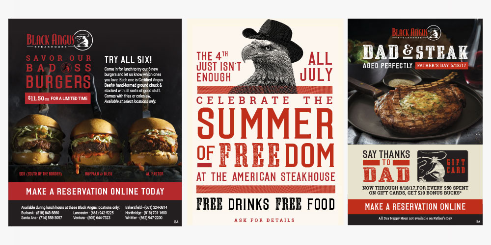
At a time when there are so many avenues for digital marketing, we’re thrilled we’ve found success for Black Angus with organic branded content that actually inspires people to go out for dinner (or lunch, or drinks…). So cheers to steak & success – and here’s to another million members.
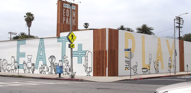
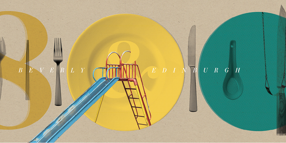
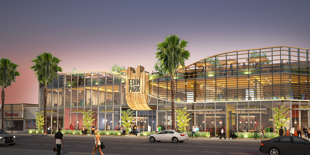
Most discussions about walls these days are negative and politically charged. Let’s take a break from all that and talk about a wall we just put up on Beverly Blvd. with the help of Hattas Public Murals to advertise L.A.’s next greatest, fantastic, amazing food hall, Edin Park.
While many of the submissions for the proposed border wall design featured drab facades and intimidating features, we’re proud to say that none of them had a slice of pizza wearing a wide-brimmed hat talking on its phone, nor a 10ft bacon-wrapped hot-dog bouncer with a clipboard. Our design did. Now we just have to worry about the 30+ food concepts and 10+ fitness studios we need to develop on the other side of it. It’s going to be tremendous.
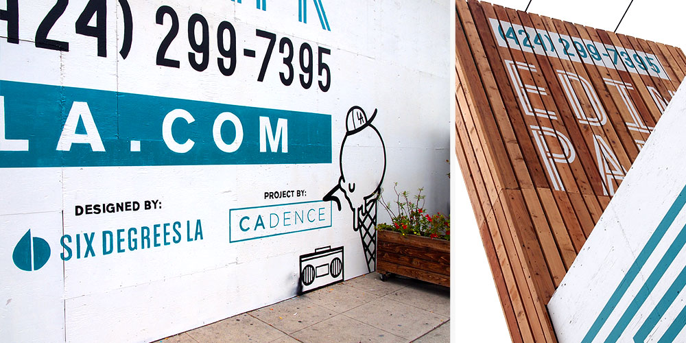
by Josh, Creative & Design
Millennials, millennials, those damn millennials. Just the mention quickly diverges into a fist-shaking critique of their work habits, emotional sensitivity, and their cyborgian connection to social media. Well, we’re not here to jump on that conversation. We like millennials. In fact, with nearly $1.3 trillion in purchasing power and almost 50% of their food expenses coming from dining out, we LOVE millennials. Gen Z on the other hand, geez it’s like they are a bunch of socially conscious, risk-averse babies. Basically, the younger generation will never be as hard-working/enlightened/pleasant-smelling/athletic or as awesome as our generation, says EVERY GENERATION EVER. Continue Reading…
by Amanda, Marketing & Strategy
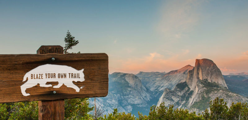
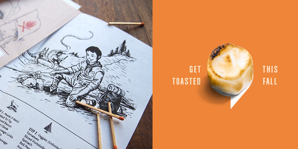
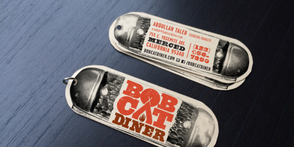
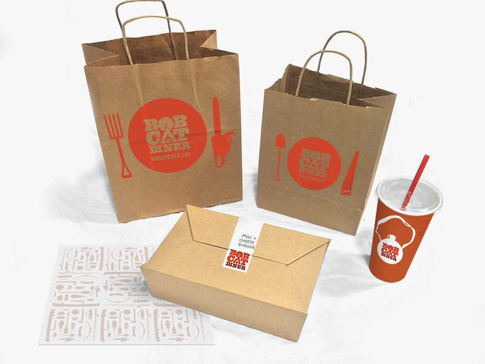
Recently, we had the chance to break out of our delicious Los Angeles foodie bubble and take a trip to the gateway of Yosemite: Merced, California. We created the brand identity for Bobcat Diner, a new restaurant concept with ambitious plans for growth. With the location and expansion plans in mind, we took inspiration from the iconic graphics of the National and State Parks to create a design that would resonate with the local Merced community, and work just as well in new locations across the country. We didn’t take it too seriously, though, with a tongue-in-cheek approach to the outdoors tucked away within the copy.
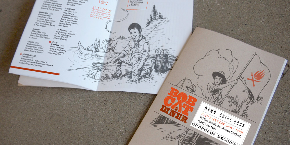
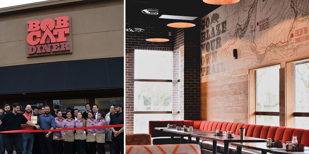
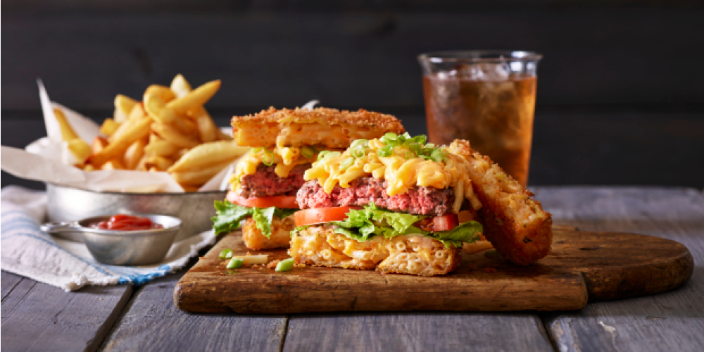
We were lucky to be brought in at the very beginning of construction, so you’ll find our graphic design work in the campfire logo, oversized trail maps on the walls (providing helpful directions to lunch and dinner over the mountainous milkshakes), and the guide to Bobcat Guide merit badges. The menus serve as a Guide Book, filled with hand-drawn illustrations for our Bobcat Guide Tips to accompany the menu of diner mainstays including breakfast skillets, burgers and sandwiches.
Once the design was complete and construction underway, our marketing team took over the restaurant’s pre-opening social media, bringing the brand’s outdoorsy voice to life and building anticipation for the opening. When California’s unexpected rain caused construction delays, we tackled the challenge of keeping interest high as the opening day changed, and changed again. When the grand opening finally arrived, we were there to capture the excitement before handing the social reins back to to the restaurant team.
All in all, we enjoyed our excursion into the wilds of Central California, and like the restaurant, we try to be true to the Bobcat Oath, even back here in Los Angeles.
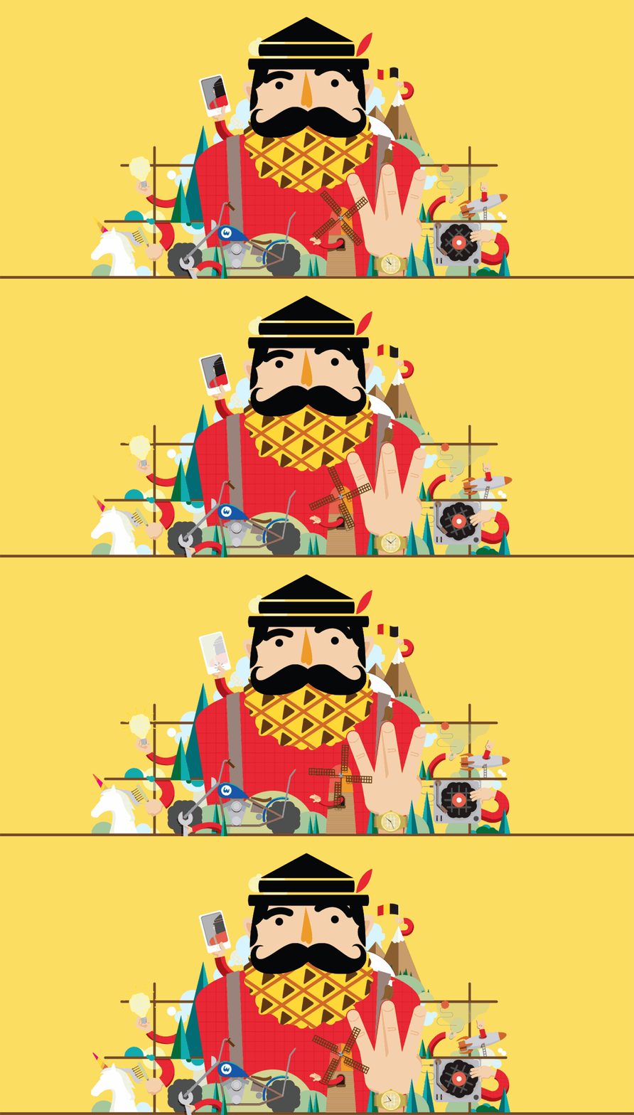
We’re giving 2016 the finger. Ok, not THE finger. In fact some people don’t even consider it a finger at all. We’re giving 2016 a thumb – a “thumbs up” to be exact. Because honestly 2016 was solid. Bombarded by social-media bad mouthing it seems like a lot of people were pretty pissed about the whole year. We just don’t share that sentiment. Just look below. Good times were had, great work was done, and we still have all of our limbs (maybe a few injuries that we swear were NOT Pokemon Go-related). What else can be said? It was a damn good year.
In that regard, we’re giving 2017 an enthusiastic handshake. You know, the one that’s a little firm. Maybe just a little bit too firm, but not to the point of actually hurting – just firm enough to confidently say, “I’m in charge.” Yeah 2017, we’re going to own you. Ahhh, who are we kidding…give us a hug.
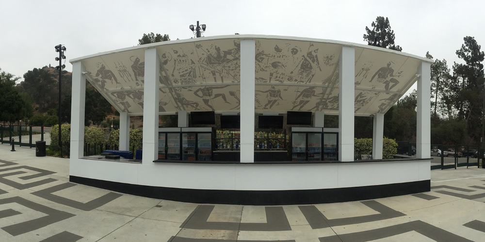
No thanks to furry walls or Jonah Hill, but we finally got into The Greek Theatre. We say “finally” because our first go was a few years back supporting AEG and Nederlander with new branding and environmental design as they bid against Live Nation. It got ugly. Lots of news articles, community uproar, council meetings, legalities and petitions – and the result was nobody got the contract.
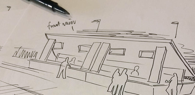
Well, when it comes to outdoor music venues in LA, THIS was our season (read about the Hollywood Bowl just a few swipes down). This time on the side of SMG and Premier with a monolithic bar concept as our Trojan horse. And it worked. The Greek really holds a special place in our hearts; where the Hollywood Bowl captures an elevated cultural evening of performance and food and wine pairing, The Greek has the soul of a club venue in a gorgeous setting; hip-flasks and hard-rock (harder rock at least…and then there’s Josh Groban).
There are two evening activities in Los Angeles we recommend to visitors. Go to The Hollywood Bowl and go to The Edison (hey, we did that brand too!). Though the Edison is cool for the aesthetic and absinthe, going to The Bowl is just one of those quintessential L.A. experiences that combines the best in food, music, atmosphere and summer-SoCal outdoor lifestyle. And you can bring your own absinthe! (Update: Guess you can’t bring liquor in, just beer and wine. Anyway, bringing absinthe into a venue is both a reckless decision for your liver, the people around you, and you can’t even do the cool pour-over the sugar-cube spoony thing).
