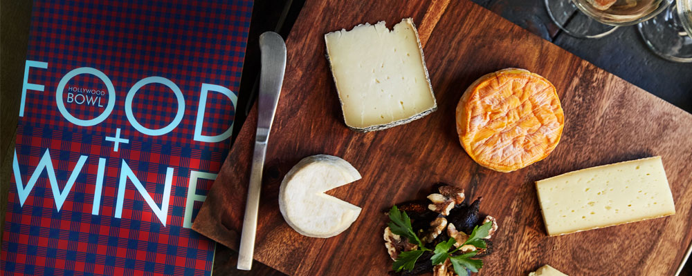
There are two evening activities in Los Angeles we recommend to visitors. Go to The Hollywood Bowl and go to The Edison (hey, we did that brand too!). Though the Edison is cool for the aesthetic and absinthe, going to The Bowl is just one of those quintessential L.A. experiences that combines the best in food, music, atmosphere and summer-SoCal outdoor lifestyle. And you can bring your own absinthe! (Update: Guess you can’t bring liquor in, just beer and wine. Anyway, bringing absinthe into a venue is both a reckless decision for your liver, the people around you, and you can’t even do the cool pour-over the sugar-cube spoony thing).
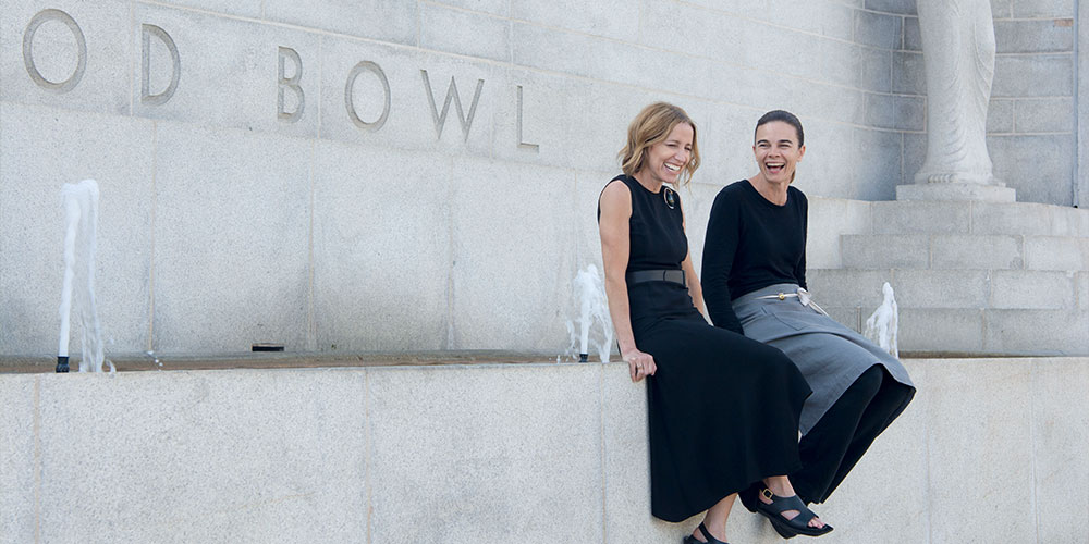
This season, The Bowl made a huge change. 10-year-incumbent Patina Restaurant Group handed over the culinary keys to Suzanne Goin and Caroline Styne (Lucques, a.o.c., Tavern, The Larder,) whose food and wine philosophy embodies the approachable, fresh, Californian vibe that’s suited for the venue.
We’d describe our vibe in the exact same way (although we do have one Bostonian on our team *shaking head sadly*) so we were honored to be brought on board to bring this change to life.
Now we’ve done plenty of venue branding in L.A. (The Greek, The Shrine, Rose Bowl, Griffith Observatory) but The Bowl posed a unique challenge. We had to both respect the existing brand, adhere to the strict guidelines of historical preservation and architecture, and consider the external brands brought in by Suzanne and Co.
Challenge is no understatement. Our conference room looked like Led Zeppelin and Keith Moon went on a bender in Office Depot. But in the melee of concept and revisions we had a revelation; it’s the food that’s the rock stars here.
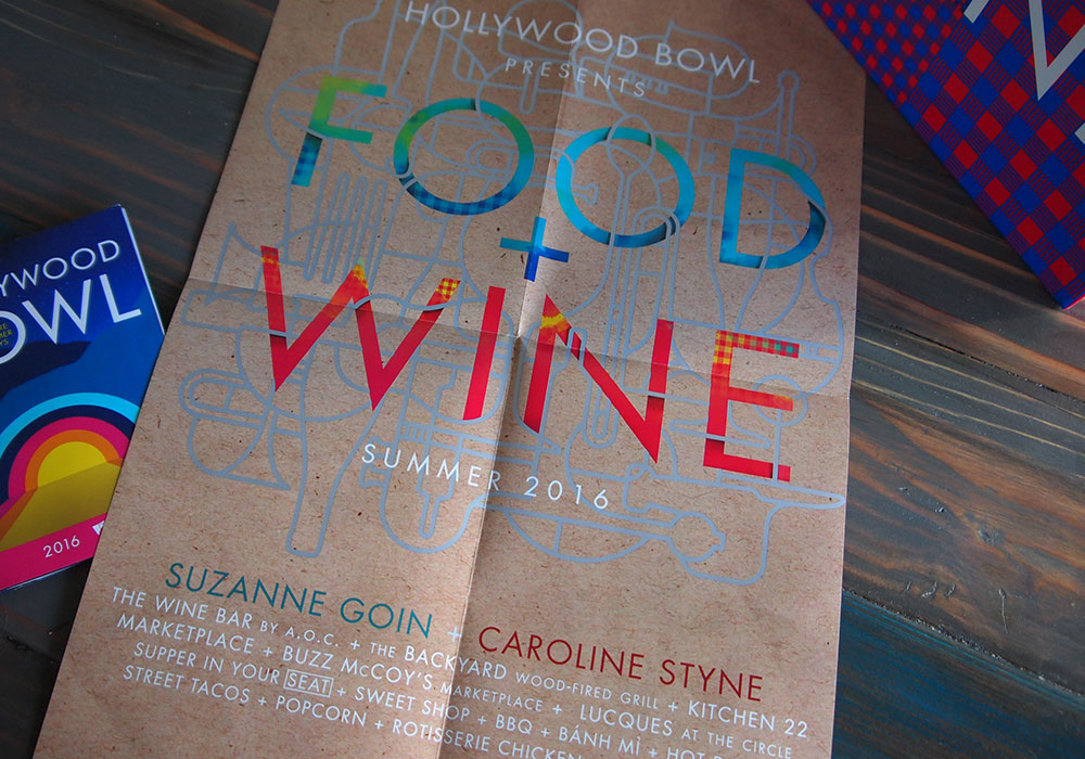
We treated FOOD + WINE like a season-long music tour where each restaurant and concession stacked the lineup. This format allowed each concept to be unique and fit within the venue like the concert posters and artists that we drew inspiration from.
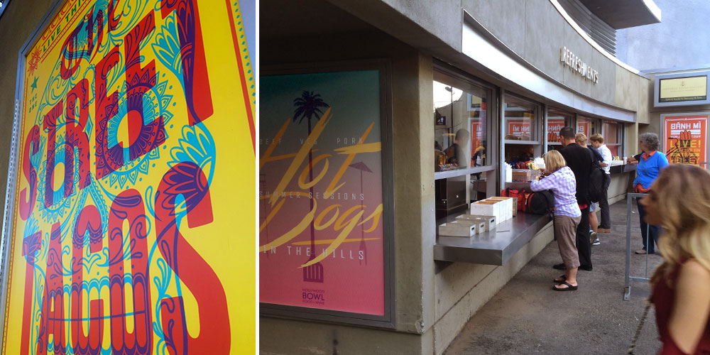
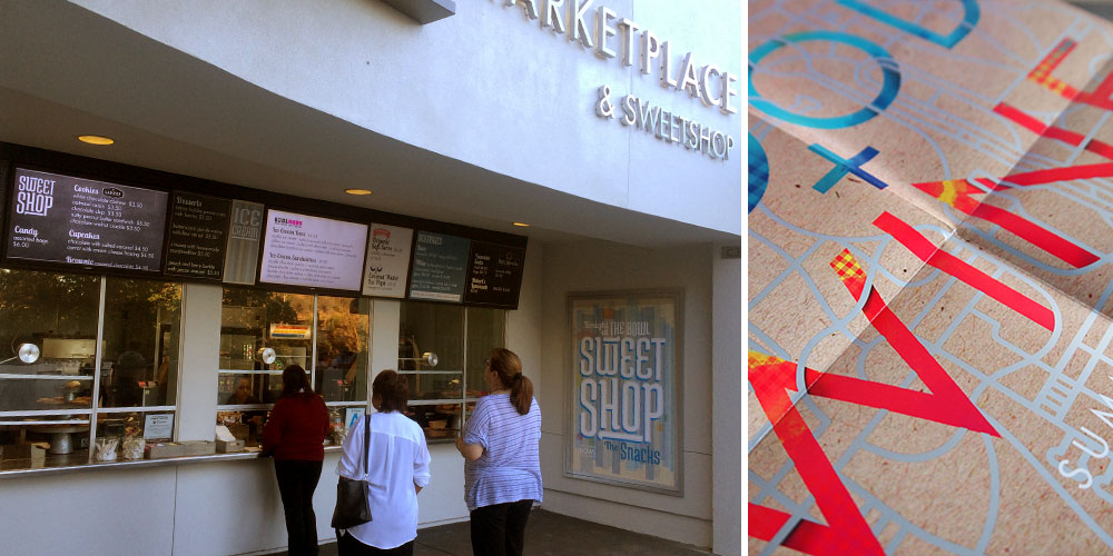
Huge posters and menu boards serve as both strong directionals and bold branding to stand out in the low-lit crowds, whereas the stand and kiosk interiors are decked out like stages, wrapped in graphics from floor to ceiling.
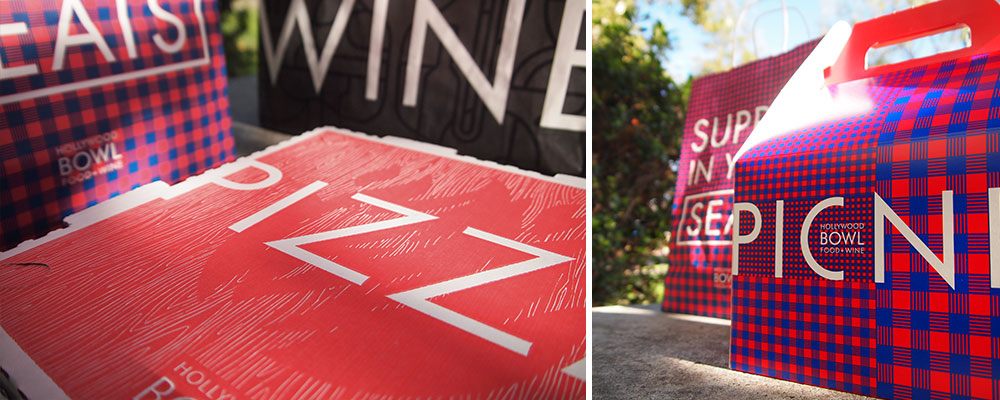
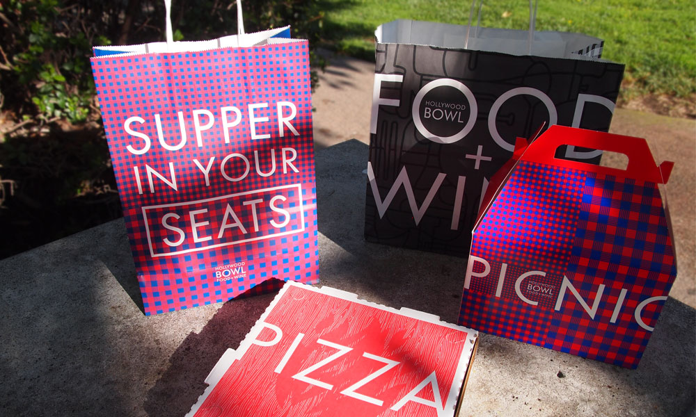
Of course, this tour needed a manager to wrangle in the chaos. The FOOD + WINE brand takes cues from the spirit and activity of the venue. The Bowl IS picnicking and the picnic pattern IS check. Gingham in a variety of combinations adorns everything from picnic boxes, to bags, to the uniforms, while drawing in the color combinations and textures found in the other concepts. The result is an impactful brand that’s fresh and bold and cohesive in its inconsistency.
