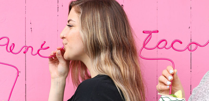
Pink Taco. I’ll give you a second to get your snickers and eye-rolls out of the way. Good? Great.
To clarify, Pink Taco is named after their signature achiote-marinated chicken taco topped with fluorescent pink habanero-pickled onions. So we don’t know what that initial fuss was about. Grow up.
We love a brand that has a clear attitude right in the name. You know the exact kind of experience you’re getting. Even better when that identity is brazen and irreverent. Taking on their social media marketing was right in our wheelhouse.
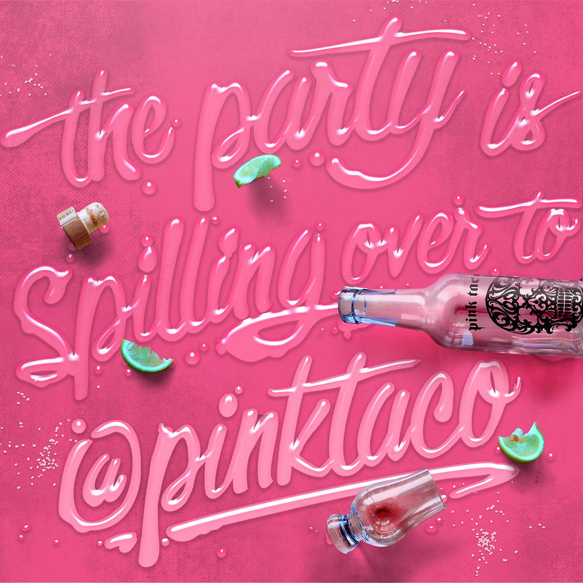
Pink Taco is all about the party, so kicking off 2020 with a new location right in the raging heart of Miami Beach makes perfect sense. Especially with Snoop Dogg officiating the opening. On social media, we’ve turned their brand into a bender of feasting, boozing, skulls, and unsolicited pink taco pics.
Well, they were kinda solicited, because they’re exactly what the client and social audiences asked for.


Hey 2020,
Now to the trends!
1. Extra Reality
2. Power Distribution
3. Reward the talent
4. More than just “like”
5. Return to nature
6. Embrace Individualism
Oh yeah, that environment we mentioned, well, it’s becoming even more personal. We are further able to adapt our surroundings and services to our individual needs creating purposeful interactions that are designed to suit us best.
Branding Illustration
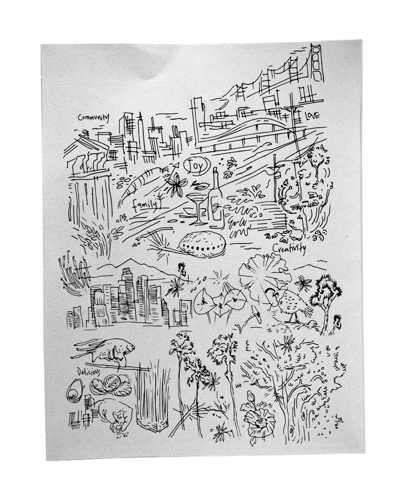
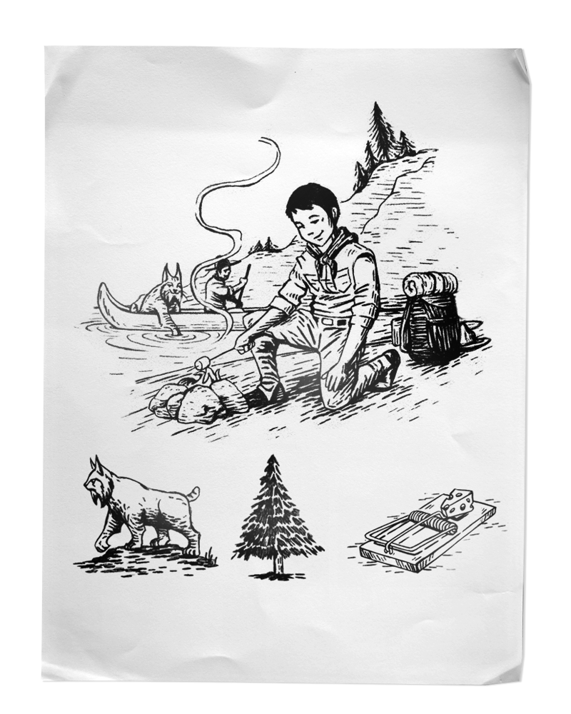
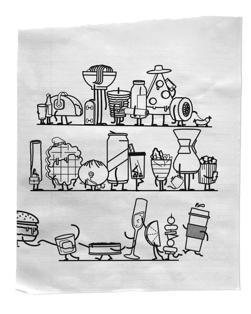
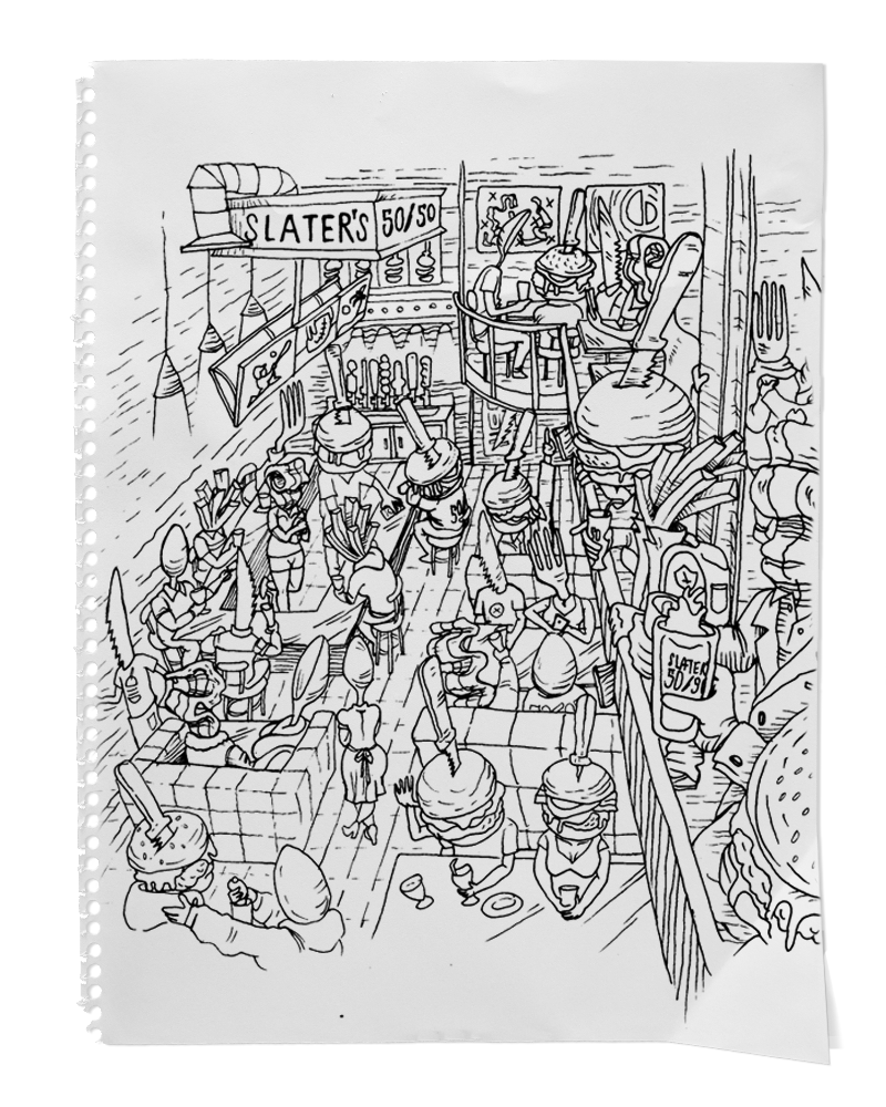
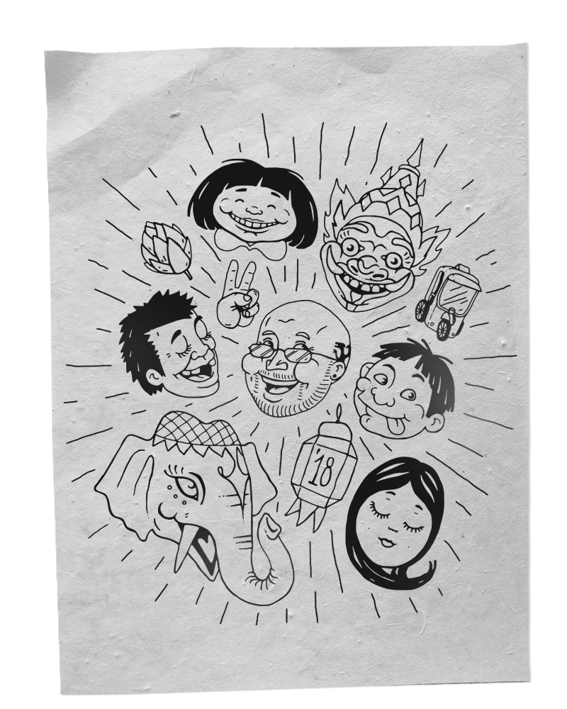
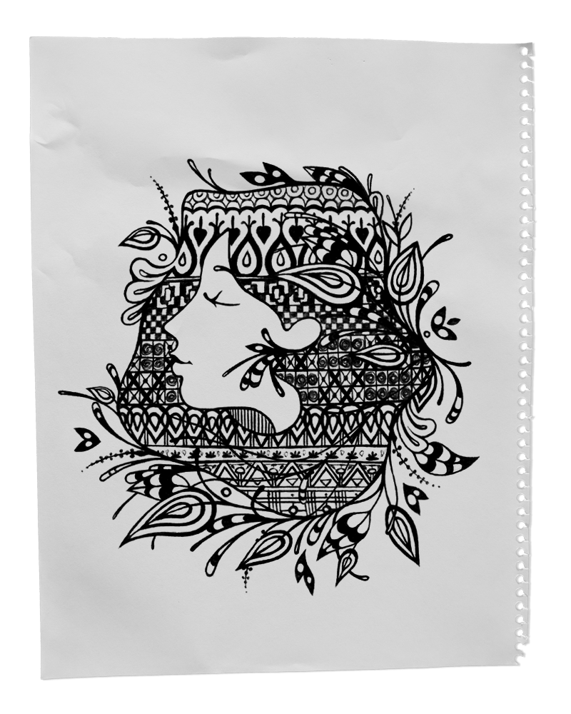
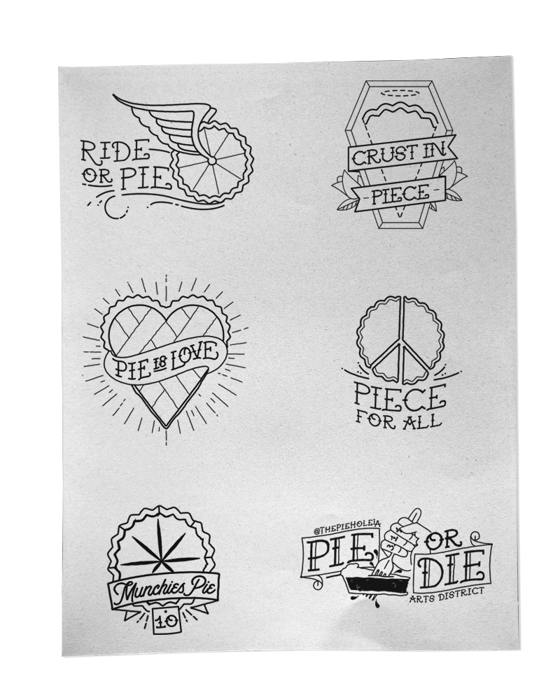
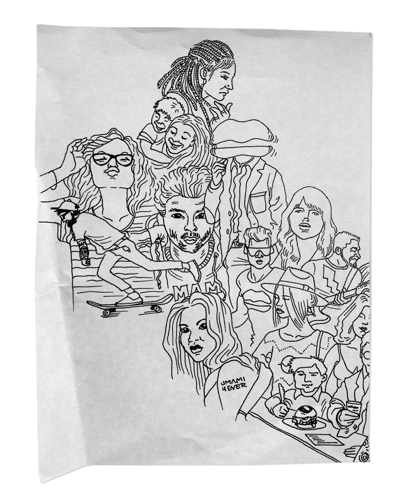
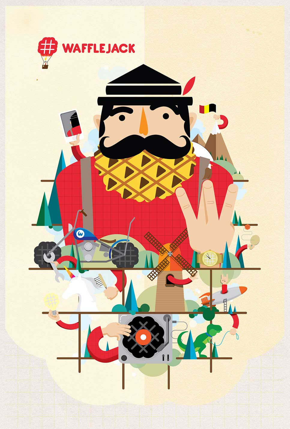
Who knew that our 11-year-old response to “what do you like to do?” was a premonition! Here we are as adults still just sitting around, “drawing and stuff.” Sure our tools may be a bit more advanced and our sketches tend to have a lot less dinosaurs and skate-parks (if you are reading this and have a dinosaur-skate-park concept you better pick up the damn phone) we still pride ourselves on putting pencil to paper to enrich our brands with some unique art. Check out some illustration samples below:
COLUMN – Josh Terry; Creative Director
As the Creative Director of a restaurant branding agency, I feel like I should enjoy oysters. I feel like I should enjoy all food and drink and for the most part I do– except oysters. Believe me though, it’s not for lack of trying. I’ve sought out these briny bites up and down the coast from Swan Oyster Depot, to L&E, to Olympia Oyster Bar. Every time thinking that this will be the time that wins me over.
Why would I subject myself to all this unsatisfactory slurping? Because I really FEEL like I should enjoy oysters. And pretty much everyone I’m with loves them. They go nuts for them. And when everyone’s eyes light up as an icy plateau of shellfish is paraded across the restaurant, I’m always there to kill the buzz with an unenthusiastic “meh.”
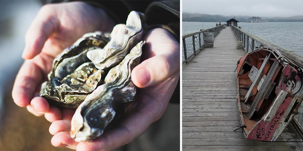
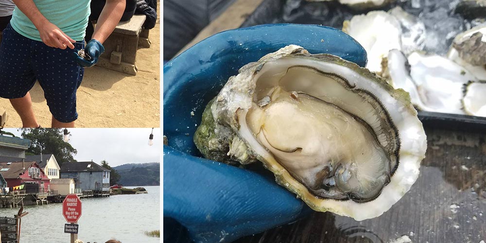
Oh but I’ve seen the pearly light! (Figuratively, pearls would probably be a choking hazard). All it took was a trip up to the Hog Island Oyster farm in Tomales Bay. In my day, I’ve eaten some weird stuff produced by interesting processes (think Sun Cooked Stew in Africa and Live-Shrimp in Cambodia) so when it came to this hang-up, I realized maybe it was the process that was missing. Sometimes I need to go through a gastronomic gauntlet to really appreciate the product. In this case, it was shucking my own oysters.
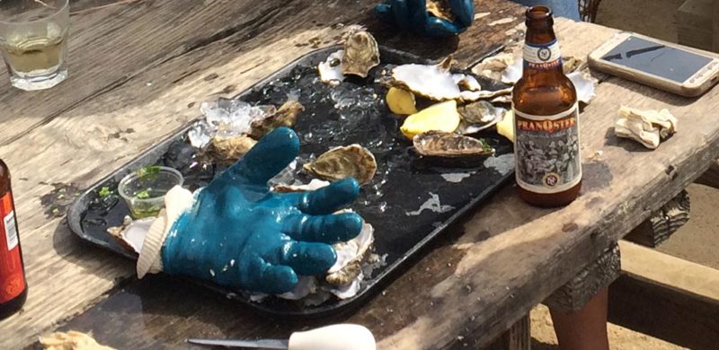
Hog Island is a simple setup. It’s a working oyster farm, so the frills are for function not form. That’s a welcome treat for someone who has worked in an industry rife with overdone design and empty restaurant concept development. Past the piled up nets, buoys, and gurgling troughs of oysters in various stages of processing there is a “pick-up” window. You place your order and get a quick demo to hopefully reduce the amount of self-stabbings and bits of broken oyster shell you consume. Armed with the requisite amount of instruction and appropriate tools: oyster knife, protective glove, and cold beers- we carried our tray of 60 (you basically order by the dozen…or five dozen. That’s commitment.) assorted Sweetwaters, Kumamotos, and French hogs over the to picnic/shucking zone.
By about the 5th or 6th oyster you really start getting the hang of it. By the 12th, I was a machine and by the 20th+ I was a machine covered in sea-water, bits of shell, and beer. Pro tip – be wary of the beer-to-oyster ratio, as your newfound shucking skills may regress. By the end of it all, I had put down more oysters in that one sitting then I’d probably had in my entire life. Shell yes! Shuck yeah!
I now love oysters.
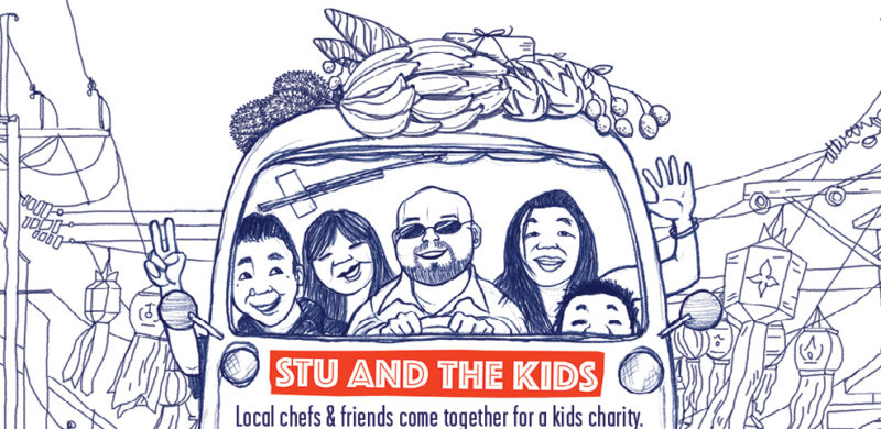
From a brand perspective, “Stu and His Friends Support Stu and the Kids” does not seem to be a great event name. Aside from being very clear that someone name “Stu” is looking for support, it doesn’t provide a lot of clues to either the cause or the event. But, despite the cryptic naming, Stu’s event is one that everyone looks forward to each year and one we’ve been proud to support for a number of years.
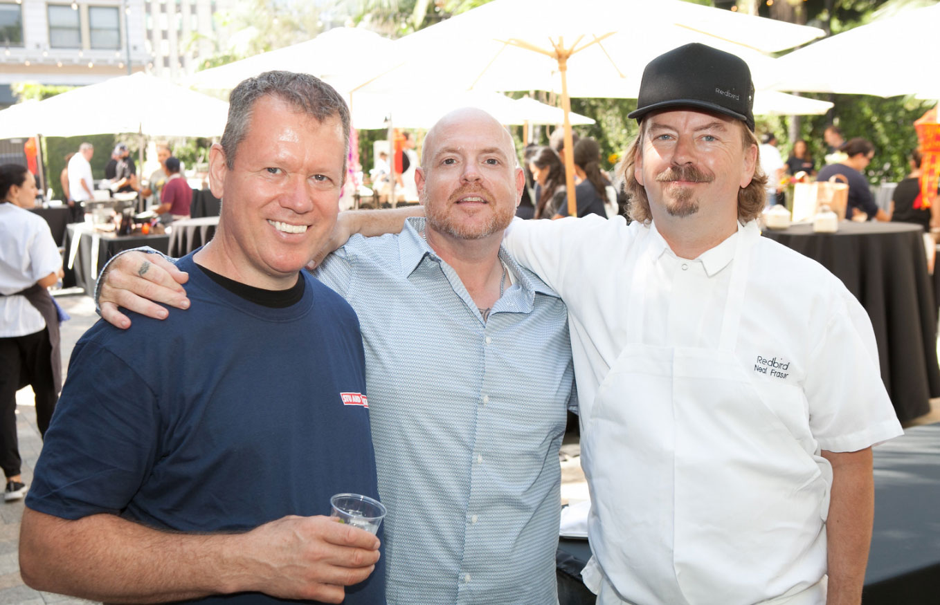
What you need to know is that Stu’s “Friends” are some of Los Angeles’s best chefs, and “the Kids” are underserved and orphaned children from the Hill Tribe in Northern Thailand. Stu is Stuart Skversky, and he’s made it his mission to help these kids; he teaches English and cooking to the younger kids, and raises money to help the older kids get a college education and build themselves a better future.
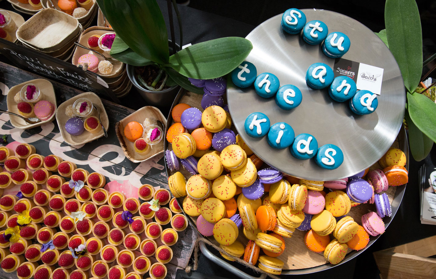
The first fundraiser for Stu and the Kids was held in 2011, and it’s grown tremendously each year. We got involved in 2014, and have helped each year since then. Over the years, we’ve helped with everything from finding a location (OK, it was a parking lot), to making the hand-drawn logo, and, of course, volunteering to take out the trash at the event. This year, we created the event’s signature graphic and event-day signage, and handled Stu’s Facebook advertising and content calendar.
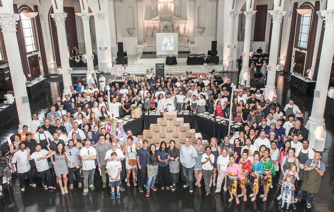
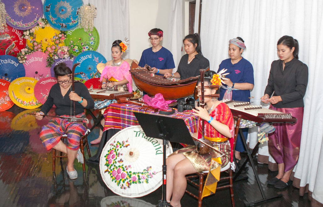
The event has grown so popular that there were plenty of volunteers to take out the trash, so we got to focus on taking pictures of the food as we sampled it, and went live on Facebook for his presentation, from thank-yous to Thai dancers. The past weekend’s fundraiser featured some of LA’s top chefs and restaurants – including Walter Manzke, Neal Fraser, Jason Neroni, Sherry Yard and Ray Garcia – not to mention chefs Jet Tila and Rocco Whalen. We’re honored to be in such talented company and help raise money for Stu and the Kids. See you next year!
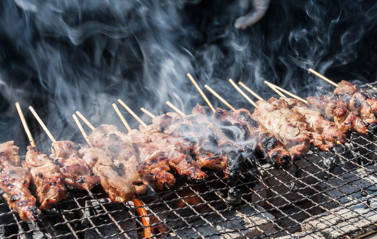
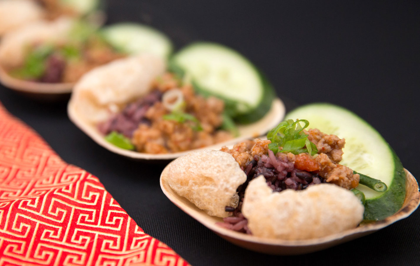
Thanks to Erik Fischer Photography and Victor Vic Photography.
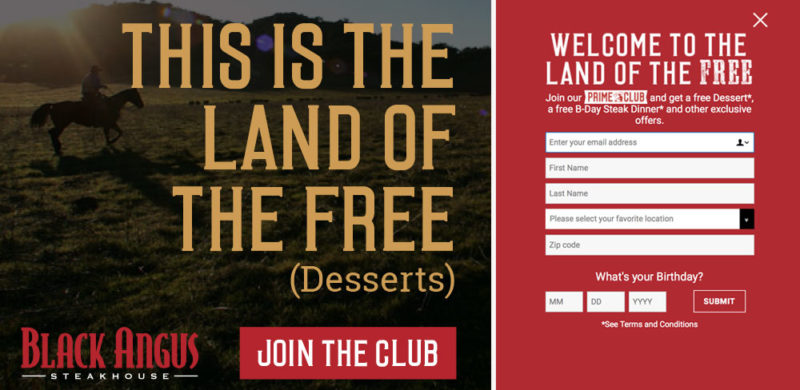
Pop the champagne and toss some confetti! We’re celebrating a huge milestone with our friends at Black Angus Steakhouse – one million subscribers to their email Prime Club. That’s nearly double the number from when we updated their branding a little over three years ago. We found the sweet spot of success by connecting with Black Angus loyalists about promotions, celebrations, and a consistent flow of news about what’s going on at each of their 45 locations.
Over 200,000 members signed up in the past year, after we launched a brand new Black Angus website. When you have 50 years of steak-making history, it can be a challenge to bring your guests into the digital age with you, but we’ve proven that email is an effective way to connect restaurant guests. We see up to a 17% increase in sales in the day following a key email blast!
Our homepage redesign focused on putting the Prime Club front and center for our daily visitors and making the sign-up process simple. We designed a pop-up that was to the point – sign up for the Prime Club and receive free goodies, mainly a free birthday steak dinner. (Of course, with a sign-up offer that good, we’d be remiss if we didn’t also mention that in-store sign ups are also going strong.) It’s a bold offering, and one that many marketers would tell you would lead to a low-quality list, but the results say otherwise. Not only do the sales jump after each blast, but the list has low attrition and strong engagement.
To keep up the momentum, we completely revamped the design of the emails, staying on-brand with direct messaging but with a fresh photography style and bold graphic elements. We diversified our promotions, from traditional coupons and LTOs to celebrating National Hamburger Day and highlighting our newest cocktails. We successfully expanded our appeal from the everyday Black Angus diner to include a newer and younger audience (you know, that elusive millennial everyone’s fighting over).
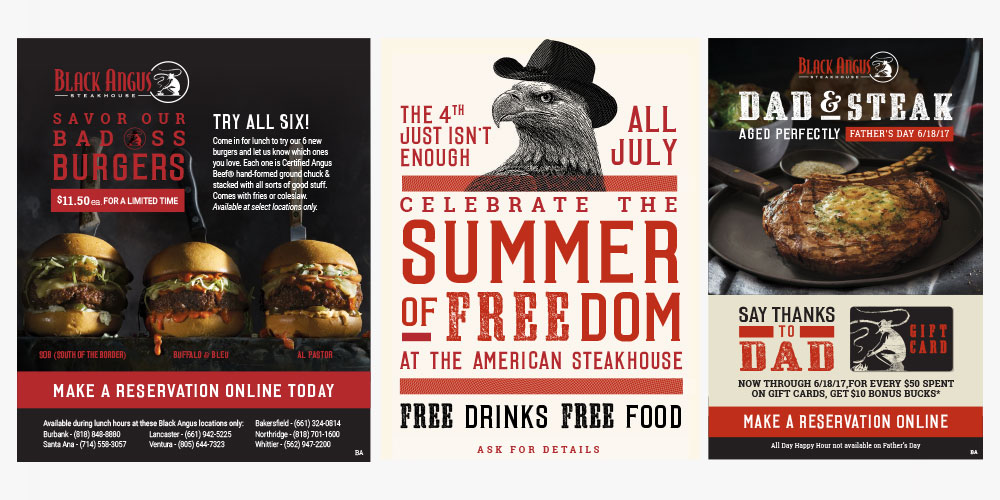
At a time when there are so many avenues for digital marketing, we’re thrilled we’ve found success for Black Angus with organic branded content that actually inspires people to go out for dinner (or lunch, or drinks…). So cheers to steak & success – and here’s to another million members.
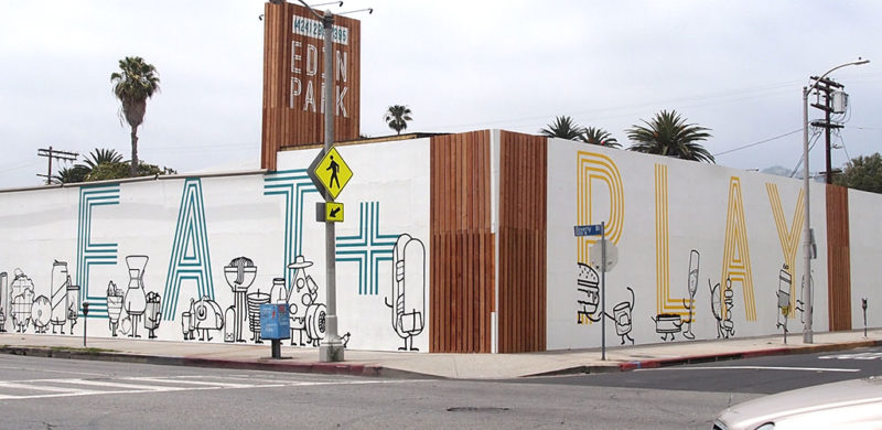
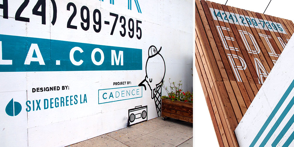
Most discussions about walls these days are negative and politically charged. Let’s take a break from all that and talk about a wall we just put up on Beverly Blvd. with the help of Hattas Public Murals to advertise L.A.’s next greatest, fantastic, amazing food hall, Edin Park.
While many of the submissions for the proposed border wall design featured drab facades and intimidating features, we’re proud to say that none of them had a slice of pizza wearing a wide-brimmed hat talking on its phone, nor a 10ft bacon-wrapped hot-dog bouncer with a clipboard. Our design did. Now we just have to worry about the 30+ food concepts and 10+ fitness studios we need to develop on the other side of it. It’s going to be tremendous.
by Amanda, Marketing & Strategy
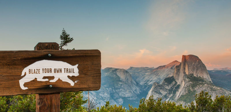
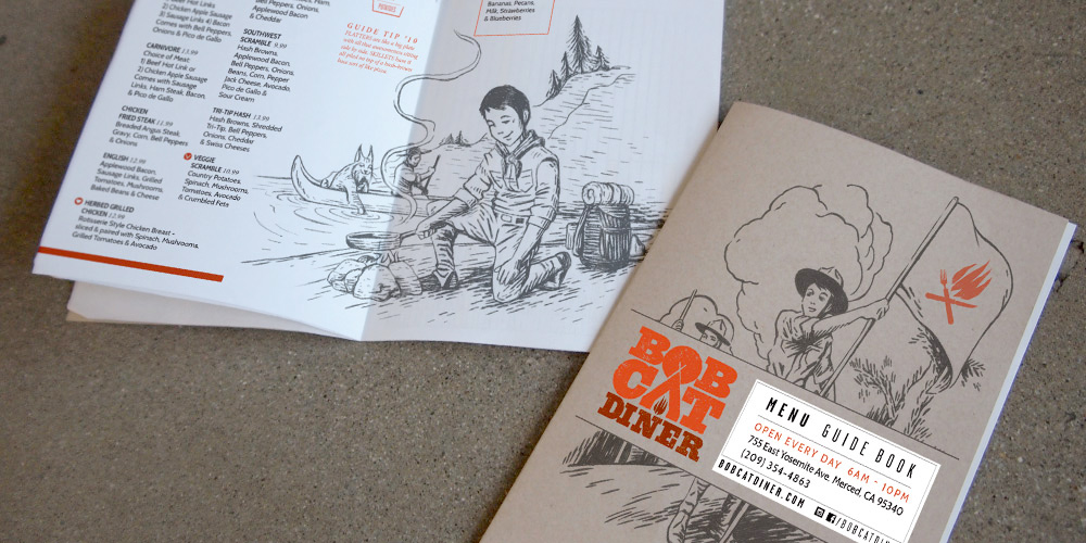
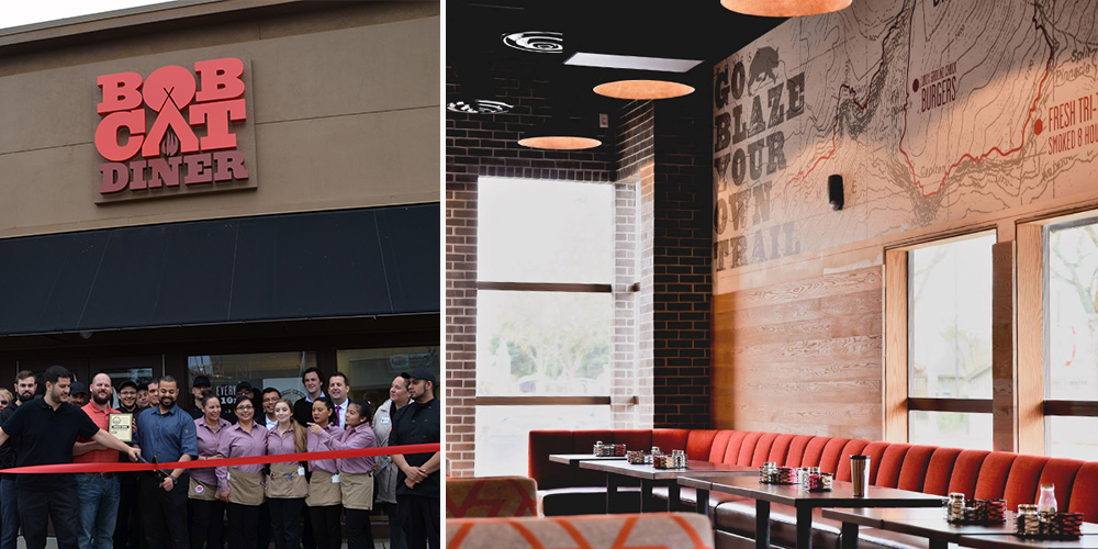
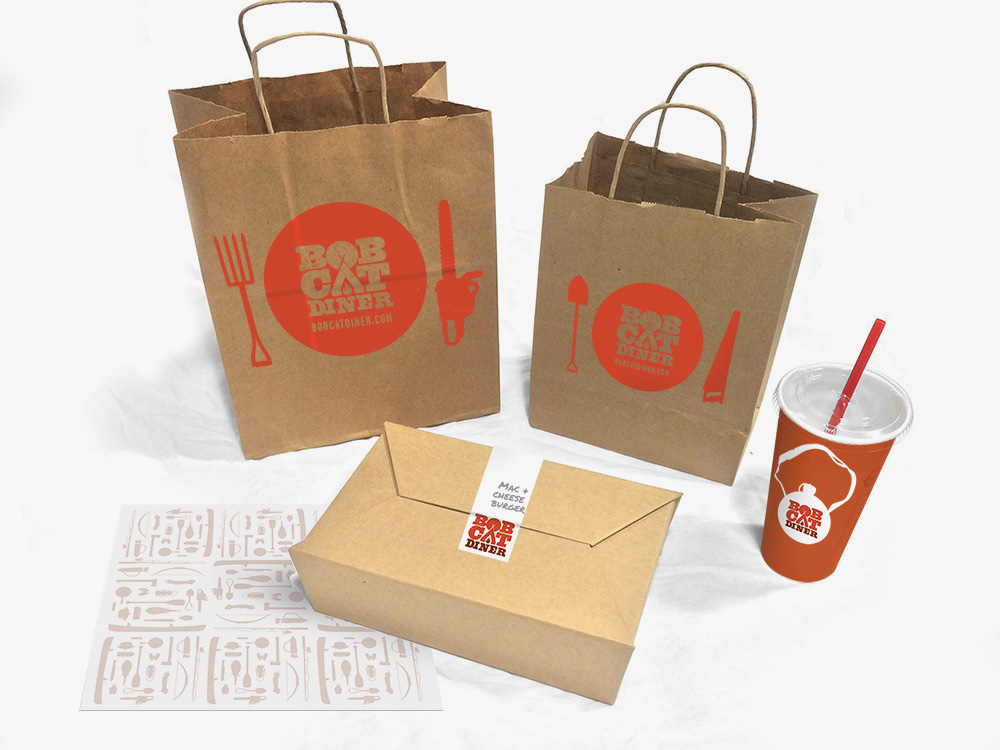
Recently, we had the chance to break out of our delicious Los Angeles foodie bubble and take a trip to the gateway of Yosemite: Merced, California. We created the brand identity for Bobcat Diner, a new restaurant concept with ambitious plans for growth. With the location and expansion plans in mind, we took inspiration from the iconic graphics of the National and State Parks to create a design that would resonate with the local Merced community, and work just as well in new locations across the country. We didn’t take it too seriously, though, with a tongue-in-cheek approach to the outdoors tucked away within the copy.
We were lucky to be brought in at the very beginning of construction, so you’ll find our graphic design work in the campfire logo, oversized trail maps on the walls (providing helpful directions to lunch and dinner over the mountainous milkshakes), and the guide to Bobcat Guide merit badges. The menus serve as a Guide Book, filled with hand-drawn illustrations for our Bobcat Guide Tips to accompany the menu of diner mainstays including breakfast skillets, burgers and sandwiches.
Once the design was complete and construction underway, our marketing team took over the restaurant’s pre-opening social media, bringing the brand’s outdoorsy voice to life and building anticipation for the opening. When California’s unexpected rain caused construction delays, we tackled the challenge of keeping interest high as the opening day changed, and changed again. When the grand opening finally arrived, we were there to capture the excitement before handing the social reins back to to the restaurant team.
All in all, we enjoyed our excursion into the wilds of Central California, and like the restaurant, we try to be true to the Bobcat Oath, even back here in Los Angeles.
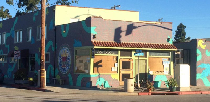
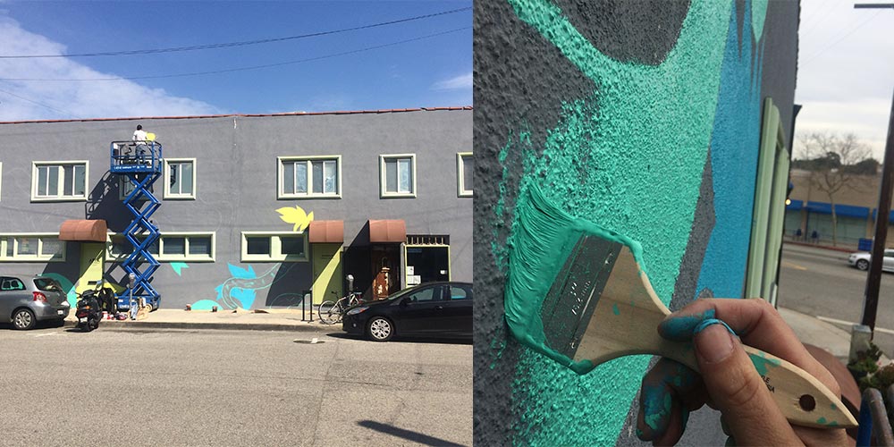
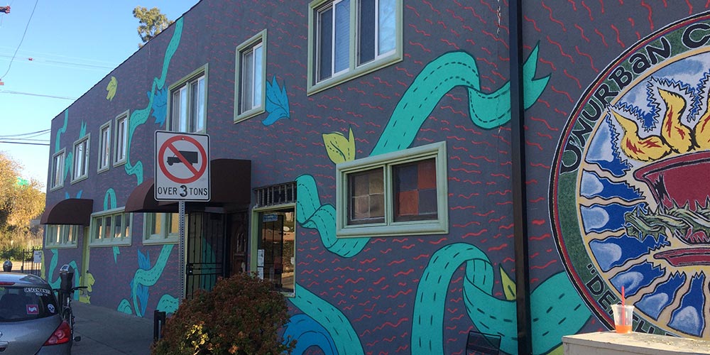
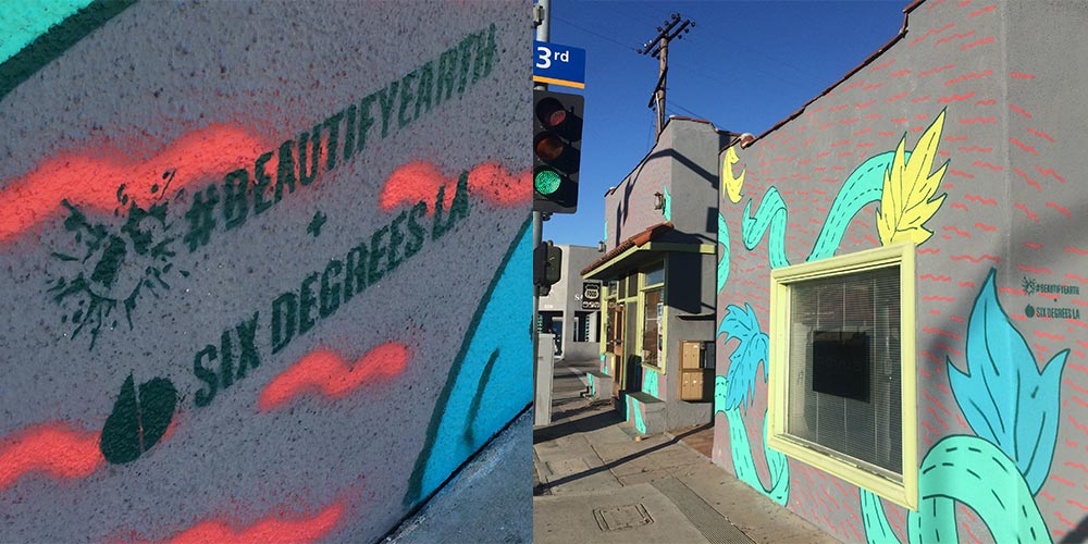
We want to make things look better. That’s what Beautify Earth wants, too. Their mission is to link up loving artists with unloved spaces to turn them into something everyone can love. Yeah, we used “love” 3 times because there is a lot needed right now and Pico Boulevard in Santa Monica was a great place to start.
Our lead designer, Uriel Bautista, took charge of the design, planning, and application. He also moonlighted as the mechanical lift operator (shhh…don’t tell OSHA). Literally, in the moonlight.
“Unurban Coffee House has one of the chillest vibes in Santa Monica. The owner, staff and regulars are filled with positive energy. They do open mic nights, it’s cozy and funky. This place’s atmosphere rejuvenates my hope in good people. The mission was to have the exterior match the spirit of the inside. So, I used their existing logo as a focal point and rays of energy radiating from it. With organic ribbons and leaves in visually-pleasing colors, the wall was filled with expanding love. It was an unforgettable experience.”
No thanks to furry walls or Jonah Hill, but we finally got into The Greek Theatre. We say “finally” because our first go was a few years back supporting AEG and Nederlander with new branding and environmental design as they bid against Live Nation. It got ugly. Lots of news articles, community uproar, council meetings, legalities and petitions – and the result was nobody got the contract.
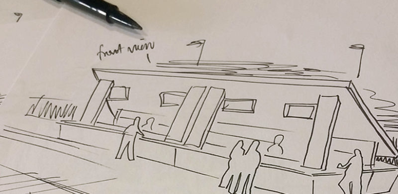
Well, when it comes to outdoor music venues in LA, THIS was our season (read about the Hollywood Bowl just a few swipes down). This time on the side of SMG and Premier with a monolithic bar concept as our Trojan horse. And it worked. The Greek really holds a special place in our hearts; where the Hollywood Bowl captures an elevated cultural evening of performance and food and wine pairing, The Greek has the soul of a club venue in a gorgeous setting; hip-flasks and hard-rock (harder rock at least…and then there’s Josh Groban).
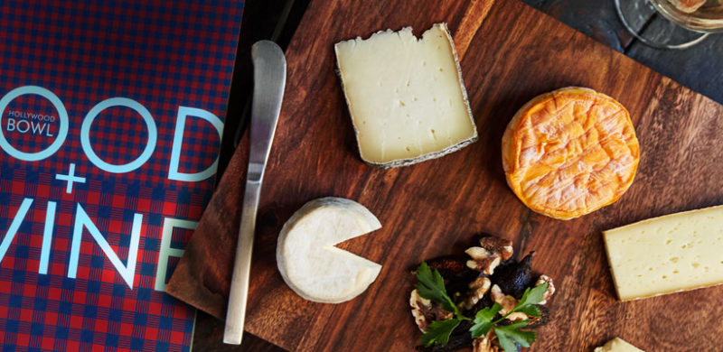
There are two evening activities in Los Angeles we recommend to visitors. Go to The Hollywood Bowl and go to The Edison (hey, we did that brand too!). Though the Edison is cool for the aesthetic and absinthe, going to The Bowl is just one of those quintessential L.A. experiences that combines the best in food, music, atmosphere and summer-SoCal outdoor lifestyle. And you can bring your own absinthe! (Update: Guess you can’t bring liquor in, just beer and wine. Anyway, bringing absinthe into a venue is both a reckless decision for your liver, the people around you, and you can’t even do the cool pour-over the sugar-cube spoony thing).
We see tourists in Los Angeles year round, but our favorite time to host friends and family is fall, when temperatures dip into the low 70s, afternoons are sunny and crisp, and the season brings festive touches to all our local haunts – pumpkins at coffee shop doors, gourds aplenty at the farmers markets…we finally feel ready to hit the town instead of being holed up in AC with our blackout curtains up. With the outdoor temperature on-point for frolicking around in a scarf with hot coffee, here are six places you must visit in LA this fall.
We find inspiration all over – in billboards we see on the way to the office, in nature on our weekend hikes, in the grocery store on unique packaging (ok, ok, booze bottles). But obviously the source of most of our inspiration is online – from Pinterest to Tumblr to traditional blogs, we crave creativity from every corner of the web. So, we had two of our designers round up some of their favorite sites to they go to to help get their creative juices flowing. Continue Reading…
There are many old and tired brands out there that fail to realize the value of good branding and that their lack there of may be a reason for their shortcomings as a business. As a marketing and branding agency, we’ve created a handy (albeit snarky) infographic to determine whether your brand is fit as a fiddle, needs a check up, or is in dire need of an ambulance.

Share Image
Ever wanted to take a short trip back to the 1970s, but without the avocado-hued appliances, shag carpet and other assorted “missteps” of the decade? We’ve got you covered. Just cruise up the 101 into North Hollywood and find yourself in the idyllic setting of The Garland. Stylish, modern, yet thoroughly nostalgic, it’s the best spot in LA to retreat from the chaos, but not get too far-out*. (*puns are very ’70s, the lack of internet access made people desperate for cheesy entertainment) Continue Reading…

The brothers behind Bicos Hospitality came to us to help them create and launch a new concept in Pasadena. They wanted to build a new, laid-back bar that was comfortable & sophisticated in equal measure – a destination for hanging out with friends, meeting a colleague for a drink, or taking a date. We were anxious to rise to the challenge and give new life to a 100 year old house. Check out the whole process below. We started with a name, then colors, logos, a story, hand-sketched elements, and Magnolia House was born.


Once we had the brand nailed down, we came up with ways to translate the heart of the house into every aspect of the experience. We designed the menus to feel like a library book, substantial and fabric covered and more inviting than the expected vinyl. The signage was given a similarly understated yet impactful treatment, and we also put together fun collateral pieces that harken back to an old-school pub vibe and blended seamlessly with the ambiance of the interior and the space’s history. The final products are shown here (along with the website, which we also designed).


And here’s a little of Magnolia House’s well-earned buzz:
