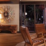
The brothers behind Bicos Hospitality came to us to help them create and launch a new concept in Pasadena. They wanted to build a new, laid-back bar that was comfortable & sophisticated in equal measure – a destination for hanging out with friends, meeting a colleague for a drink, or taking a date. We were anxious to rise to the challenge and give new life to a 100 year old house. Check out the whole process below. We started with a name, then colors, logos, a story, hand-sketched elements, and Magnolia House was born.


Once we had the brand nailed down, we came up with ways to translate the heart of the house into every aspect of the experience. We designed the menus to feel like a library book, substantial and fabric covered and more inviting than the expected vinyl. The signage was given a similarly understated yet impactful treatment, and we also put together fun collateral pieces that harken back to an old-school pub vibe and blended seamlessly with the ambiance of the interior and the space’s history. The final products are shown here (along with the website, which we also designed).


And here’s a little of Magnolia House’s well-earned buzz:


