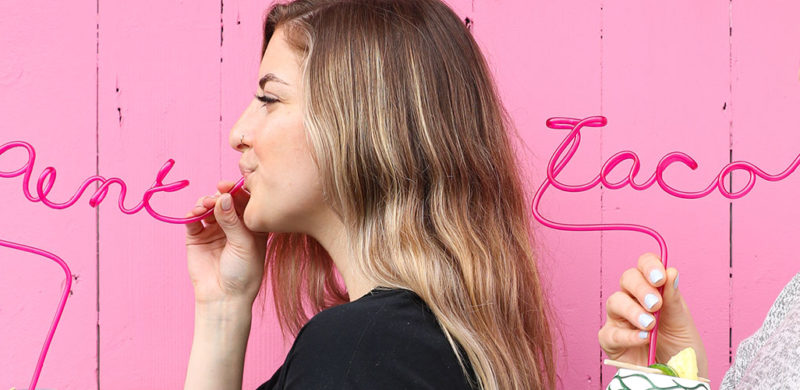
Pink Taco. I’ll give you a second to get your snickers and eye-rolls out of the way. Good? Great.
To clarify, Pink Taco is named after their signature achiote-marinated chicken taco topped with fluorescent pink habanero-pickled onions. So we don’t know what that initial fuss was about. Grow up.
We love a brand that has a clear attitude right in the name. You know the exact kind of experience you’re getting. Even better when that identity is brazen and irreverent. Taking on their social media marketing was right in our wheelhouse.
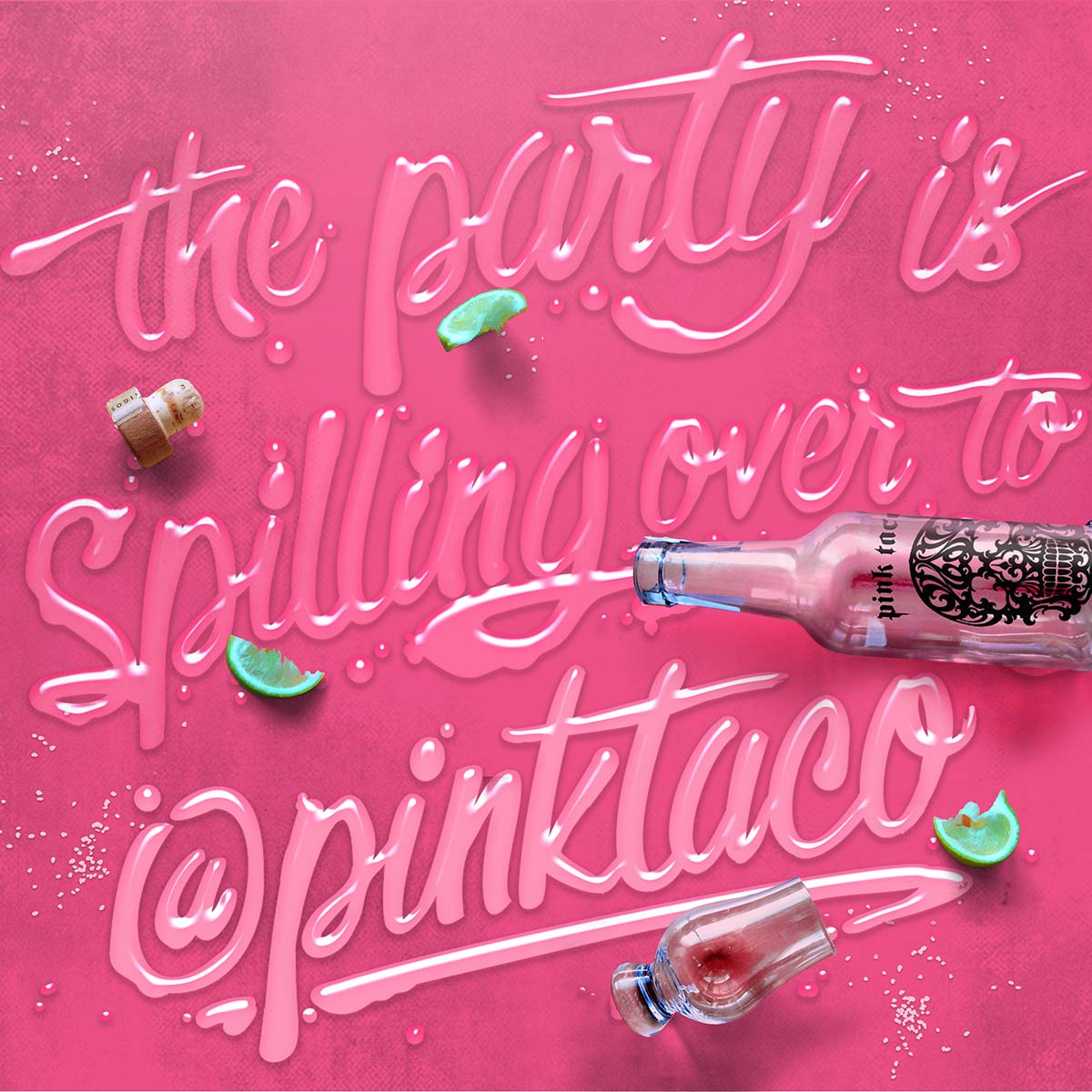
Pink Taco is all about the party, so kicking off 2020 with a new location right in the raging heart of Miami Beach makes perfect sense. Especially with Snoop Dogg officiating the opening. On social media, we’ve turned their brand into a bender of feasting, boozing, skulls, and unsolicited pink taco pics.
Well, they were kinda solicited, because they’re exactly what the client and social audiences asked for.


Hey 2020,
Now to the trends!
1. Extra Reality
2. Power Distribution
3. Reward the talent
4. More than just “like”
5. Return to nature
6. Embrace Individualism
Oh yeah, that environment we mentioned, well, it’s becoming even more personal. We are further able to adapt our surroundings and services to our individual needs creating purposeful interactions that are designed to suit us best.
Start Here: Why You Deserve a Brand Session
Jump in with both feet. Just keep swimming. Ready. Aim. Fire.
We’re all for moving fast and being decisive, but there’s something to be said for starting at the beginning. When creating a new business, or trying to change the direction of an existing one, it can feel like you spend all of your time talking about it. And you probably are, but are you talking about the right things?
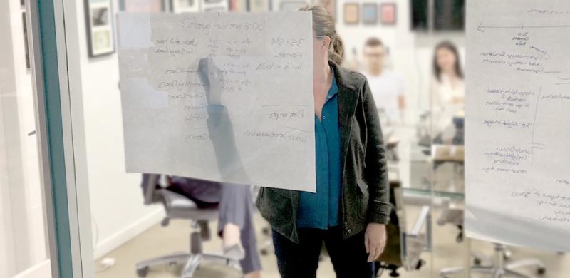
Even if you spend every hour of the day talking about your new business, it’s important to stop, take a breath, gather the team around the table, and have a real conversation about what you’re building. Not about which sconces should go in the dining room or whether you can afford that really cool oven, but about the guiding principles of your brand.
We know that sounds heady and intangible, but it’s actually very practical. A brand session is critical to bringing your team into alignment on the big picture—it defines your true north. You may have a perfect, complete vision of your new business, but if it only lives inside your head, it’s almost impossible to transform that vision into reality. If everyone on the team has a slightly different vision of the goal, you run the risk of ending up with a mish-mash of a brand.
We kick off every branding project with a brand session for one simple reason: to define the brand in a way that brings everyone together on the same path.
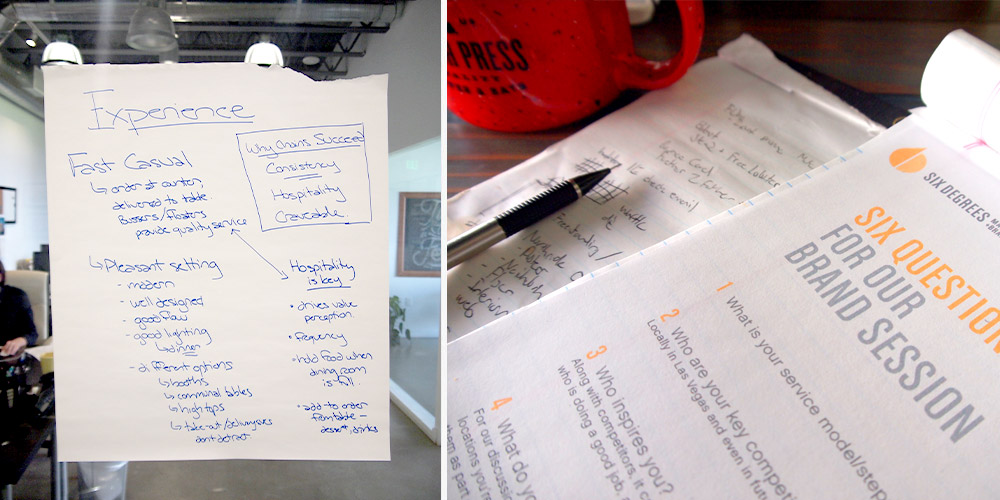
The session itself is what’s really important; a guided conversation that explores the most critical aspects of your new business. We’ll dig into the areas that are key to your success, things like: the values that are the foundation of your brand, where your concept falls within the bigger market, and the things that make you stand out from your competition.
We customize each session, based on each client’s needs, but what remains the same is the results. Not only do you walk out of the room immediately after the session with a better understanding of your own brand, but but we wrap things up with a brand summary report, ready to be shared with potential investors and landlords, and incorporated into training materials.
Bottom line? It’s time to start at the beginning and build a strong foundation for your brand. Then, you can get that cool oven.
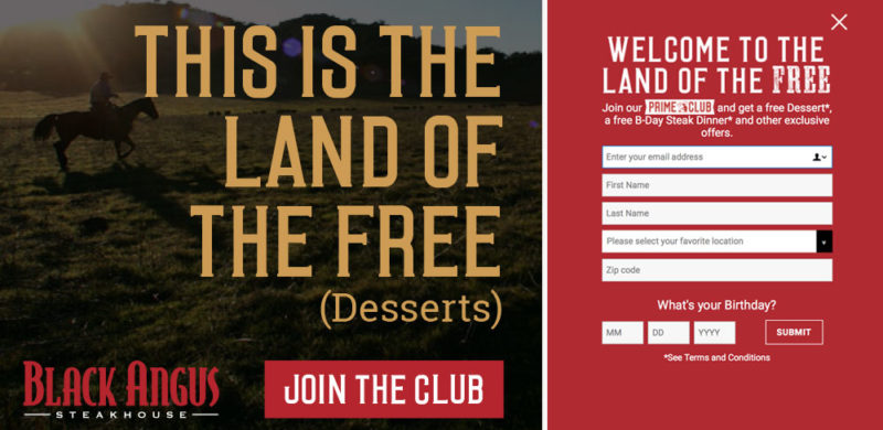
Pop the champagne and toss some confetti! We’re celebrating a huge milestone with our friends at Black Angus Steakhouse – one million subscribers to their email Prime Club. That’s nearly double the number from when we updated their branding a little over three years ago. We found the sweet spot of success by connecting with Black Angus loyalists about promotions, celebrations, and a consistent flow of news about what’s going on at each of their 45 locations.
Over 200,000 members signed up in the past year, after we launched a brand new Black Angus website. When you have 50 years of steak-making history, it can be a challenge to bring your guests into the digital age with you, but we’ve proven that email is an effective way to connect restaurant guests. We see up to a 17% increase in sales in the day following a key email blast!
Our homepage redesign focused on putting the Prime Club front and center for our daily visitors and making the sign-up process simple. We designed a pop-up that was to the point – sign up for the Prime Club and receive free goodies, mainly a free birthday steak dinner. (Of course, with a sign-up offer that good, we’d be remiss if we didn’t also mention that in-store sign ups are also going strong.) It’s a bold offering, and one that many marketers would tell you would lead to a low-quality list, but the results say otherwise. Not only do the sales jump after each blast, but the list has low attrition and strong engagement.
To keep up the momentum, we completely revamped the design of the emails, staying on-brand with direct messaging but with a fresh photography style and bold graphic elements. We diversified our promotions, from traditional coupons and LTOs to celebrating National Hamburger Day and highlighting our newest cocktails. We successfully expanded our appeal from the everyday Black Angus diner to include a newer and younger audience (you know, that elusive millennial everyone’s fighting over).
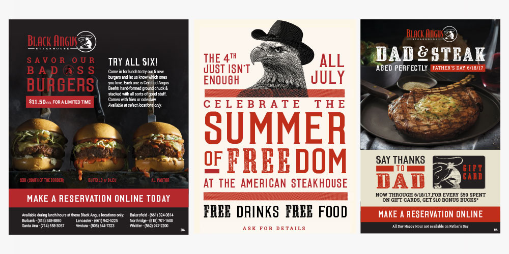
At a time when there are so many avenues for digital marketing, we’re thrilled we’ve found success for Black Angus with organic branded content that actually inspires people to go out for dinner (or lunch, or drinks…). So cheers to steak & success – and here’s to another million members.
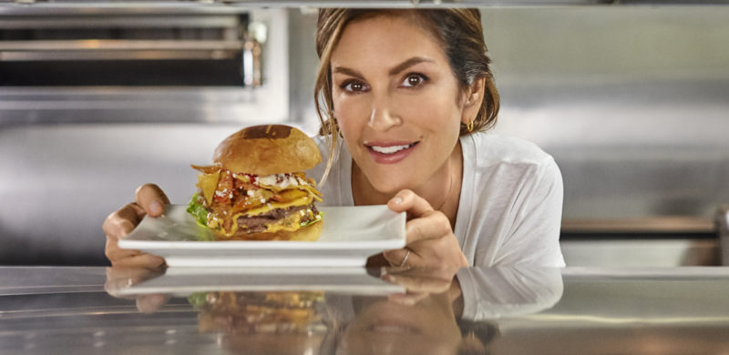
Some of us are of an age where we still harbor a (tiny) crush on our first supermodel. We may be all grown-up now, but Cindy Crawford gives us a little flutter in our hearts and reminds us of a time when the world was filled with possibility, and we could go anywhere and become anyone, as long as we wore our Calvins, with a cold Pepsi at hand.
Continue Reading…
by Amanda, Marketing & Strategy
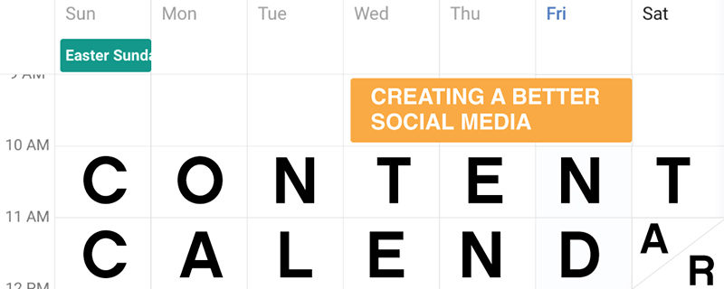
This year, we’ve had several clients in need of social media strategy, and inevitably, content calendars, as part of their restaurant marketing package. So, we thought it was time to fine-tune our own content calendar template.
by Josh, Creative & Design
Millennials, millennials, those damn millennials. Just the mention quickly diverges into a fist-shaking critique of their work habits, emotional sensitivity, and their cyborgian connection to social media. Well, we’re not here to jump on that conversation. We like millennials. In fact, with nearly $1.3 trillion in purchasing power and almost 50% of their food expenses coming from dining out, we LOVE millennials. Gen Z on the other hand, geez it’s like they are a bunch of socially conscious, risk-averse babies. Basically, the younger generation will never be as hard-working/enlightened/pleasant-smelling/athletic or as awesome as our generation, says EVERY GENERATION EVER. Continue Reading…
by Jennie, Operations & Marketing
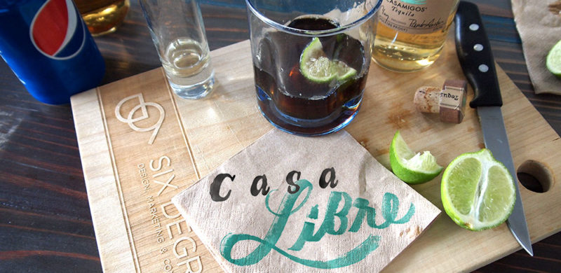
One of the first things people notice when they’re in our office (besides the never-ending construction on Wilshire) is the full bar in our conference room. What can we say except every office should be set up for success with a multitude of spirits at the ready. We even recently found (and promptly purchased) perfect glasses for our weekly sipping.
by Amanda, Marketing & Strategy
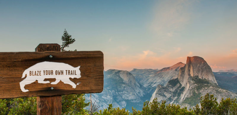
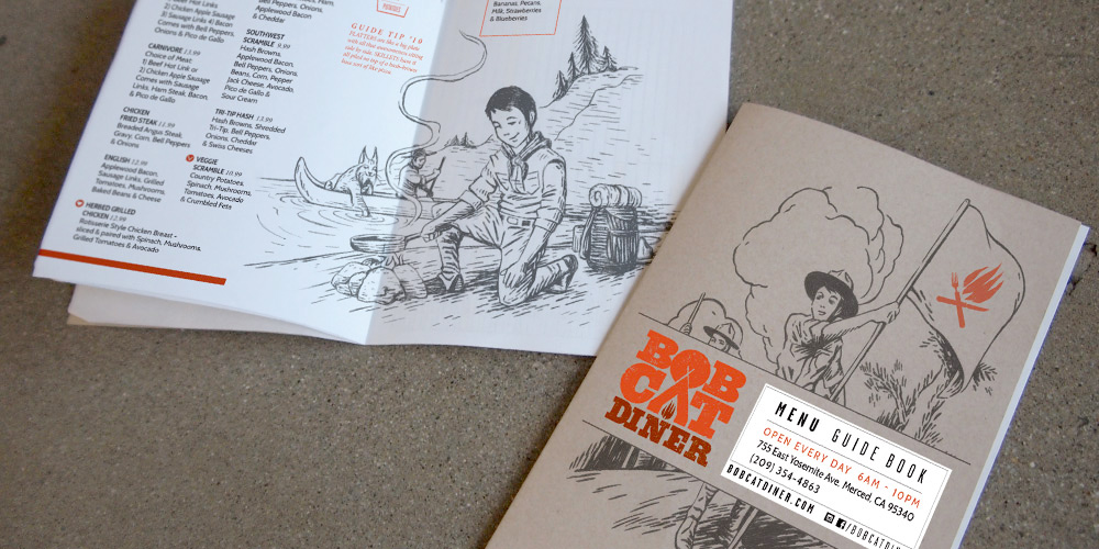
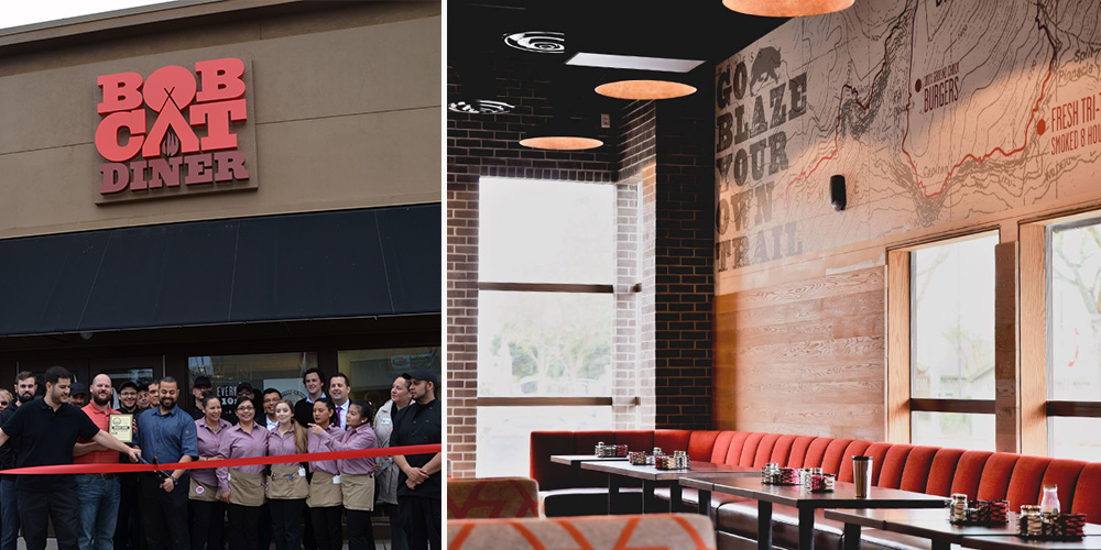
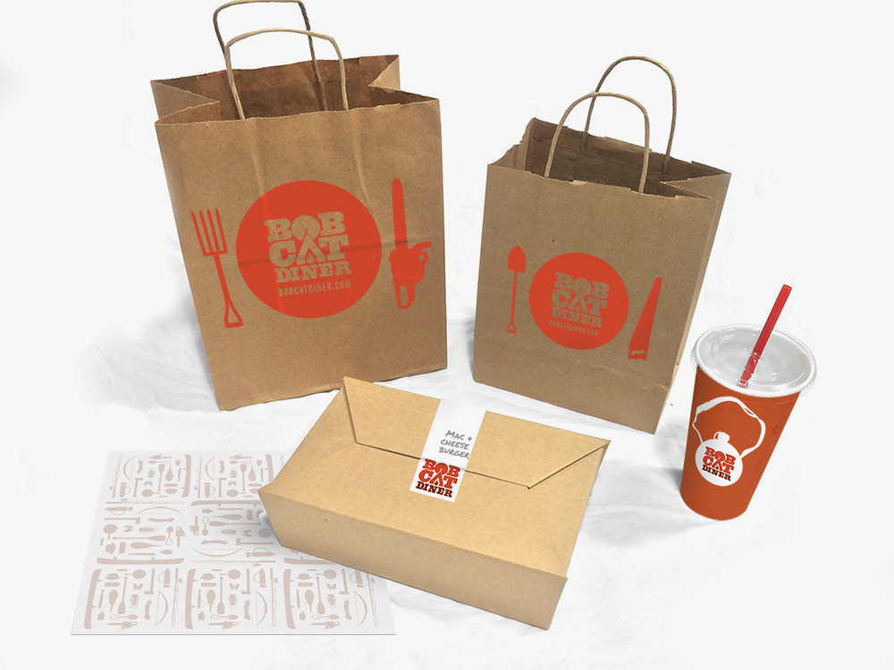
Recently, we had the chance to break out of our delicious Los Angeles foodie bubble and take a trip to the gateway of Yosemite: Merced, California. We created the brand identity for Bobcat Diner, a new restaurant concept with ambitious plans for growth. With the location and expansion plans in mind, we took inspiration from the iconic graphics of the National and State Parks to create a design that would resonate with the local Merced community, and work just as well in new locations across the country. We didn’t take it too seriously, though, with a tongue-in-cheek approach to the outdoors tucked away within the copy.
We were lucky to be brought in at the very beginning of construction, so you’ll find our graphic design work in the campfire logo, oversized trail maps on the walls (providing helpful directions to lunch and dinner over the mountainous milkshakes), and the guide to Bobcat Guide merit badges. The menus serve as a Guide Book, filled with hand-drawn illustrations for our Bobcat Guide Tips to accompany the menu of diner mainstays including breakfast skillets, burgers and sandwiches.
Once the design was complete and construction underway, our marketing team took over the restaurant’s pre-opening social media, bringing the brand’s outdoorsy voice to life and building anticipation for the opening. When California’s unexpected rain caused construction delays, we tackled the challenge of keeping interest high as the opening day changed, and changed again. When the grand opening finally arrived, we were there to capture the excitement before handing the social reins back to to the restaurant team.
All in all, we enjoyed our excursion into the wilds of Central California, and like the restaurant, we try to be true to the Bobcat Oath, even back here in Los Angeles.
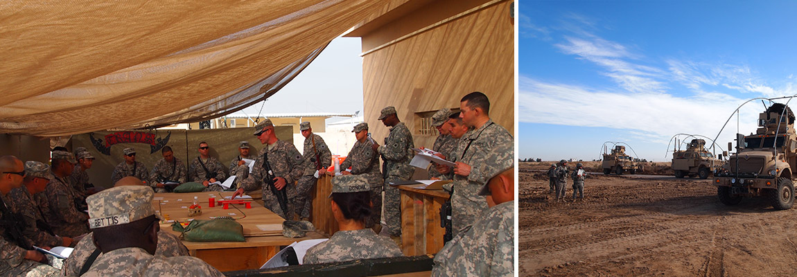
We’re crouched in a roadside ditch about 25km north of Baghdad. Securing my M4 to my dust-caked shoulder harness, I reached deep under my heavy chest armor to pull out a small water-proof notebook. It’s time to give a Creative Brief. Okay okay, there really isn’t anything creative about it and it’s actually called an Operations Order. But the purpose is the same: deliver essential information effectively to your troops so they’re clear on the mission and everyone – down to the lowest rank – knows how to accomplish the objective. You know, in case something happens like your comms drop out in a blinding 120+ degrees sandstorm, or your Creative Director had to attend an unexpected site-visit at the new Firestone Brewery (I’m just giving you a heads up that’s going to happen) at 11 a.m. on a Tuesday.
There isn’t much of my military past that I can apply to my creative present, but the Operations Order is one of them. Sometimes you have weeks to prepare building a miniature movie set that would make Lucas swoon, and sometimes you’re crouching in a ditch in Iraq scratching in the sand with sticks.
In it’s simplest format, it is quick and direct – it cuts to the essentials. That lack of focus is the bane of most Creative Briefs; long biblical doctrines of bullshit that turn over every stone to include the anecdote about the CFOs nephew who burped up a yellow marble at Easter and hence inspired their spherical logo design. Sure, sure – there’s good stuff in there – but in the bulk of it the momentum and direction gets lost. Leaving the team bewildered and thinking only about joining their CD on mid-day brewery tours. And frankly, I don’t have time to write that shit, so it never gets done.
And so, in a wonderful blending of militant urgency and creative need, the Brief Creative Brief was born.
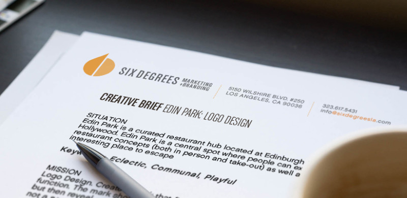
Following the format of the Army’s Operation Order this simple 5-paragraph (mmm…maybe more like keywords and sentence fragments) format gets to the project-specific goods without all the thirst inducing clutter. If it’s more than a page, you’re doing it wrong.
Here we go:
SITUATION: Recon. This isn’t a snapshot of your Wikipedia page, but the reasoning and background that has gotten the client to the point of doing this project. It’s also good to give a few keywords that describes the current state of the client.
MISSION: Objective. What are we trying to accomplish? Is it changing the perception of the client from those keywords we addressed above? Get butts in seats. We need to be as clear as possible, and highlight the main goals of the project in order to create. Again, highlight keywords. If in fact that sandstorm whips through our agency, our personnel need to know the direction we’re headed.
TARGET: Well…it’s the target. These are our demographics. Who do we want to engage with the this project? Who is the audience? It’s also important to quickly explain the current demo if we are looking to shift that focus.
EXECUTION: Deliverables. Often there will be an over-arching not-so-brief Creative Brief for larger campaigns. This brief is a breakdown of those individual parts so we have a measurable approach in accomplishable steps.
SCHEDULE: Oh yes, the deadlines. It’s important to set smaller, accomplishable goals and checkpoints to make sure the big drop-dead date is met and the creative on track.
We see tourists in Los Angeles year round, but our favorite time to host friends and family is fall, when temperatures dip into the low 70s, afternoons are sunny and crisp, and the season brings festive touches to all our local haunts – pumpkins at coffee shop doors, gourds aplenty at the farmers markets…we finally feel ready to hit the town instead of being holed up in AC with our blackout curtains up. With the outdoor temperature on-point for frolicking around in a scarf with hot coffee, here are six places you must visit in LA this fall.
There are many old and tired brands out there that fail to realize the value of good branding and that their lack there of may be a reason for their shortcomings as a business. As a marketing and branding agency, we’ve created a handy (albeit snarky) infographic to determine whether your brand is fit as a fiddle, needs a check up, or is in dire need of an ambulance.

