There’s a not-so-new bakery brand in Los Angeles. You’ve definitely had Cadoro’s bread – whether stacked with avocado at La La Land Kind Cafe or loaded with fillings at Fat Sal’s. You might have met the owners at the Santa Monica Farmer’s Market, or picked up their loaves at your neighborhood Bristol Farms. But until now, you haven’t seen what the masters of baking do when given the chance to create the whole culinary experience. They’re now making sandwiches, toasts and dips of their own for the new Cadoro Cafe.
Taking an established B2B business and creating a whole new bakery brand that spoke to consumers was our mission in this project – capturing the intrigue of a bakery’s own cafe and converting it into a craving for breakfast sandwiches strong enough to draw people to a quiet corner of Inglewood.
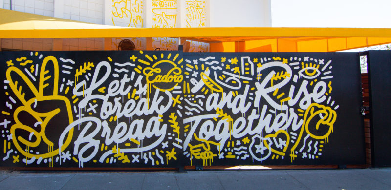
We strategically created this bakery brand extension from start to finish; starting with the oversized sliding gate turned billboard. Taking inspiration from the Inglewood neighborhood that has been home to Cadoro for twenty years, we loaded it with bold, bright graphics that meld street art, pop art and, of course, bread. It’s familiar, but reimagined, and started building anticipation for the cafe from the first stroke of paint. (Shout-out to Hattas for taking our design to reality.)
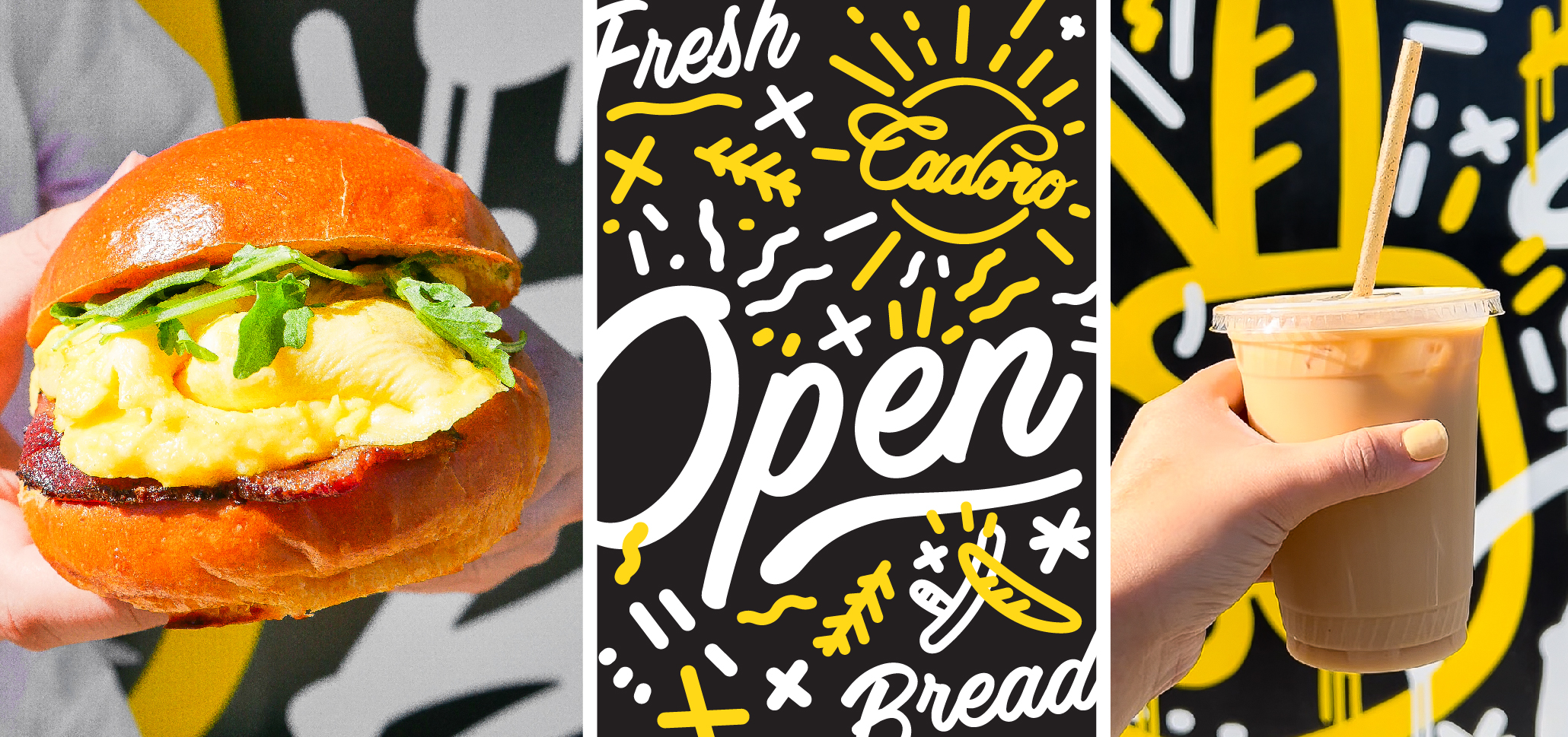
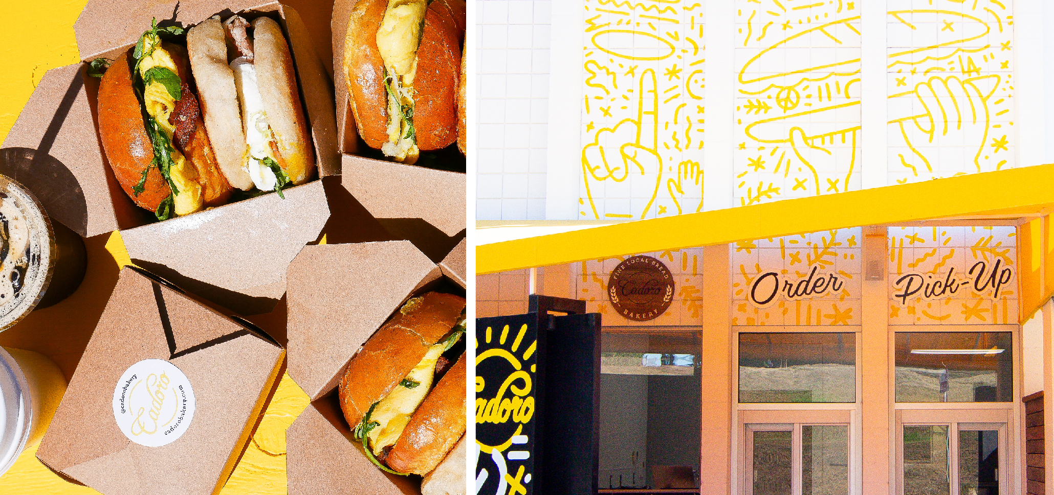
From the gate, the new bakery brand extends to every guest touchpoint. Our graphics climb the walls to create even more neighborhood visibility, make their mark on menus and packaging, and spread to the digital platforms. Our social photography is as bright as the branding – showing the food you want, mouth-watering, over-the-top and on-the-go.
The bold, iconic graphics of Cadoro’s new bakery brand create a unified experience for guests. From the first glimpse of the gate that tells you you’re in the right place to the moment you post a photo of your sandwich on social, the bright designs are a constant, friendly companion. It’s a bold new mark on Cadoro’s long-time neighborhood.
Let’s be honest – you can get a good taco anywhere, and we love living in a world with a taco truck on every corner. But there’s a big difference between leaning over a well-sauced taco in a parking lot and the vacation-in-a-single-meal experience that you can get at Sol Cocina.
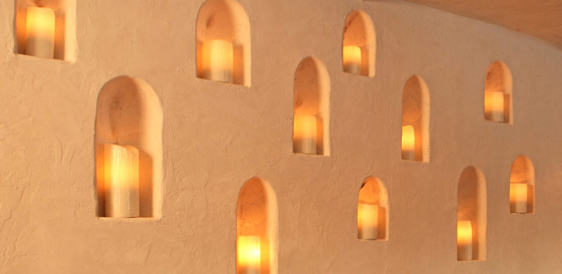
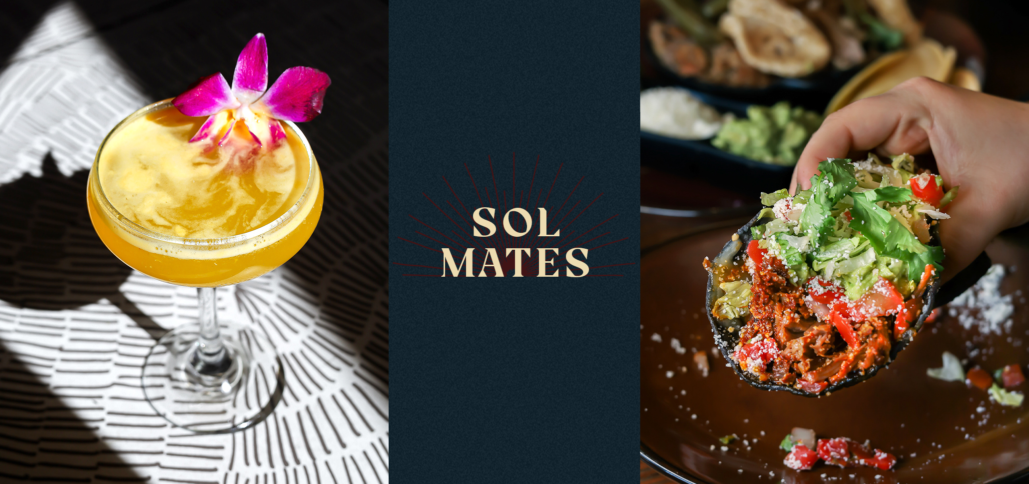
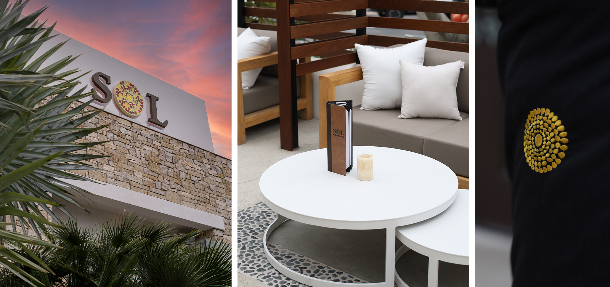
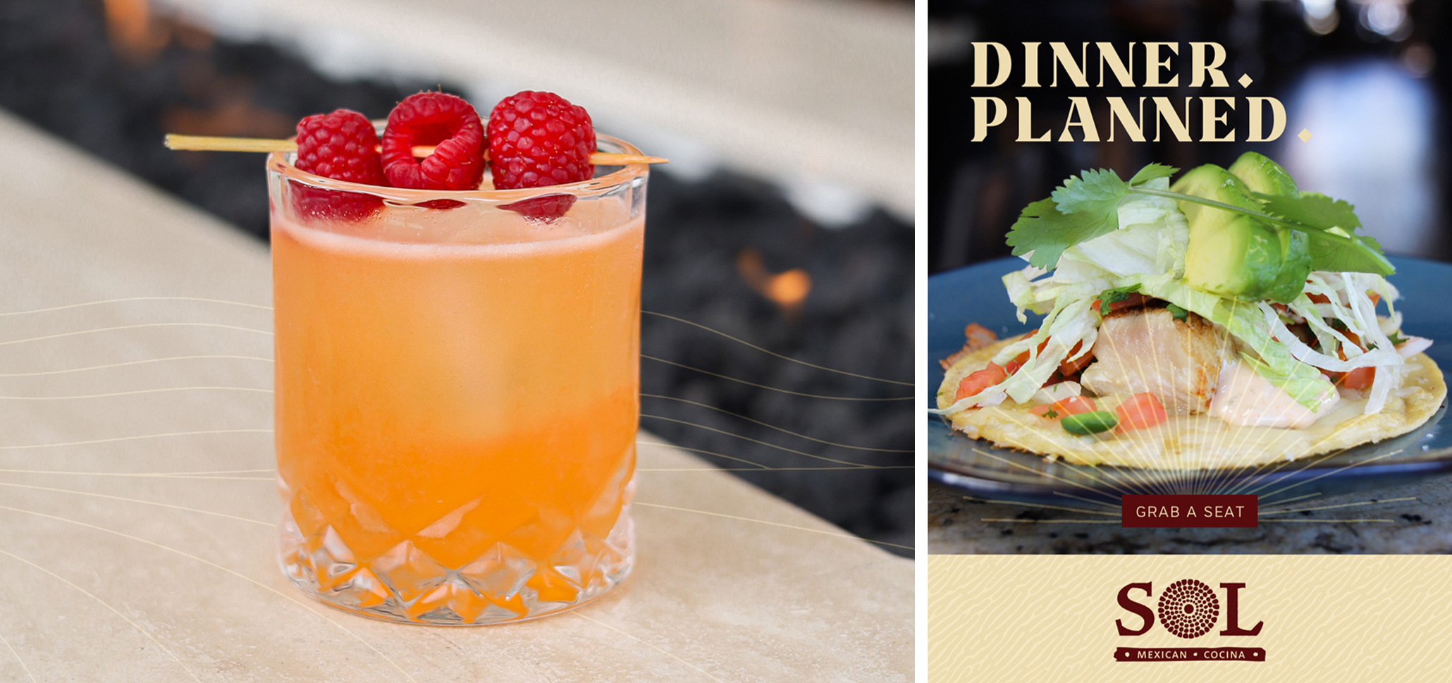
Everyone needs an escape these days, and we did a restaurant rebrand for Xperience Restaurant Group’s growing mini-chain Sol Cocina with that in mind. After a strategic brand session with their team, we captured the effortless elegance of a high-end Baja resort, no passport required. At the heart of our rebrand: the interplay of shadow and light at the Baja coast. The shadowed places created by bright sunlight, the golden glow of flickering firelight, and the way day-drinking blends seamlessly into dinner when you’re on vacation.
Our restaurant rebrand transformed Sol into a place to see and be seen; a place to shine. Hand-drawn icons, glamorous photography, and intricate typography capture the immersive restaurant experience, and now Sol has a story to tell.
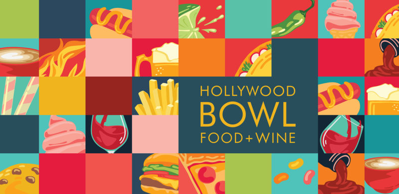
The Hollywood Bowl celebrates its 100th anniversary this year, and LA’s favorite summer destination has never looked better, thanks to fresh new branding for the Food & Wine program.
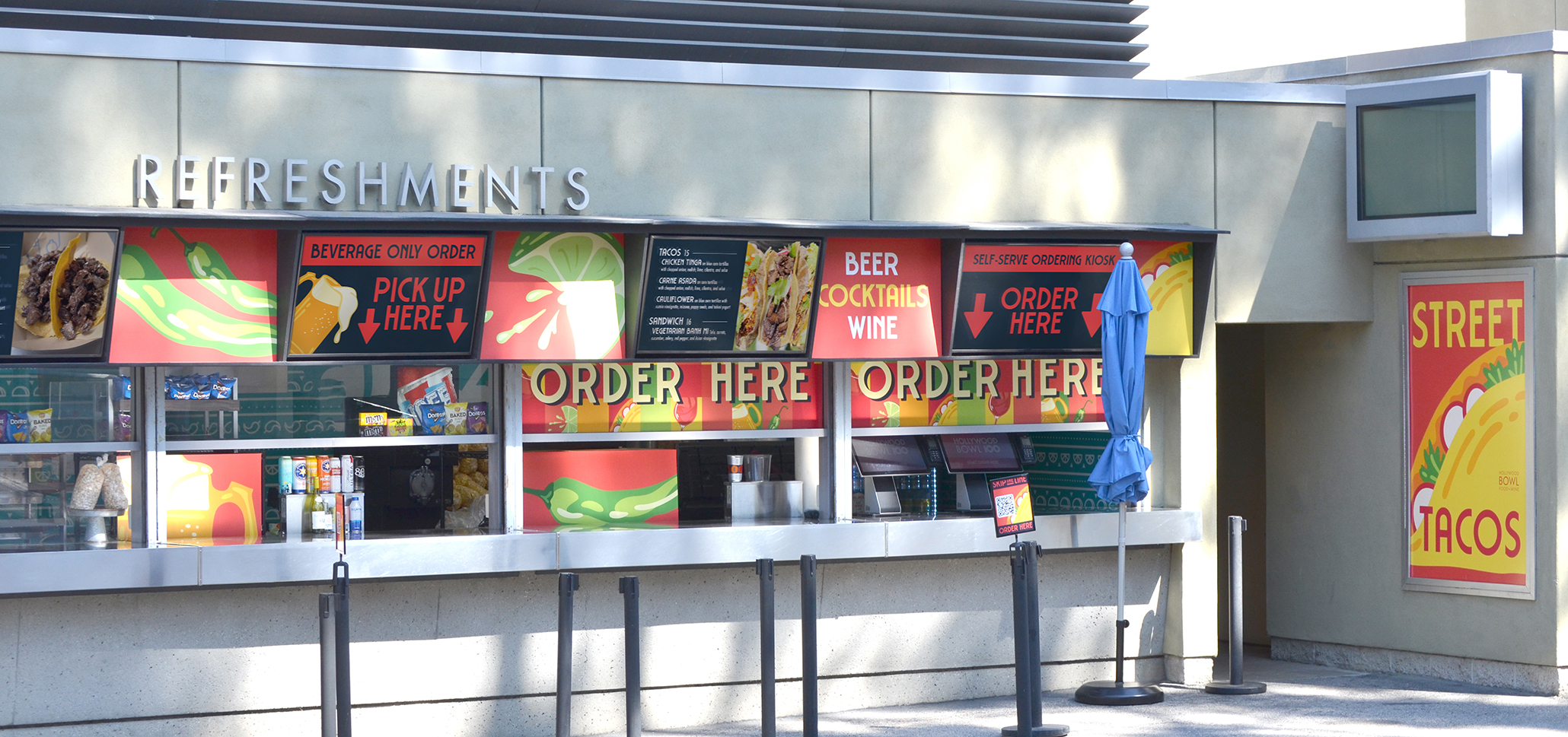
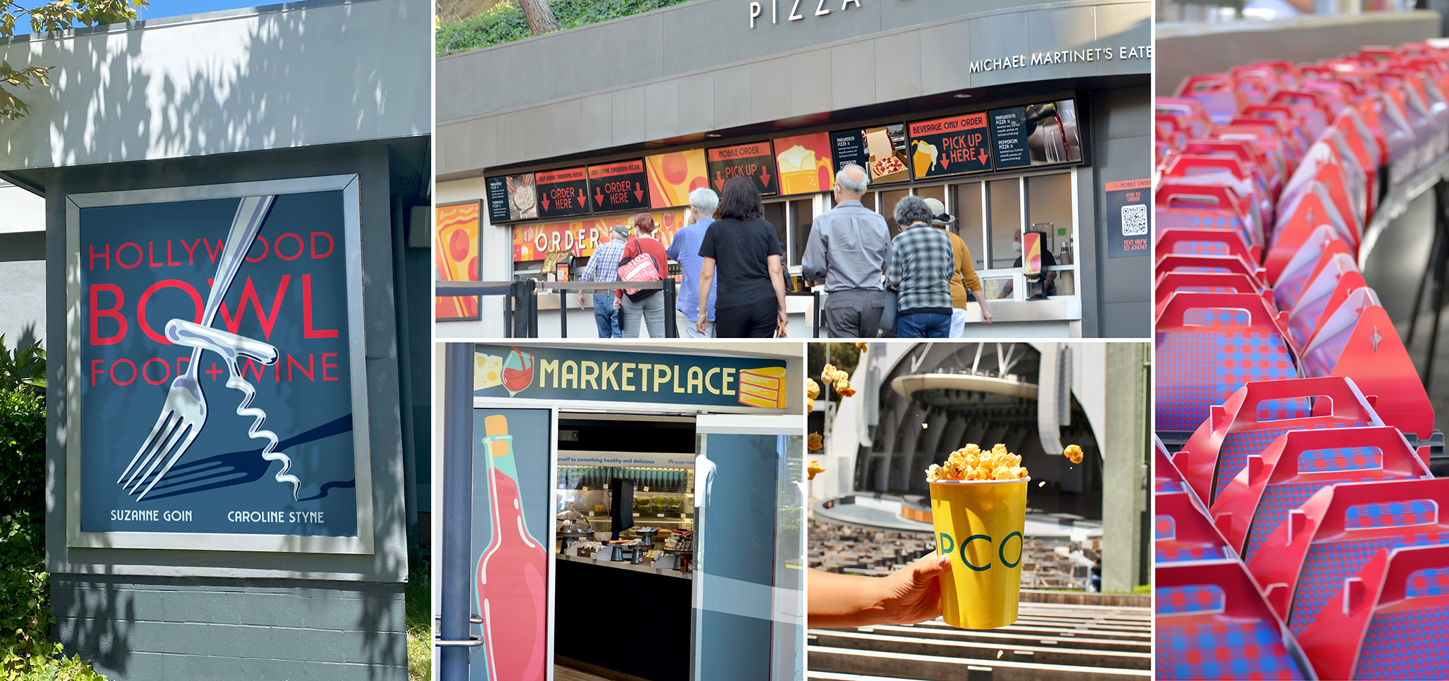
Five years after Carolyn Styne and Suzanne Goin took the helm of the Bowl’s extensive food, wine and concessions program in partnership with Sodexo, it was time for an update. We were brought on to reimagine the look of the food and beverage program. From wayfinding signage down to the fine details like napkin dispensers, we created a unified visual identity for the program that allowed each of the locations shine.
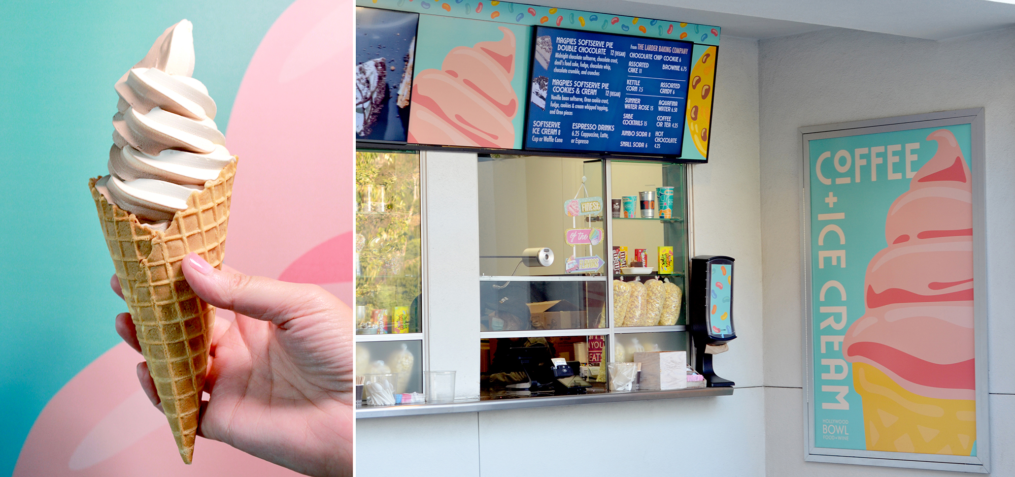
Appropriately for the 100th anniversary, we created a brand that is bright, joyous and celebratory. Simple illustrations have a vintage feel, evoking iconic WPA posters of the last century, but the close-up cropping and vibrant colors modernize the designs. A broad color palette works together, while allowing enough range to complement everything from pizza to ice cream.
We created a unique design for each concession stand, within the overall property branding. Large hero posters, menu board graphics, ordering kiosks, and equipment overlays all share a bold color palette and key graphics to bring them together.
Of course, at a venue as big as the Bowl, there’s always another branding project to do, so we’ve also been shooting video, taking photos and editing Reels, and we’ll be creating new signage throughout the season.
Happy Birthday Hollywood Bowl, hope you like the cake!
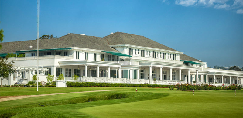
This past weekend, the 46th Walker Cup returned to California for the first time in 35 years, teeing off at the Los Angeles Country Club. The legendary golf match is a biennial team competition that pits USA against Great Britain and Ireland— three countries that sure do love a good lawn mower. The Match is held over two days as 20 amateur players vie for the team title and national pride.
The impressive grounds of Los Angeles Country Club North demanded an impressive and refined dining experience for fans and participants alike. Wolfgang Puck Catering won the dining contract with a strong proposal last year. Can you guess which LA marketing agency helped them with it? Yep, Six Degrees LA at your service. As the event drew near, we joined the marketing team to make sure the signage and print elements were also up to par.
We don’t want to brag, but we’ve had plenty of experience in both special event branding and venue branding.
Our design sensibility led us to create clean graphics for each of the food stands; the menus were packed with flavor synonymous with California and Wolfgang Puck, including wood-fired pizza, street food, and farmers market staples that showcased LA’s rich cultural core to the rest of the world. Our work kept things simple and straightforward so attendees could get back to the action on the fairway.
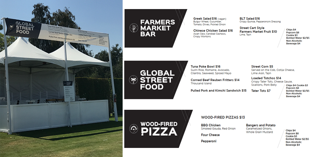
The trick for big events is understanding the flow of space and the variations of deliverables needed to fit it. Experience teaches you how each piece fits together, in order to drive the customer towards the product. The job of a restaurant marketing agency like us is to take the list of food offerings from Wolfgang Puck and create print-ready materials.
For this event, we created menu boards, menus for tent posts, and a brochure dining guide that helped people find food options on site. Our font choices and unique icons reflected the local, fresh energy and helped the food experience at the Walker Cup feel very SoCal— even with the sound of posh accents all around.
The weekend wrapped up with a resounding win for Team USA, bolstered by efforts from several California players, including a La Cañada native. We’d like to think we were part of the victory–maybe catching sight of our menu boards helped them feel right at home.
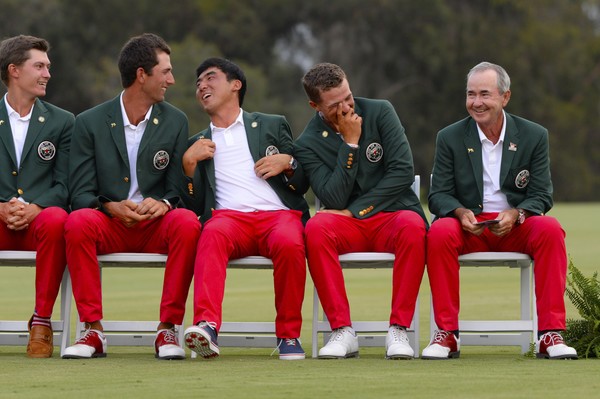 Photo by Harry How
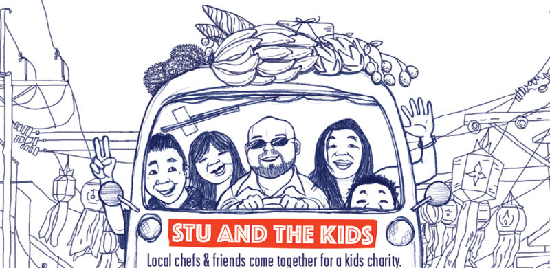
From a brand perspective, “Stu and His Friends Support Stu and the Kids” does not seem to be a great event name. Aside from being very clear that someone name “Stu” is looking for support, it doesn’t provide a lot of clues to either the cause or the event. But, despite the cryptic naming, Stu’s event is one that everyone looks forward to each year and one we’ve been proud to support for a number of years.
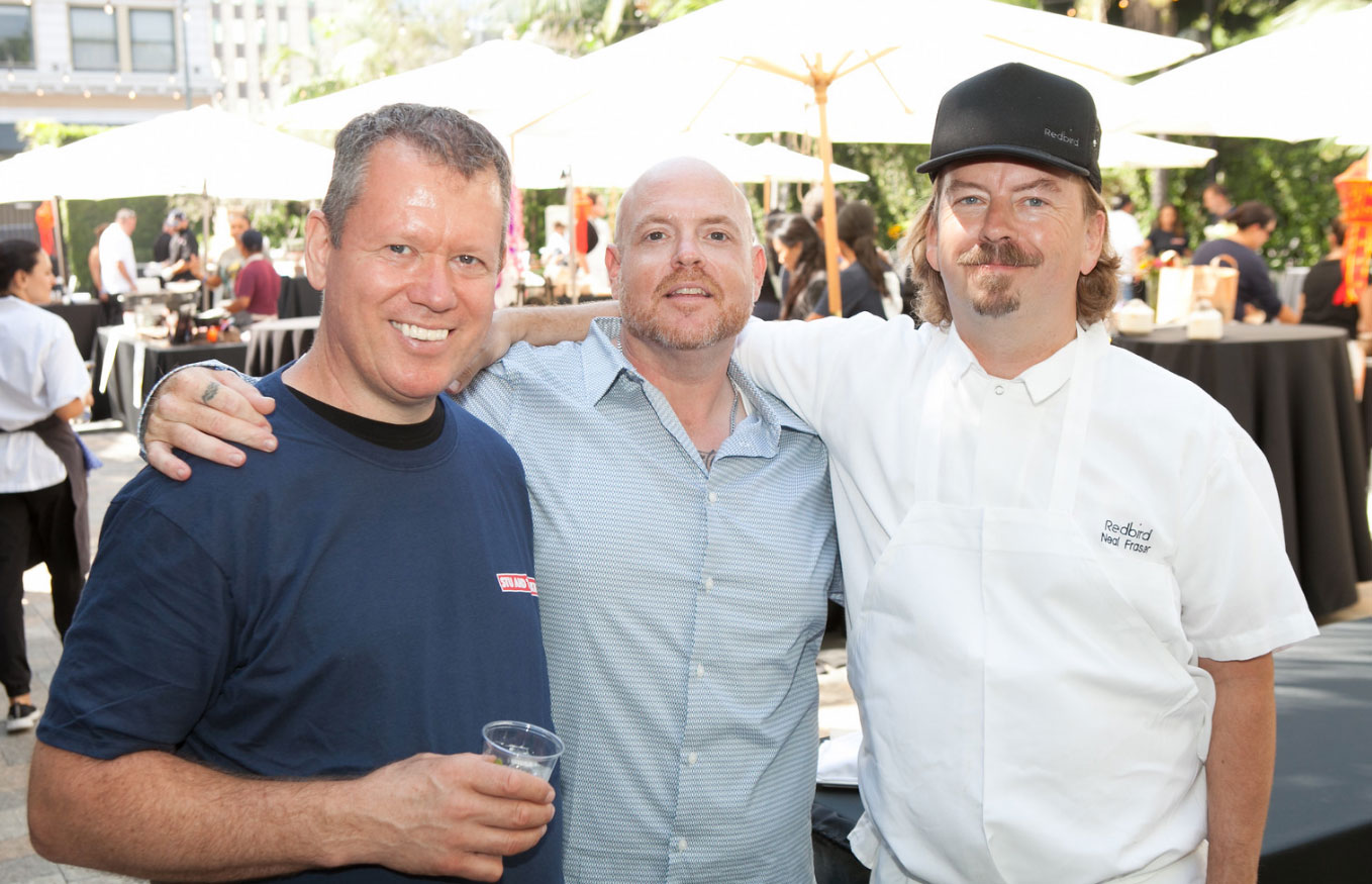
What you need to know is that Stu’s “Friends” are some of Los Angeles’s best chefs, and “the Kids” are underserved and orphaned children from the Hill Tribe in Northern Thailand. Stu is Stuart Skversky, and he’s made it his mission to help these kids; he teaches English and cooking to the younger kids, and raises money to help the older kids get a college education and build themselves a better future.
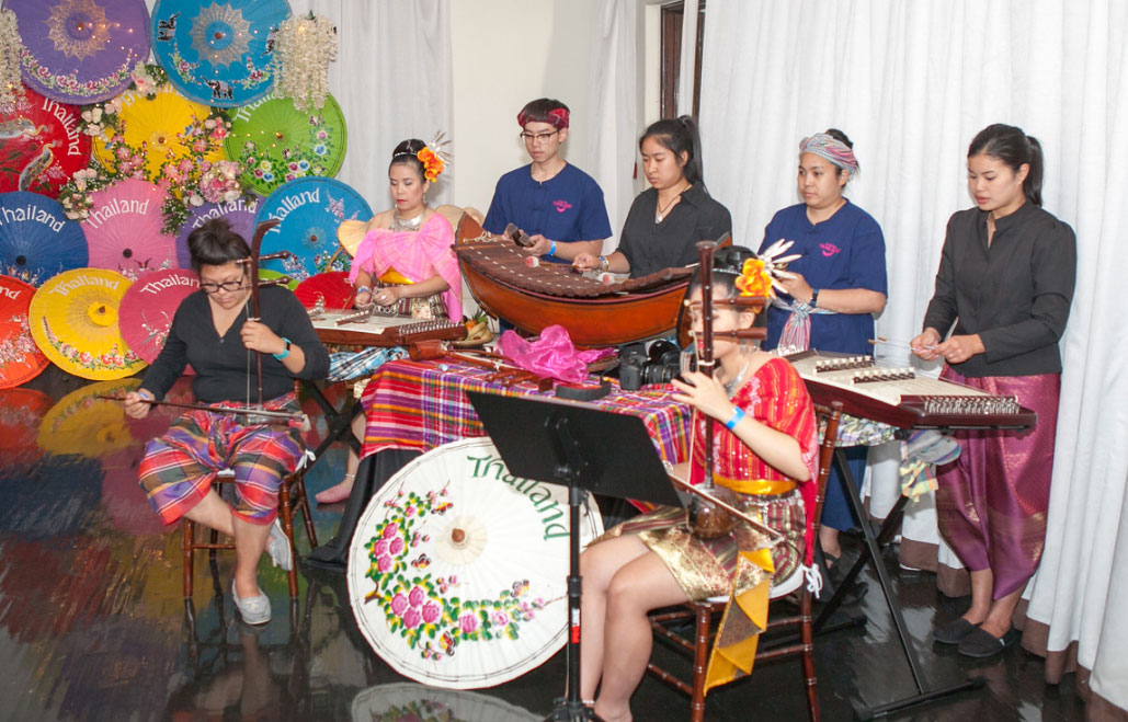
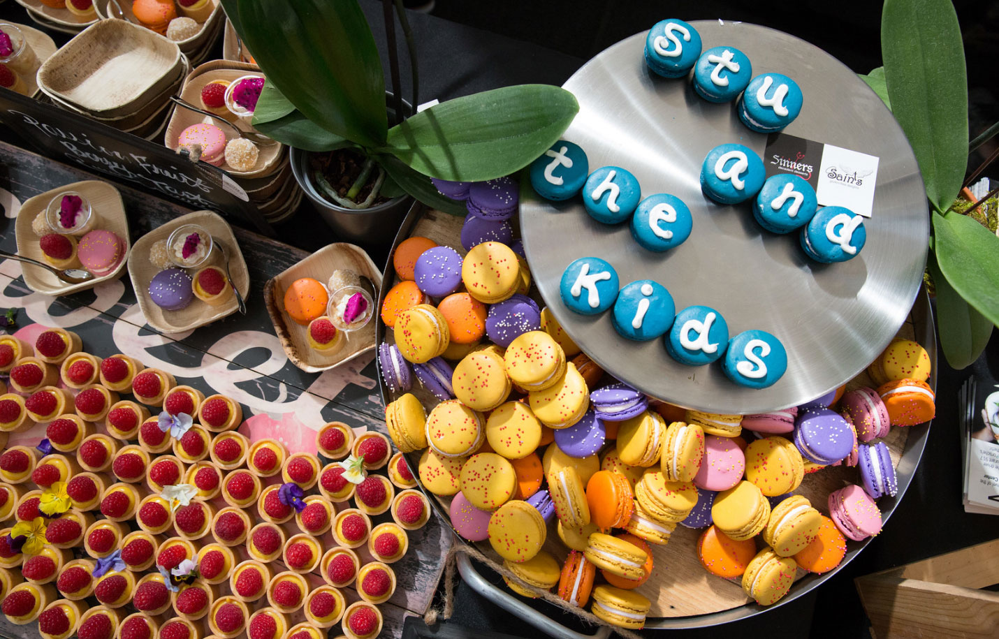
The first fundraiser for Stu and the Kids was held in 2011, and it’s grown tremendously each year. We got involved in 2014, and have helped each year since then. Over the years, we’ve helped with everything from finding a location (OK, it was a parking lot), to making the hand-drawn logo, and, of course, volunteering to take out the trash at the event. This year, we created the event’s signature graphic and event-day signage, and handled Stu’s Facebook advertising and content calendar.
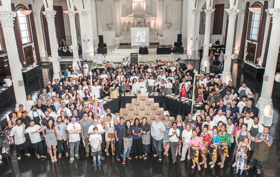
The event has grown so popular that there were plenty of volunteers to take out the trash, so we got to focus on taking pictures of the food as we sampled it, and went live on Facebook for his presentation, from thank-yous to Thai dancers. The past weekend’s fundraiser featured some of LA’s top chefs and restaurants – including Walter Manzke, Neal Fraser, Jason Neroni, Sherry Yard and Ray Garcia – not to mention chefs Jet Tila and Rocco Whalen. We’re honored to be in such talented company and help raise money for Stu and the Kids. See you next year!
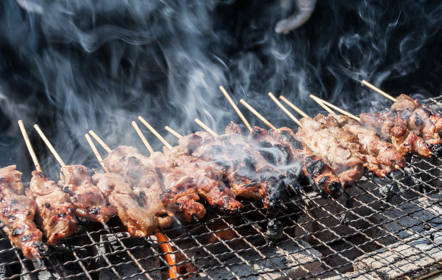
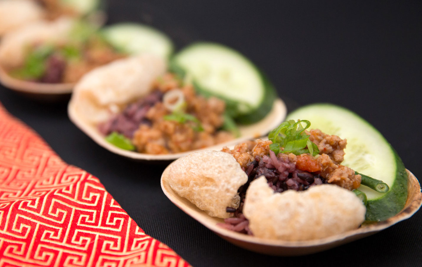
Thanks to Erik Fischer Photography and Victor Vic Photography.
Pop the champagne and toss some confetti! We’re celebrating a huge milestone with our friends at Black Angus Steakhouse – one million subscribers to their email Prime Club. That’s nearly double the number from when we updated their branding a little over three years ago. We found the sweet spot of success by connecting with Black Angus loyalists about promotions, celebrations, and a consistent flow of news about what’s going on at each of their 45 locations.
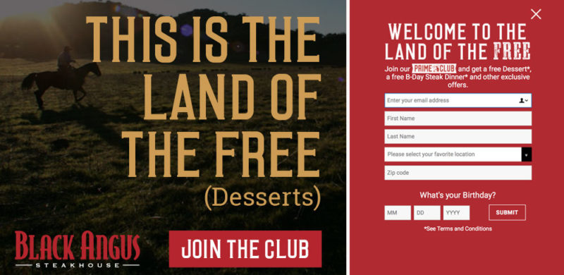
Over 200,000 members signed up in the past year, after we launched a brand new Black Angus website. When you have 50 years of steak-making history, it can be a challenge to bring your guests into the digital age with you, but we’ve proven that email is an effective way to connect restaurant guests. We see up to a 17% increase in sales in the day following a key email blast!
Our homepage redesign focused on putting the Prime Club front and center for our daily visitors and making the sign-up process simple. We designed a pop-up that was to the point – sign up for the Prime Club and receive free goodies, mainly a free birthday steak dinner. (Of course, with a sign-up offer that good, we’d be remiss if we didn’t also mention that in-store sign ups are also going strong.) It’s a bold offering, and one that many marketers would tell you would lead to a low-quality list, but the results say otherwise. Not only do the sales jump after each blast, but the list has low attrition and strong engagement.
To keep up the momentum, we completely revamped the design of the emails, staying on-brand with direct messaging but with a fresh photography style and bold graphic elements. We diversified our promotions, from traditional coupons and LTOs to celebrating National Hamburger Day and highlighting our newest cocktails. We successfully expanded our appeal from the everyday Black Angus diner to include a newer and younger audience (you know, that elusive millennial everyone’s fighting over).
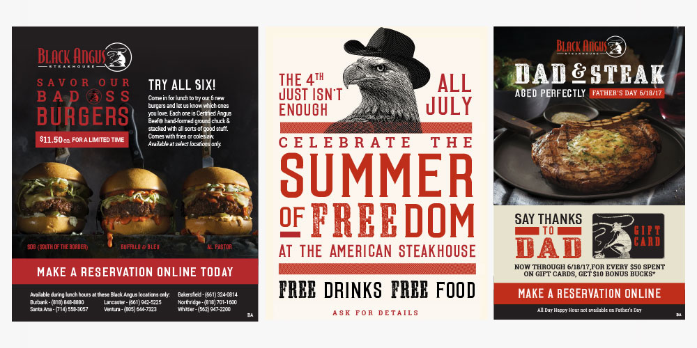
At a time when there are so many avenues for digital marketing, we’re thrilled we’ve found success for Black Angus with organic branded content that actually inspires people to go out for dinner (or lunch, or drinks…). So cheers to steak & success – and here’s to another million members.
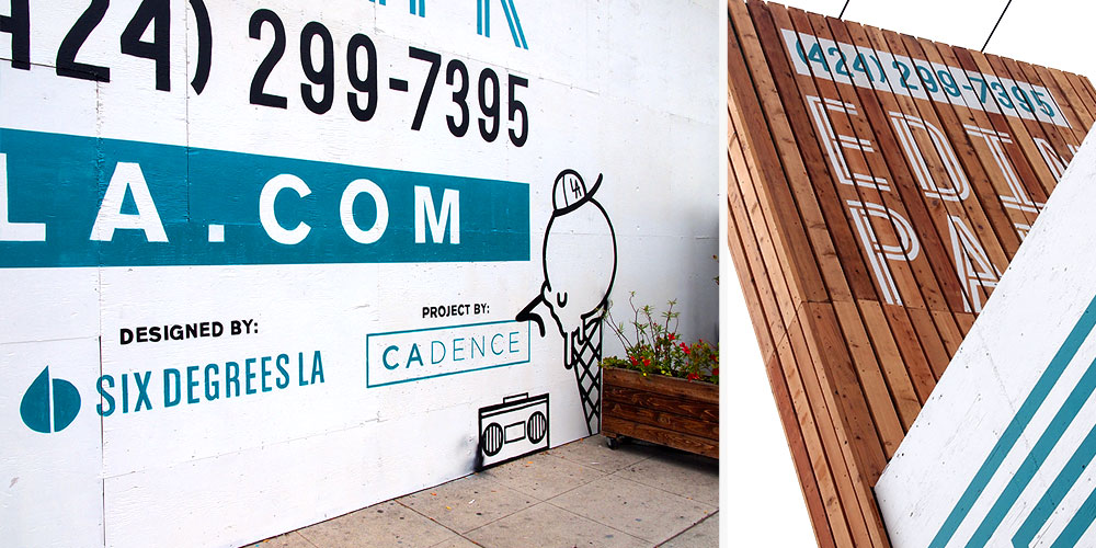
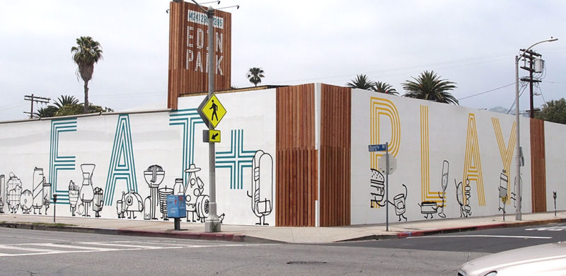
Most discussions about walls these days are negative and politically charged. Let’s take a break from all that and talk about a wall we just put up on Beverly Blvd. with the help of Hattas Public Murals to advertise L.A.’s next greatest, fantastic, amazing food hall, Edin Park.
While many of the submissions for the proposed border wall design featured drab facades and intimidating features, we’re proud to say that none of them had a slice of pizza wearing a wide-brimmed hat talking on its phone, nor a 10ft bacon-wrapped hot-dog bouncer with a clipboard. Our design did. Now we just have to worry about the 30+ food concepts and 10+ fitness studios we need to develop on the other side of it. It’s going to be tremendous.
