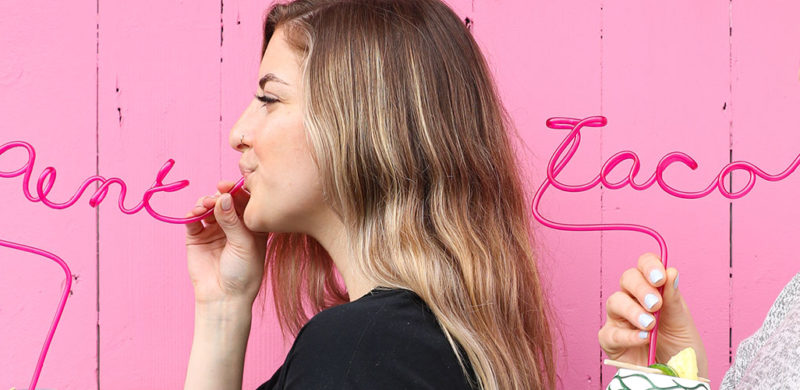
Pink Taco. I’ll give you a second to get your snickers and eye-rolls out of the way. Good? Great.
To clarify, Pink Taco is named after their signature achiote-marinated chicken taco topped with fluorescent pink habanero-pickled onions. So we don’t know what that initial fuss was about. Grow up.
We love a brand that has a clear attitude right in the name. You know the exact kind of experience you’re getting. Even better when that identity is brazen and irreverent. Taking on their social media marketing was right in our wheelhouse.
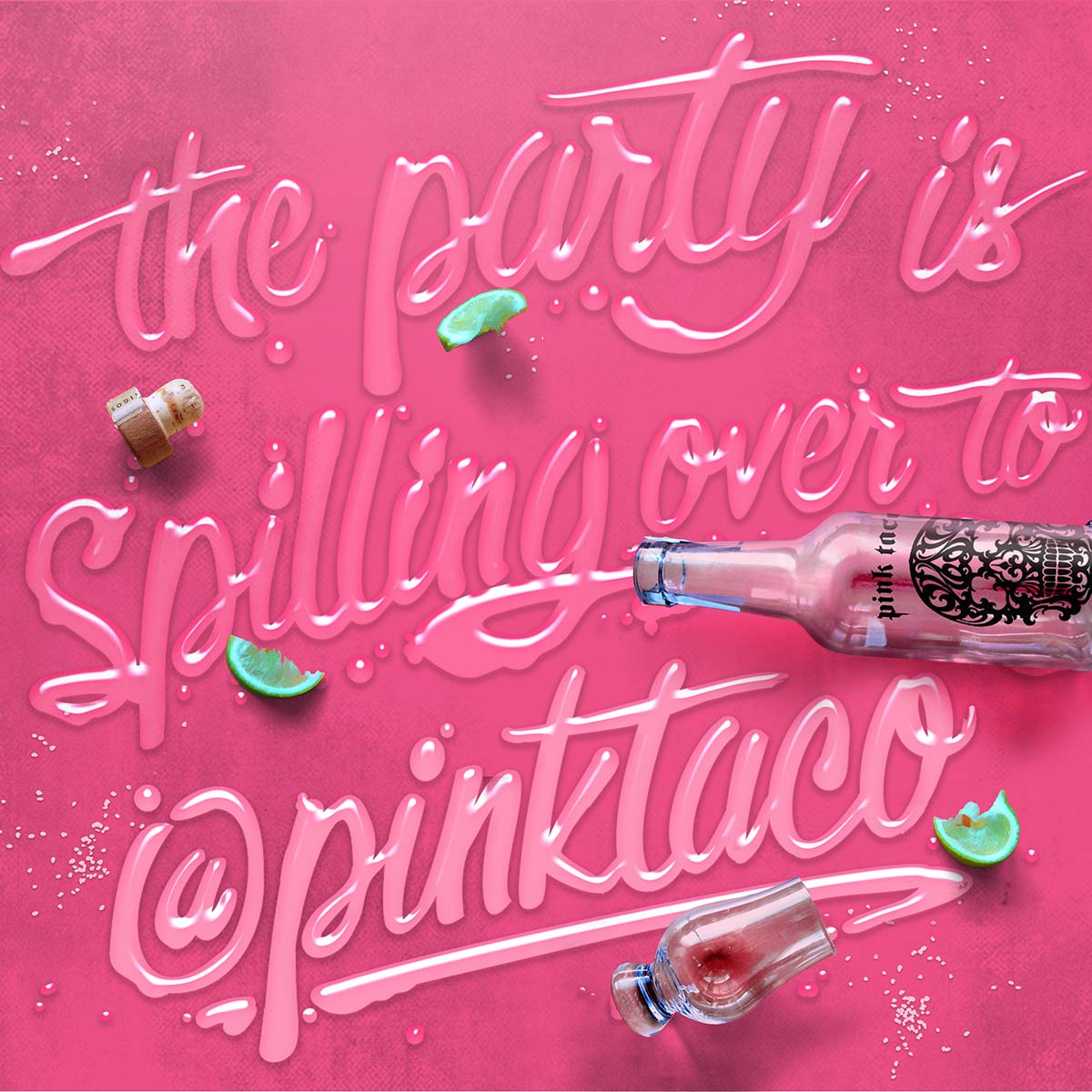
Pink Taco is all about the party, so kicking off 2020 with a new location right in the raging heart of Miami Beach makes perfect sense. Especially with Snoop Dogg officiating the opening. On social media, we’ve turned their brand into a bender of feasting, boozing, skulls, and unsolicited pink taco pics.
Well, they were kinda solicited, because they’re exactly what the client and social audiences asked for.


Hey 2020,
Now to the trends!
1. Extra Reality
2. Power Distribution
3. Reward the talent
4. More than just “like”
5. Return to nature
6. Embrace Individualism
Oh yeah, that environment we mentioned, well, it’s becoming even more personal. We are further able to adapt our surroundings and services to our individual needs creating purposeful interactions that are designed to suit us best.
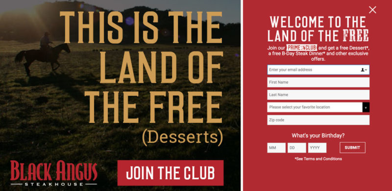
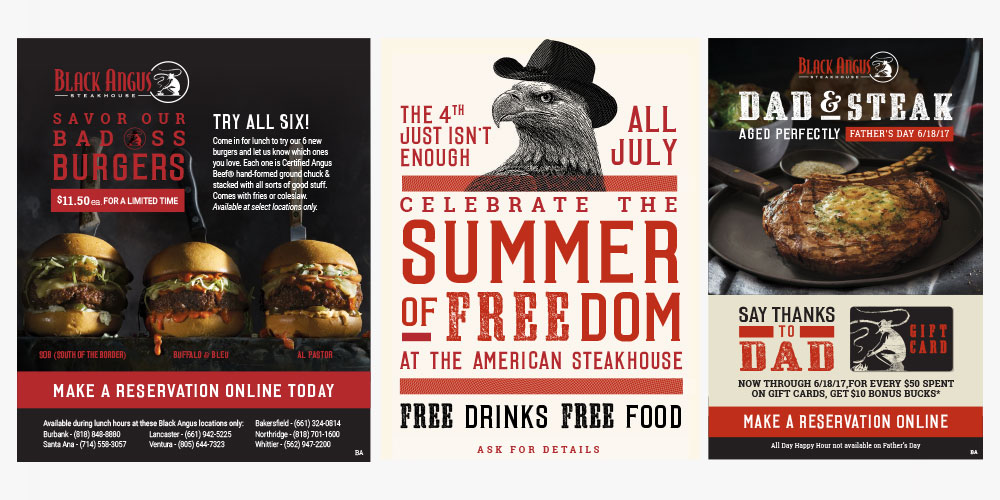
Pop the champagne and toss some confetti! We’re celebrating a huge milestone with our friends at Black Angus Steakhouse – one million subscribers to their email Prime Club. That’s nearly double the number from when we updated their branding a little over three years ago. We found the sweet spot of success by connecting with Black Angus loyalists about promotions, celebrations, and a consistent flow of news about what’s going on at each of their 45 locations.
Over 200,000 members signed up in the past year, after we launched a brand new Black Angus website. When you have 50 years of steak-making history, it can be a challenge to bring your guests into the digital age with you, but we’ve proven that email is an effective way to connect restaurant guests. We see up to a 17% increase in sales in the day following a key email blast!
Our homepage redesign focused on putting the Prime Club front and center for our daily visitors and making the sign-up process simple. We designed a pop-up that was to the point – sign up for the Prime Club and receive free goodies, mainly a free birthday steak dinner. (Of course, with a sign-up offer that good, we’d be remiss if we didn’t also mention that in-store sign ups are also going strong.) It’s a bold offering, and one that many marketers would tell you would lead to a low-quality list, but the results say otherwise. Not only do the sales jump after each blast, but the list has low attrition and strong engagement.
To keep up the momentum, we completely revamped the design of the emails, staying on-brand with direct messaging but with a fresh photography style and bold graphic elements. We diversified our promotions, from traditional coupons and LTOs to celebrating National Hamburger Day and highlighting our newest cocktails. We successfully expanded our appeal from the everyday Black Angus diner to include a newer and younger audience (you know, that elusive millennial everyone’s fighting over).
At a time when there are so many avenues for digital marketing, we’re thrilled we’ve found success for Black Angus with organic branded content that actually inspires people to go out for dinner (or lunch, or drinks…). So cheers to steak & success – and here’s to another million members.
by Amanda, Marketing & Strategy
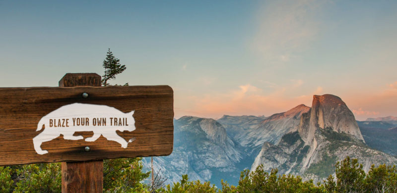
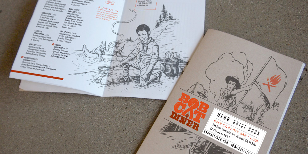
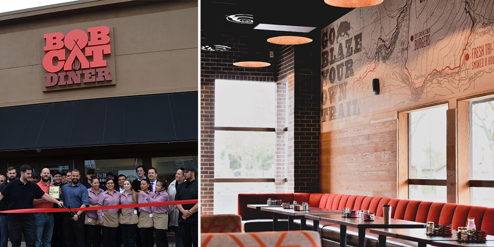
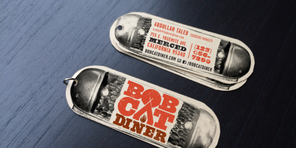
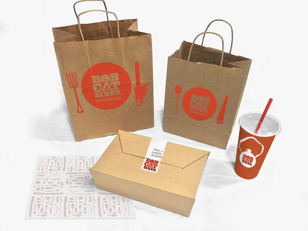
Recently, we had the chance to break out of our delicious Los Angeles foodie bubble and take a trip to the gateway of Yosemite: Merced, California. We created the brand identity for Bobcat Diner, a new restaurant concept with ambitious plans for growth. With the location and expansion plans in mind, we took inspiration from the iconic graphics of the National and State Parks to create a design that would resonate with the local Merced community, and work just as well in new locations across the country. We didn’t take it too seriously, though, with a tongue-in-cheek approach to the outdoors tucked away within the copy.
We were lucky to be brought in at the very beginning of construction, so you’ll find our graphic design work in the campfire logo, oversized trail maps on the walls (providing helpful directions to lunch and dinner over the mountainous milkshakes), and the guide to Bobcat Guide merit badges. The menus serve as a Guide Book, filled with hand-drawn illustrations for our Bobcat Guide Tips to accompany the menu of diner mainstays including breakfast skillets, burgers and sandwiches.
Once the design was complete and construction underway, our marketing team took over the restaurant’s pre-opening social media, bringing the brand’s outdoorsy voice to life and building anticipation for the opening. When California’s unexpected rain caused construction delays, we tackled the challenge of keeping interest high as the opening day changed, and changed again. When the grand opening finally arrived, we were there to capture the excitement before handing the social reins back to to the restaurant team.
All in all, we enjoyed our excursion into the wilds of Central California, and like the restaurant, we try to be true to the Bobcat Oath, even back here in Los Angeles.
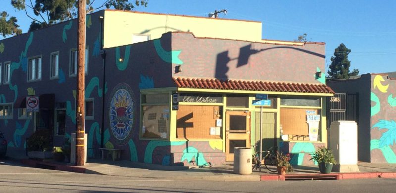
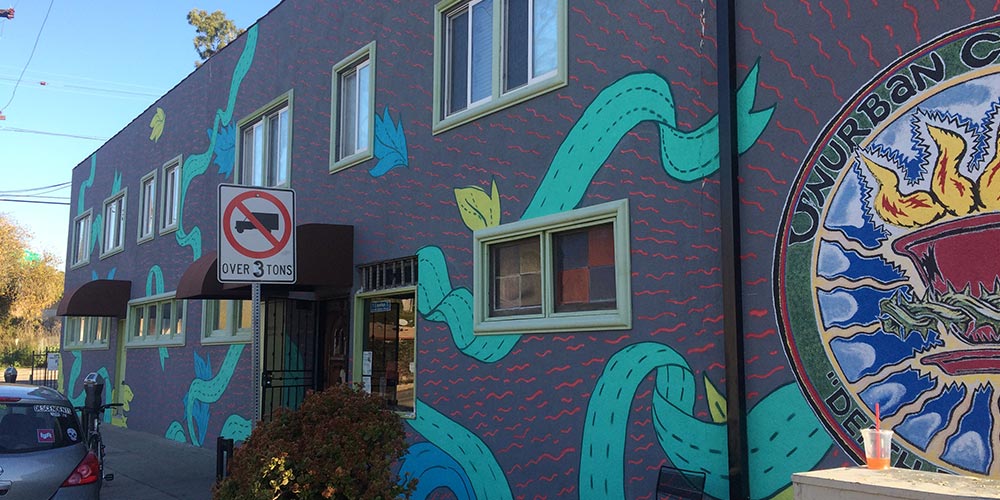
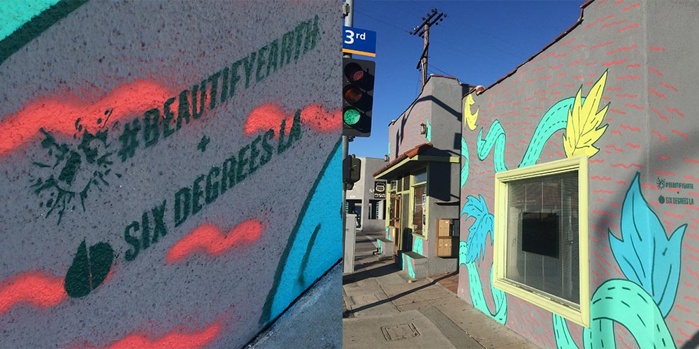
We want to make things look better. That’s what Beautify Earth wants, too. Their mission is to link up loving artists with unloved spaces to turn them into something everyone can love. Yeah, we used “love” 3 times because there is a lot needed right now and Pico Boulevard in Santa Monica was a great place to start.
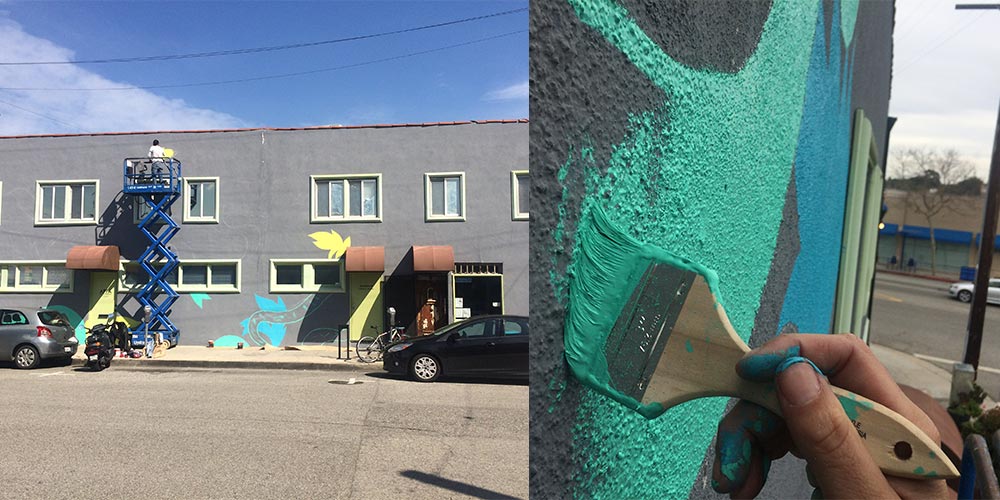
Our lead designer, Uriel Bautista, took charge of the design, planning, and application. He also moonlighted as the mechanical lift operator (shhh…don’t tell OSHA). Literally, in the moonlight.
“Unurban Coffee House has one of the chillest vibes in Santa Monica. The owner, staff and regulars are filled with positive energy. They do open mic nights, it’s cozy and funky. This place’s atmosphere rejuvenates my hope in good people. The mission was to have the exterior match the spirit of the inside. So, I used their existing logo as a focal point and rays of energy radiating from it. With organic ribbons and leaves in visually-pleasing colors, the wall was filled with expanding love. It was an unforgettable experience.”
We’re giving 2016 the finger. Ok, not THE finger. In fact some people don’t even consider it a finger at all. We’re giving 2016 a thumb – a “thumbs up” to be exact. Because honestly 2016 was solid. Bombarded by social-media bad mouthing it seems like a lot of people were pretty pissed about the whole year. We just don’t share that sentiment. Just look below. Good times were had, great work was done, and we still have all of our limbs (maybe a few injuries that we swear were NOT Pokemon Go-related). What else can be said? It was a damn good year.
In that regard, we’re giving 2017 an enthusiastic handshake. You know, the one that’s a little firm. Maybe just a little bit too firm, but not to the point of actually hurting – just firm enough to confidently say, “I’m in charge.” Yeah 2017, we’re going to own you. Ahhh, who are we kidding…give us a hug.
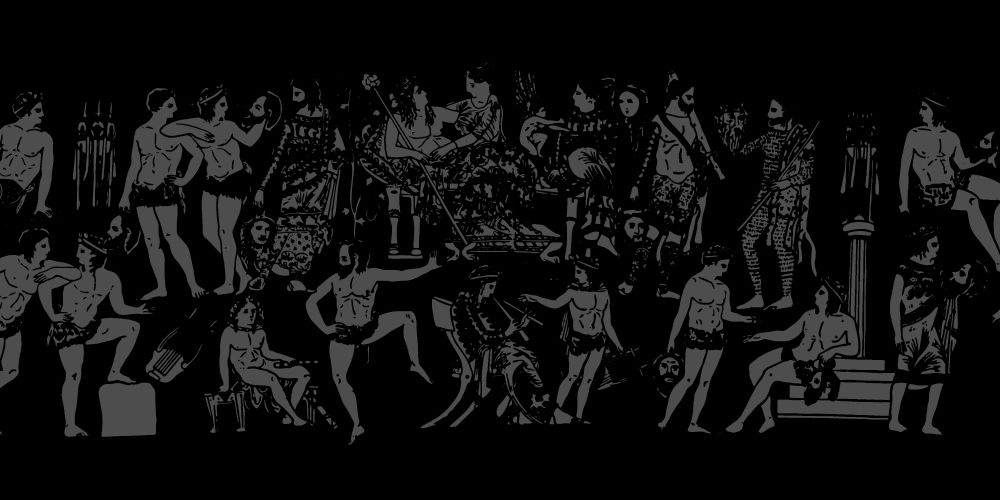
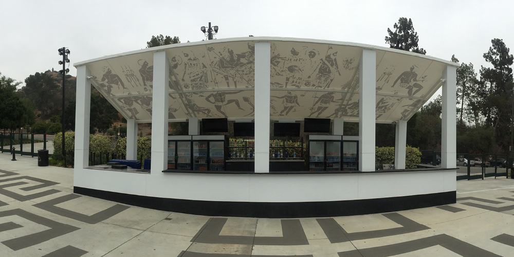
No thanks to furry walls or Jonah Hill, but we finally got into The Greek Theatre. We say “finally” because our first go was a few years back supporting AEG and Nederlander with new branding and environmental design as they bid against Live Nation. It got ugly. Lots of news articles, community uproar, council meetings, legalities and petitions – and the result was nobody got the contract.
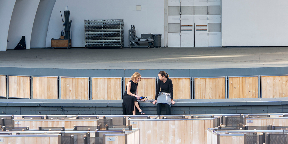
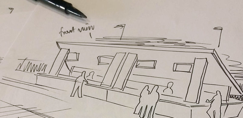
Well, when it comes to outdoor music venues in LA, THIS was our season (read about the Hollywood Bowl just a few swipes down). This time on the side of SMG and Premier with a monolithic bar concept as our Trojan horse. And it worked. The Greek really holds a special place in our hearts; where the Hollywood Bowl captures an elevated cultural evening of performance and food and wine pairing, The Greek has the soul of a club venue in a gorgeous setting; hip-flasks and hard-rock (harder rock at least…and then there’s Josh Groban).
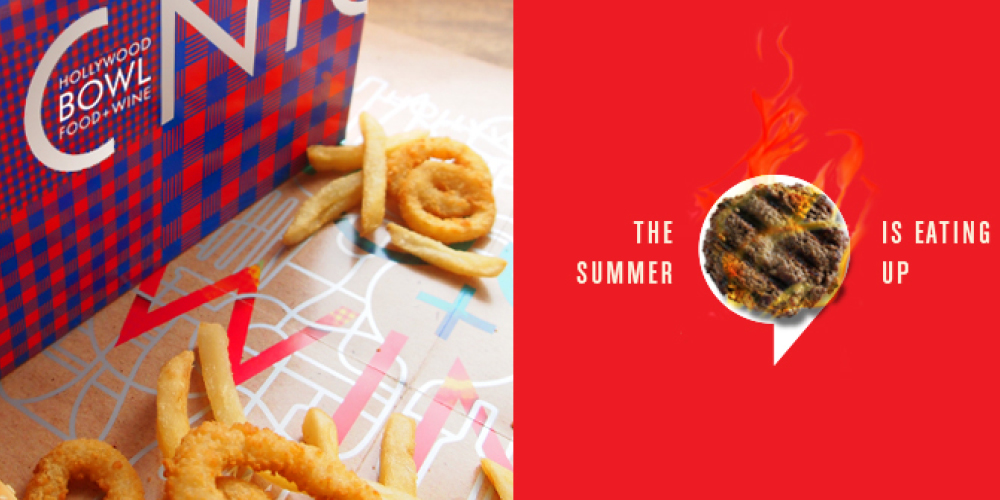
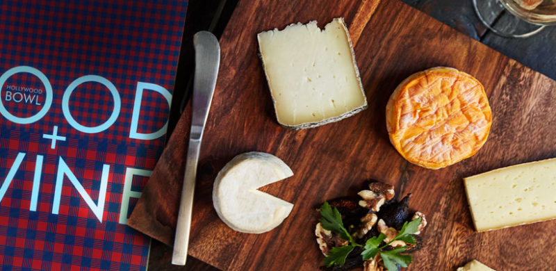
There are two evening activities in Los Angeles we recommend to visitors. Go to The Hollywood Bowl and go to The Edison (hey, we did that brand too!). Though the Edison is cool for the aesthetic and absinthe, going to The Bowl is just one of those quintessential L.A. experiences that combines the best in food, music, atmosphere and summer-SoCal outdoor lifestyle. And you can bring your own absinthe! (Update: Guess you can’t bring liquor in, just beer and wine. Anyway, bringing absinthe into a venue is both a reckless decision for your liver, the people around you, and you can’t even do the cool pour-over the sugar-cube spoony thing).
We find inspiration all over – in billboards we see on the way to the office, in nature on our weekend hikes, in the grocery store on unique packaging (ok, ok, booze bottles). But obviously the source of most of our inspiration is online – from Pinterest to Tumblr to traditional blogs, we crave creativity from every corner of the web. So, we had two of our designers round up some of their favorite sites to they go to to help get their creative juices flowing. Continue Reading…
