Hey 2020,
Now to the trends!
1. Extra Reality
2. Power Distribution
3. Reward the talent
4. More than just “like”
5. Return to nature
6. Embrace Individualism
Oh yeah, that environment we mentioned, well, it’s becoming even more personal. We are further able to adapt our surroundings and services to our individual needs creating purposeful interactions that are designed to suit us best.
If there’s one thing we recognize at Six Degrees LA, it’s that feeling good about where you eat is a must for all people. Shockingly, food tastes better when you’re not having an identity crisis and guilt isn’t choking you up! It may seem simple, but during our many years in restaurant branding, especially as a LA marketing agency with a whole range of clients, we’ve learned time and time again that the dining choices customers make reflect their emotions, desires, and yes—sometimes politics— rather than simply deciding on a food price point. To help make this more complex call, they rely on a perception of a brand from start to finish.
This past week, big restaurant branding headlines coming from Tom Colicchio’s Fowler & Wells in Manhattan and Brad Greenhill’s Katoi in Corktown, Detroit have brought the issue of naming and social responsibility to the forefront. As the NYT and Eater reported, both restaurants have come under heavy criticism for problematic monikers; their historical and cultural implications weighed on the conscience of customers and critics and, ultimately, lead to a need to re-name in order to remain loyal to the brand vision .
And then of course there’s the grumblings over Dunkin Donuts, who are playing the name-game in their own corporate way. Sometimes it’s hard not to throw up your hands and roll your eyes (Come on guys, you sell donuts— everyone knows you sell donuts), but this news cycle just confirms that ethics, ethos, and the bottom-line all drive choices to try and better represent a restaurant to a customer.
We won’t get political and dwell on whether motivations are always pure (because it’s a Monday and no one needs that kind of suffering) but as a LA marketing agency we know that branding extends beyond a name and into skills we’ve mastered— like restaurant logo design and photography revamps— and each element must reflect the brand identity. Usually the situation isn’t as extreme as the issues getting recent press attention, but our role is the same.
Clients come to us when they recognize a disconnect between where they see themselves and where customers see them, and we use strategy, aesthetics, and brand messaging to help create an experience that each guest can feel good about.
Don’t get us wrong, the big name on the sign is important. The one moniker lives beyond every medium, making it the single lasting impression of a brand. But if picking a whole new name feels like an insurmountable logistical nightmare (To-Go bag reprint? Legal footer EVERYWHERE? Bartender pocket squares, anyone?), that’s where we step in and help make adjustments to a brand identity through a whole spectrum of elements. We’ve helped with everything from VIP fundraisers to community murals to sticking logos on Magic 8 balls.
If you have the slightest inkling that you may want a name change, it should be addressed immediately. “Sooner-rather-than-later” couldn’t ring more true (Tom Colicchio and Brad Greenhill would agree, we think). There are tools we can employ to explore the possibility, from market research to guest surveys. Analytics + our instincts can help you be sure your company is making the responsible call.
Can’t wait for the data? Check out our “When Restaurant Branding Should Happen” infographic that takes our signature tongue-in-cheek approach to answering the pesky question.
In any case, fixing a perception problem starts with finding a partner that can handle the logistical and creative heat. Let’s talk— before the angry tweets roll in and well before the pain of chiseling out logos on all those beautiful engraved maple cutting boards.
by Amanda, Marketing & Strategy
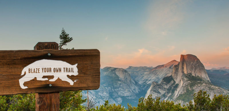
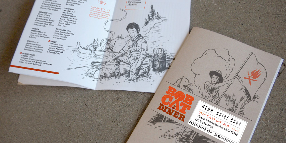
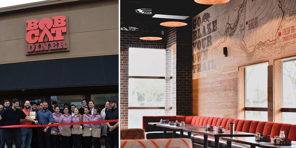
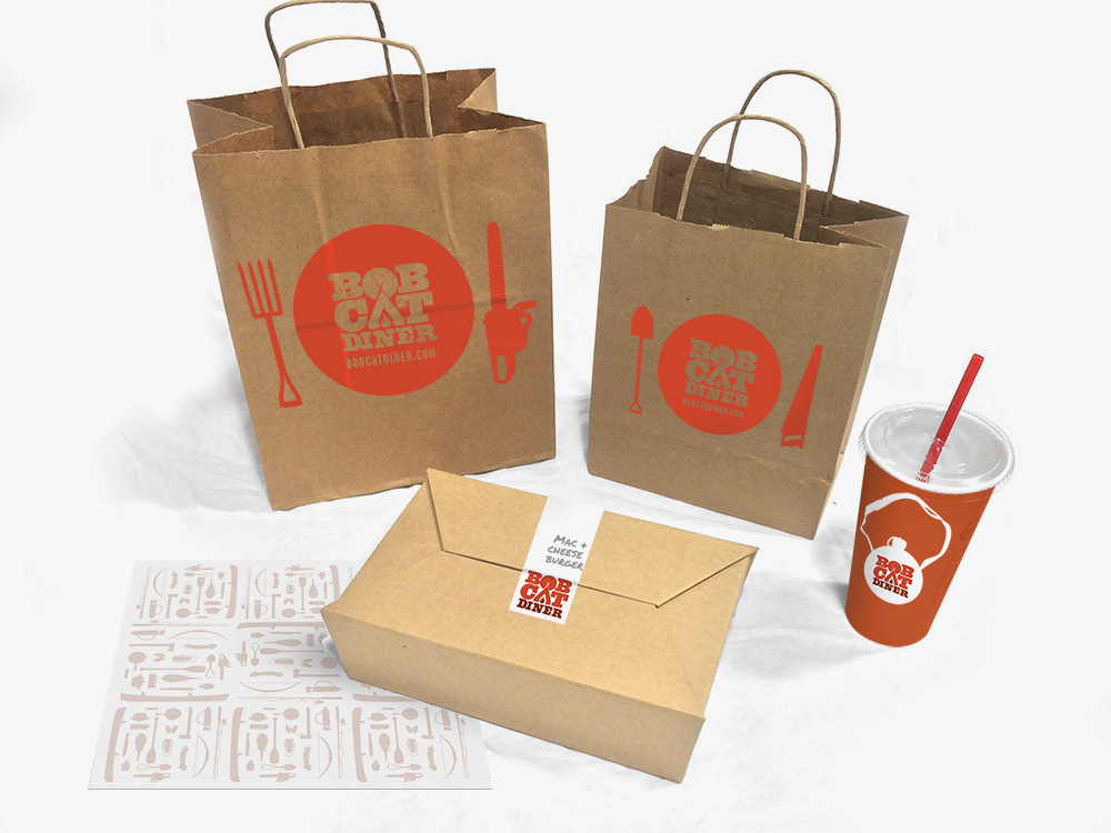
Recently, we had the chance to break out of our delicious Los Angeles foodie bubble and take a trip to the gateway of Yosemite: Merced, California. We created the brand identity for Bobcat Diner, a new restaurant concept with ambitious plans for growth. With the location and expansion plans in mind, we took inspiration from the iconic graphics of the National and State Parks to create a design that would resonate with the local Merced community, and work just as well in new locations across the country. We didn’t take it too seriously, though, with a tongue-in-cheek approach to the outdoors tucked away within the copy.
We were lucky to be brought in at the very beginning of construction, so you’ll find our graphic design work in the campfire logo, oversized trail maps on the walls (providing helpful directions to lunch and dinner over the mountainous milkshakes), and the guide to Bobcat Guide merit badges. The menus serve as a Guide Book, filled with hand-drawn illustrations for our Bobcat Guide Tips to accompany the menu of diner mainstays including breakfast skillets, burgers and sandwiches.
Once the design was complete and construction underway, our marketing team took over the restaurant’s pre-opening social media, bringing the brand’s outdoorsy voice to life and building anticipation for the opening. When California’s unexpected rain caused construction delays, we tackled the challenge of keeping interest high as the opening day changed, and changed again. When the grand opening finally arrived, we were there to capture the excitement before handing the social reins back to to the restaurant team.
All in all, we enjoyed our excursion into the wilds of Central California, and like the restaurant, we try to be true to the Bobcat Oath, even back here in Los Angeles.
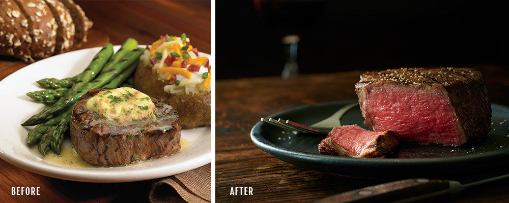
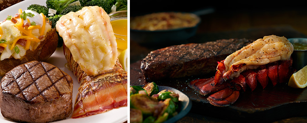
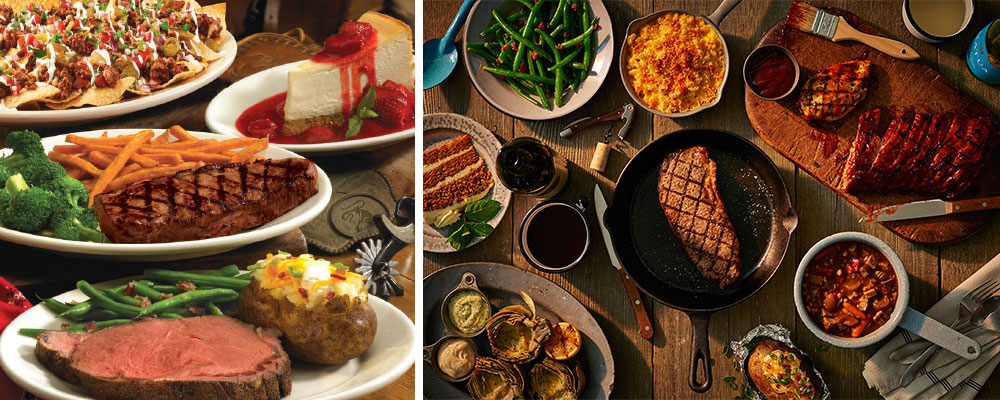
We want to rant. Drone on about heat-lamp-esque lighting, plate compositions that read like the portfolio pages of the finest Japanese faux-food artists, and of course physics defying drop-shadows that cling unnaturally to the bottom of plates like miserable clouds. We’re talking about most of the chain restaurant photography pre-Instagram. Those were dark times. Well, actually, over-lit, over-saturated times.
But instead of just complaining we’ve done something about it. We partnered up with Eskite Photography Studio and shot new photographs for Black Angus. They had a dated photo collection that needed to be…well, refreshed to match the rebrand we’ve been working on. Ah hell, we might as well just show you. The new photos are on the right, by the way.

The brothers behind Bicos Hospitality came to us to help them create and launch a new concept in Pasadena. They wanted to build a new, laid-back bar that was comfortable & sophisticated in equal measure – a destination for hanging out with friends, meeting a colleague for a drink, or taking a date. We were anxious to rise to the challenge and give new life to a 100 year old house. Check out the whole process below. We started with a name, then colors, logos, a story, hand-sketched elements, and Magnolia House was born.


Once we had the brand nailed down, we came up with ways to translate the heart of the house into every aspect of the experience. We designed the menus to feel like a library book, substantial and fabric covered and more inviting than the expected vinyl. The signage was given a similarly understated yet impactful treatment, and we also put together fun collateral pieces that harken back to an old-school pub vibe and blended seamlessly with the ambiance of the interior and the space’s history. The final products are shown here (along with the website, which we also designed).


And here’s a little of Magnolia House’s well-earned buzz:
