by Amanda, Marketing & Strategy
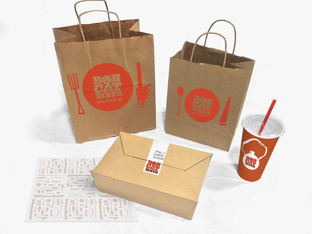
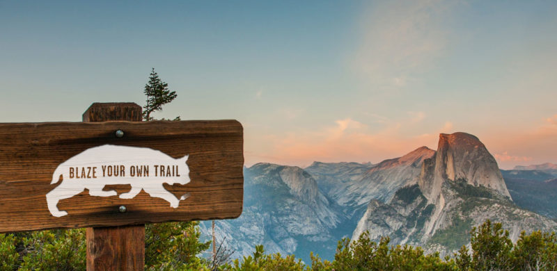
Recently, we had the chance to break out of our delicious Los Angeles foodie bubble and take a trip to the gateway of Yosemite: Merced, California. We created the brand identity for Bobcat Diner, a new restaurant concept with ambitious plans for growth. With the location and expansion plans in mind, we took inspiration from the iconic graphics of the National and State Parks to create a design that would resonate with the local Merced community, and work just as well in new locations across the country. We didn’t take it too seriously, though, with a tongue-in-cheek approach to the outdoors tucked away within the copy.
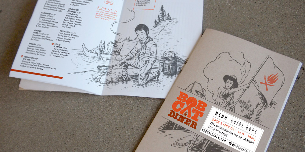
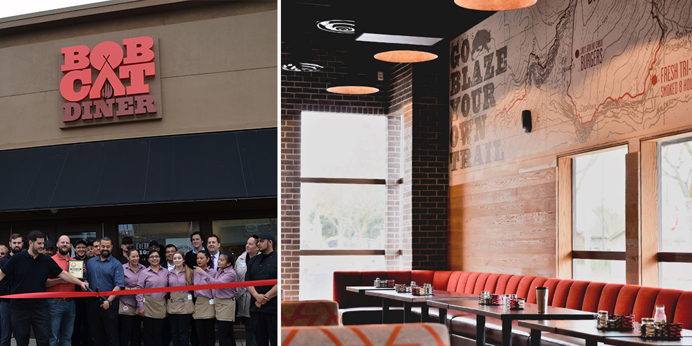
We were lucky to be brought in at the very beginning of construction, so you’ll find our graphic design work in the campfire logo, oversized trail maps on the walls (providing helpful directions to lunch and dinner over the mountainous milkshakes), and the guide to Bobcat Guide merit badges. The menus serve as a Guide Book, filled with hand-drawn illustrations for our Bobcat Guide Tips to accompany the menu of diner mainstays including breakfast skillets, burgers and sandwiches.

Once the design was complete and construction underway, our marketing team took over the restaurant’s pre-opening social media, bringing the brand’s outdoorsy voice to life and building anticipation for the opening. When California’s unexpected rain caused construction delays, we tackled the challenge of keeping interest high as the opening day changed, and changed again. When the grand opening finally arrived, we were there to capture the excitement before handing the social reins back to to the restaurant team.
All in all, we enjoyed our excursion into the wilds of Central California, and like the restaurant, we try to be true to the Bobcat Oath, even back here in Los Angeles.

The brothers behind Bicos Hospitality came to us to help them create and launch a new concept in Pasadena. They wanted to build a new, laid-back bar that was comfortable & sophisticated in equal measure – a destination for hanging out with friends, meeting a colleague for a drink, or taking a date. We were anxious to rise to the challenge and give new life to a 100 year old house. Check out the whole process below. We started with a name, then colors, logos, a story, hand-sketched elements, and Magnolia House was born.


Once we had the brand nailed down, we came up with ways to translate the heart of the house into every aspect of the experience. We designed the menus to feel like a library book, substantial and fabric covered and more inviting than the expected vinyl. The signage was given a similarly understated yet impactful treatment, and we also put together fun collateral pieces that harken back to an old-school pub vibe and blended seamlessly with the ambiance of the interior and the space’s history. The final products are shown here (along with the website, which we also designed).


And here’s a little of Magnolia House’s well-earned buzz:


