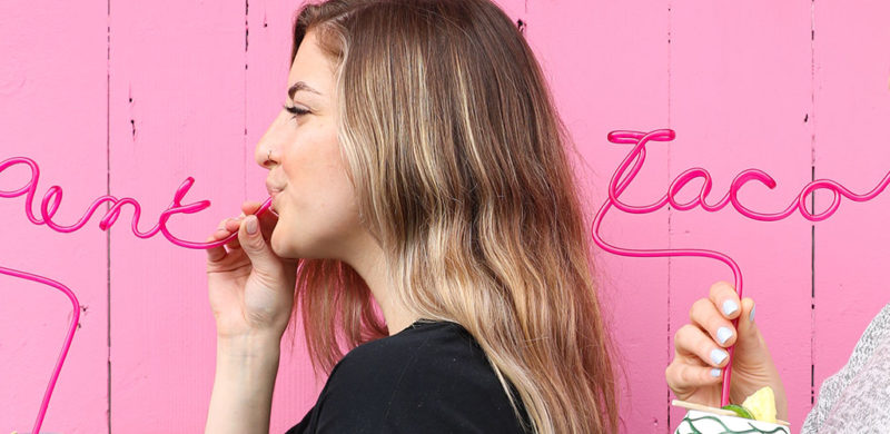
Pink Taco. I’ll give you a second to get your snickers and eye-rolls out of the way. Good? Great.
To clarify, Pink Taco is named after their signature achiote-marinated chicken taco topped with fluorescent pink habanero-pickled onions. So we don’t know what that initial fuss was about. Grow up.
We love a brand that has a clear attitude right in the name. You know the exact kind of experience you’re getting. Even better when that identity is brazen and irreverent. Taking on their social media marketing was right in our wheelhouse.
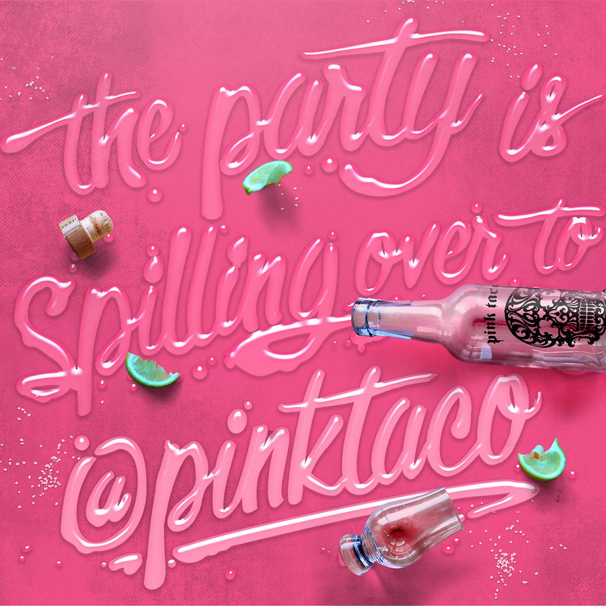
Pink Taco is all about the party, so kicking off 2020 with a new location right in the raging heart of Miami Beach makes perfect sense. Especially with Snoop Dogg officiating the opening. On social media, we’ve turned their brand into a bender of feasting, boozing, skulls, and unsolicited pink taco pics.
Well, they were kinda solicited, because they’re exactly what the client and social audiences asked for.


Hey 2020,
Now to the trends!
1. Extra Reality
2. Power Distribution
3. Reward the talent
4. More than just “like”
5. Return to nature
6. Embrace Individualism
Oh yeah, that environment we mentioned, well, it’s becoming even more personal. We are further able to adapt our surroundings and services to our individual needs creating purposeful interactions that are designed to suit us best.
Branding Illustration
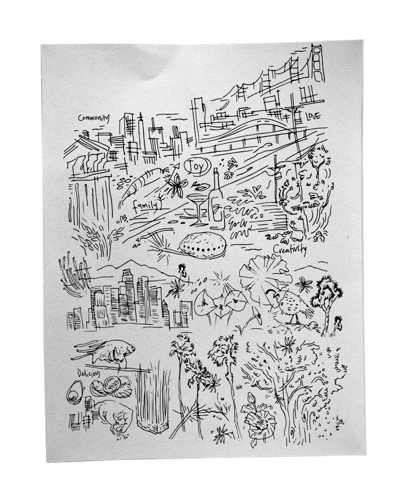
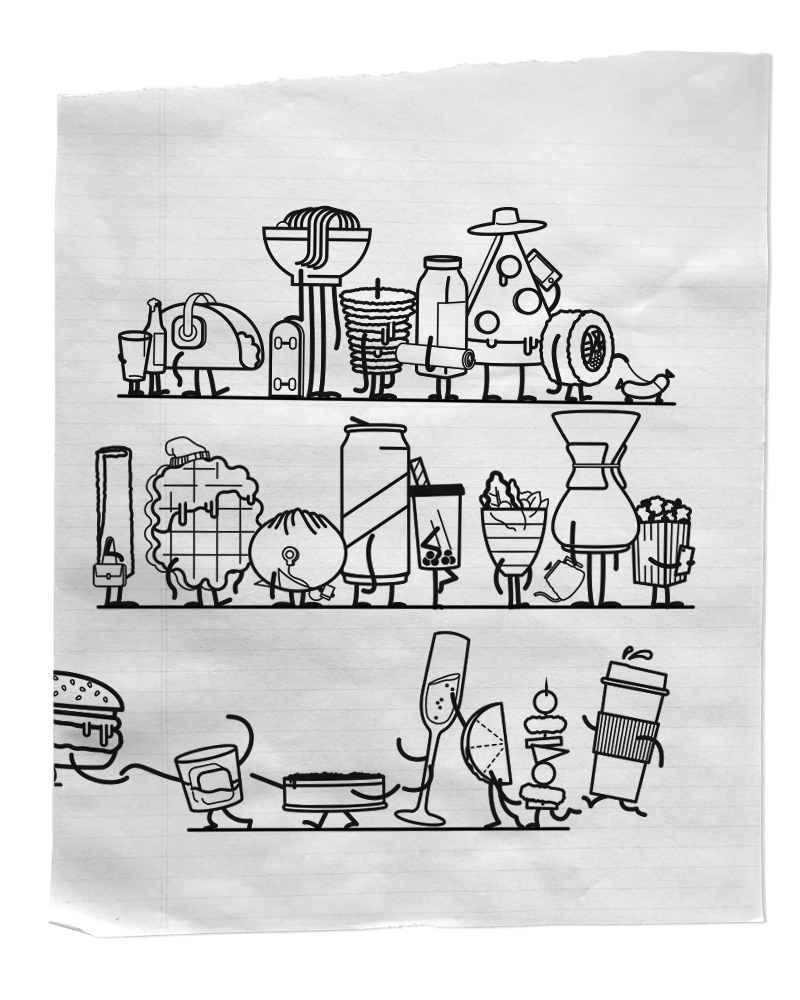
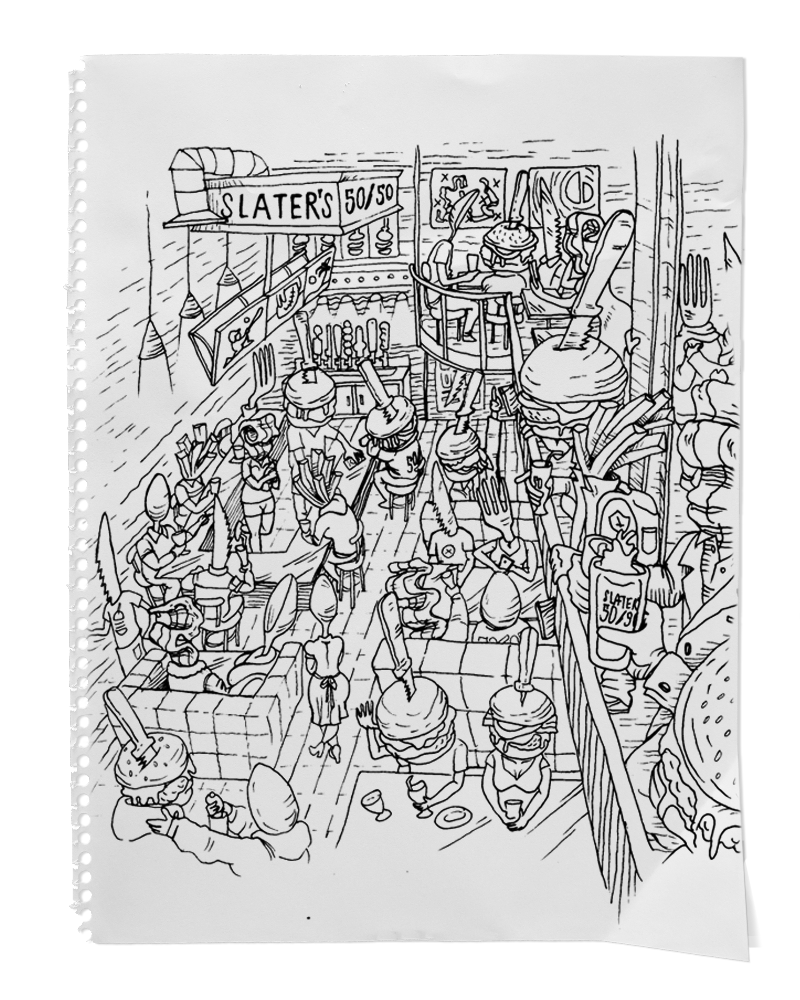
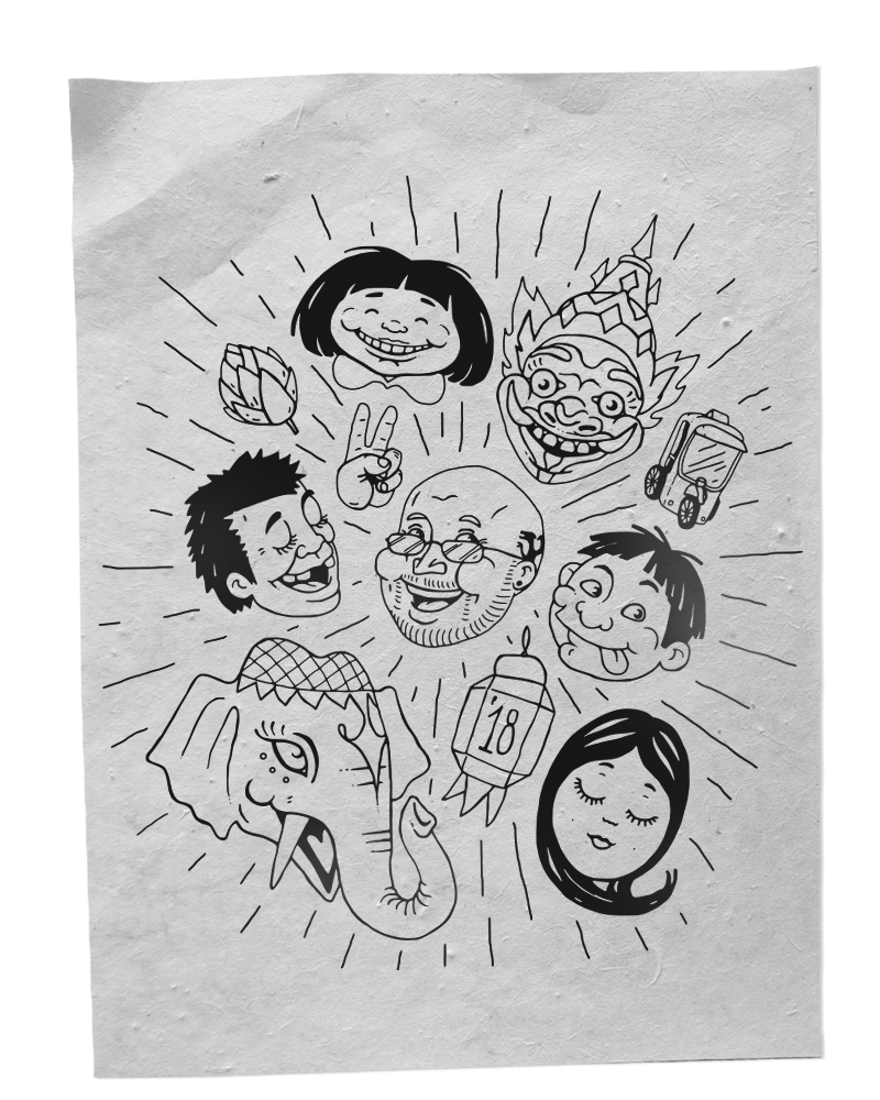
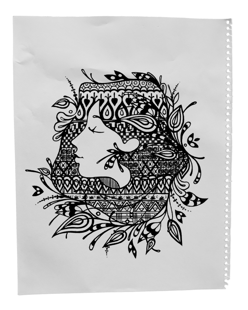
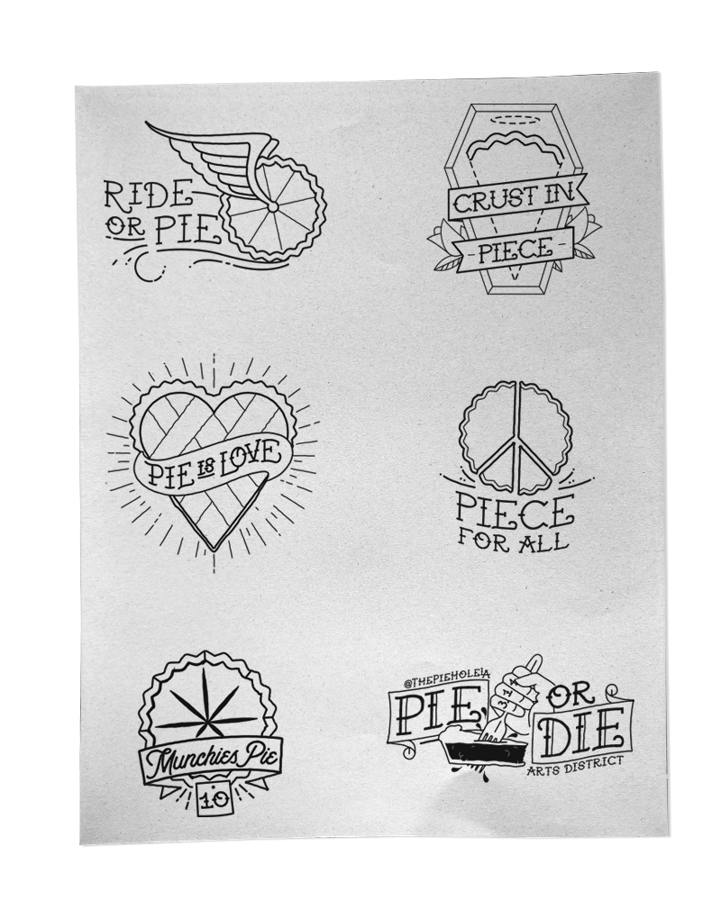
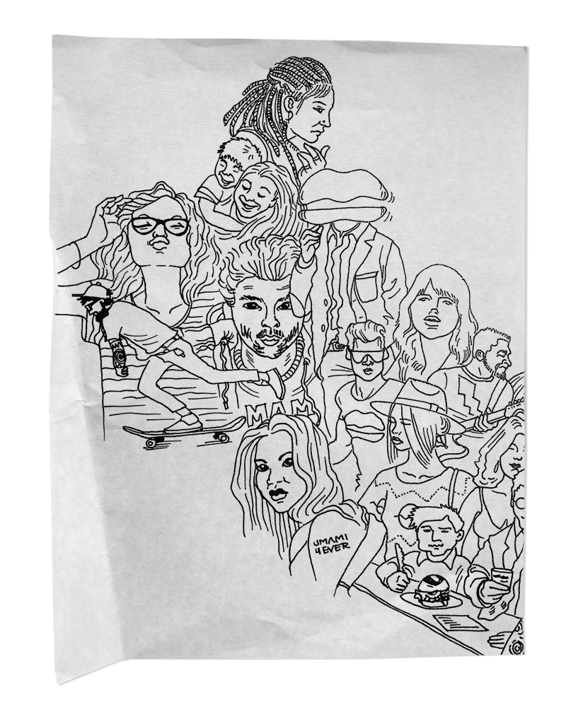
Who knew that our 11-year-old response to “what do you like to do?” was a premonition! Here we are as adults still just sitting around, “drawing and stuff.” Sure our tools may be a bit more advanced and our sketches tend to have a lot less dinosaurs and skate-parks (if you are reading this and have a dinosaur-skate-park concept you better pick up the damn phone) we still pride ourselves on putting pencil to paper to enrich our brands with some unique art. Check out some illustration samples below:
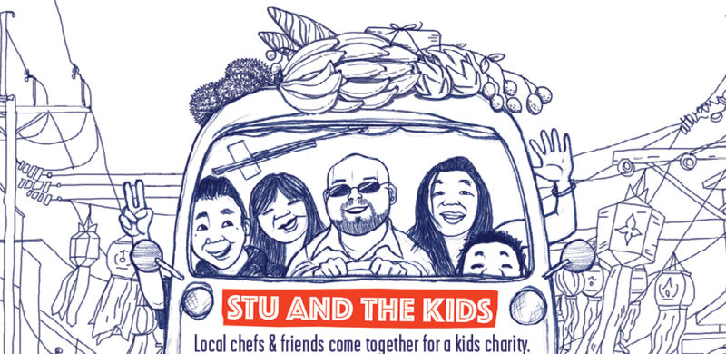
From a brand perspective, “Stu and His Friends Support Stu and the Kids” does not seem to be a great event name. Aside from being very clear that someone name “Stu” is looking for support, it doesn’t provide a lot of clues to either the cause or the event. But, despite the cryptic naming, Stu’s event is one that everyone looks forward to each year and one we’ve been proud to support for a number of years.
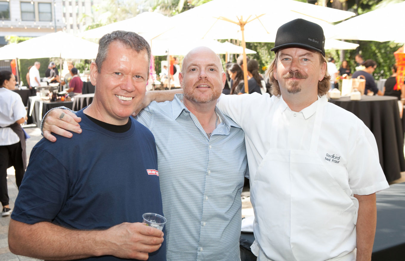
What you need to know is that Stu’s “Friends” are some of Los Angeles’s best chefs, and “the Kids” are underserved and orphaned children from the Hill Tribe in Northern Thailand. Stu is Stuart Skversky, and he’s made it his mission to help these kids; he teaches English and cooking to the younger kids, and raises money to help the older kids get a college education and build themselves a better future.
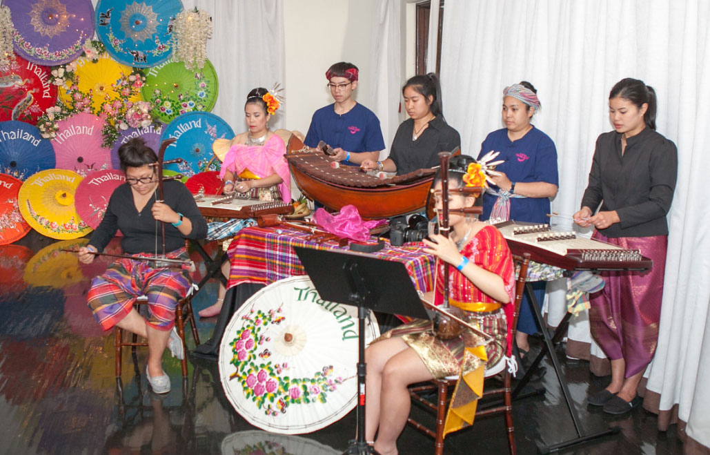
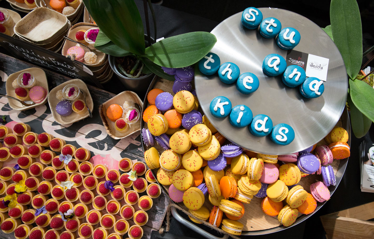
The first fundraiser for Stu and the Kids was held in 2011, and it’s grown tremendously each year. We got involved in 2014, and have helped each year since then. Over the years, we’ve helped with everything from finding a location (OK, it was a parking lot), to making the hand-drawn logo, and, of course, volunteering to take out the trash at the event. This year, we created the event’s signature graphic and event-day signage, and handled Stu’s Facebook advertising and content calendar.
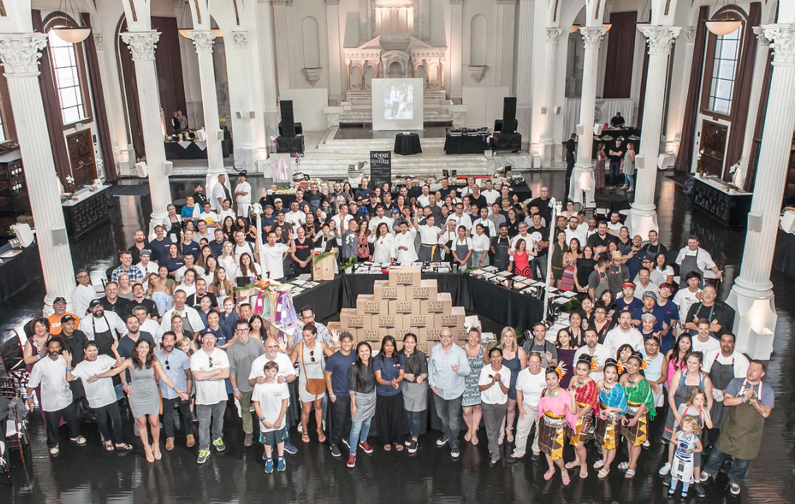
The event has grown so popular that there were plenty of volunteers to take out the trash, so we got to focus on taking pictures of the food as we sampled it, and went live on Facebook for his presentation, from thank-yous to Thai dancers. The past weekend’s fundraiser featured some of LA’s top chefs and restaurants – including Walter Manzke, Neal Fraser, Jason Neroni, Sherry Yard and Ray Garcia – not to mention chefs Jet Tila and Rocco Whalen. We’re honored to be in such talented company and help raise money for Stu and the Kids. See you next year!
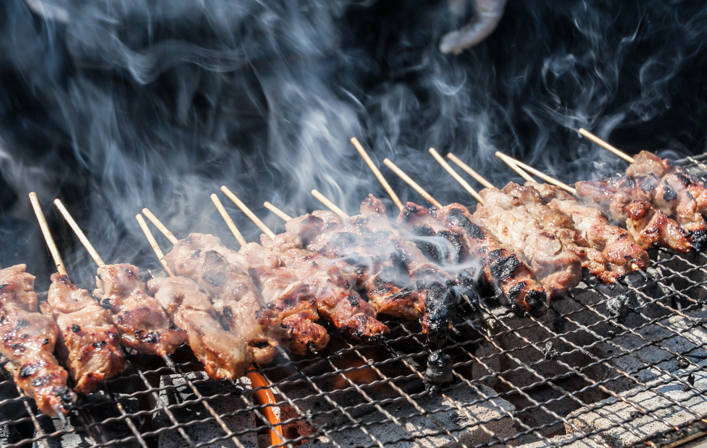
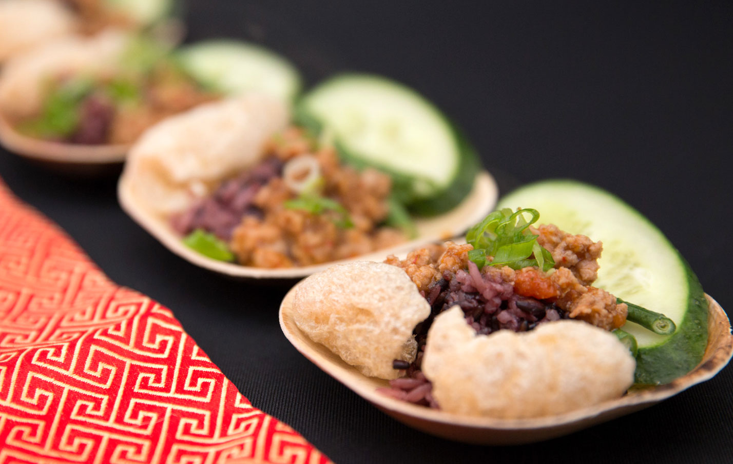
Thanks to Erik Fischer Photography and Victor Vic Photography.
by Amanda, Marketing & Strategy
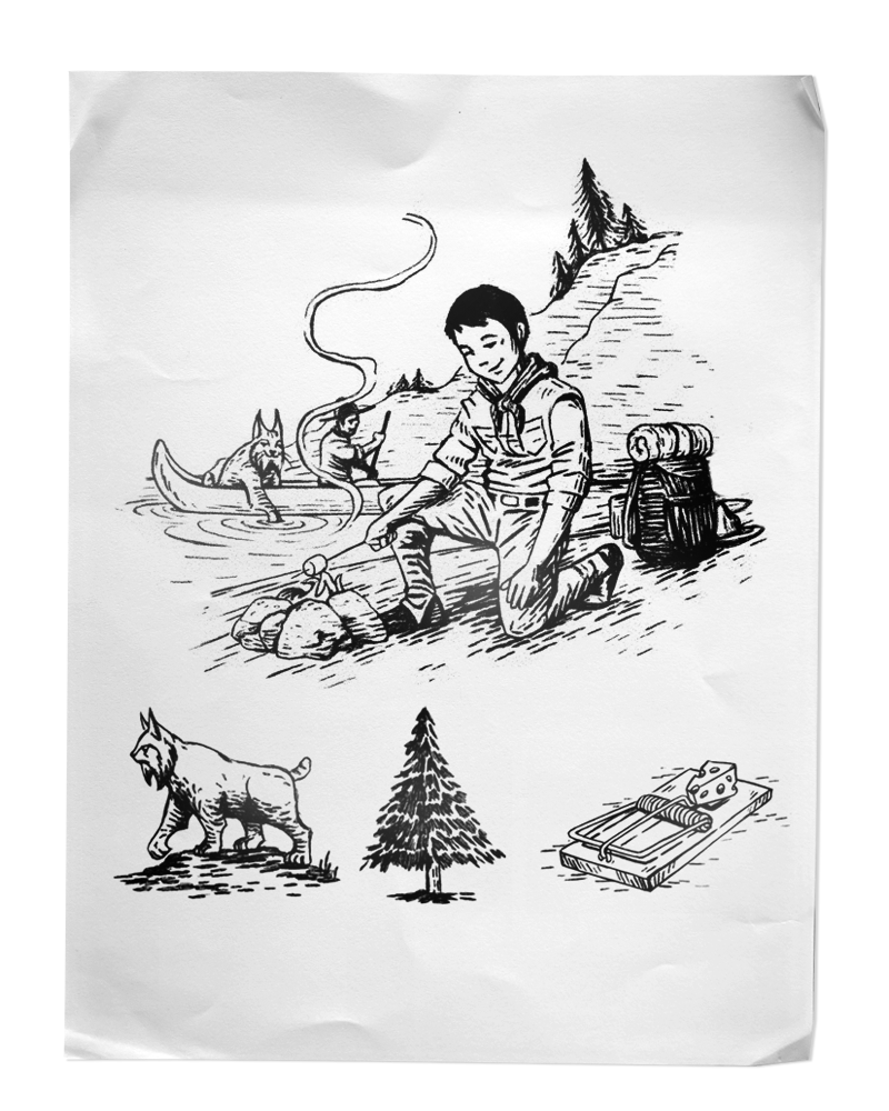
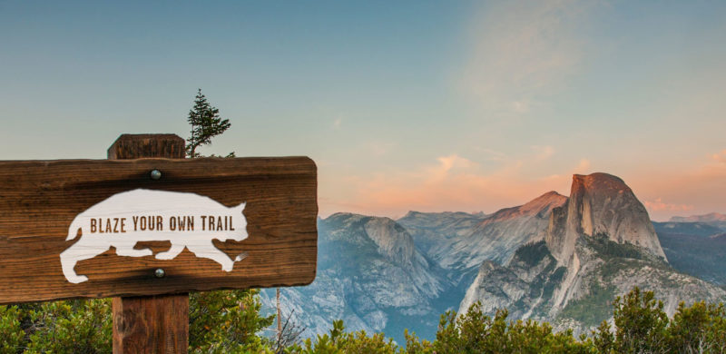
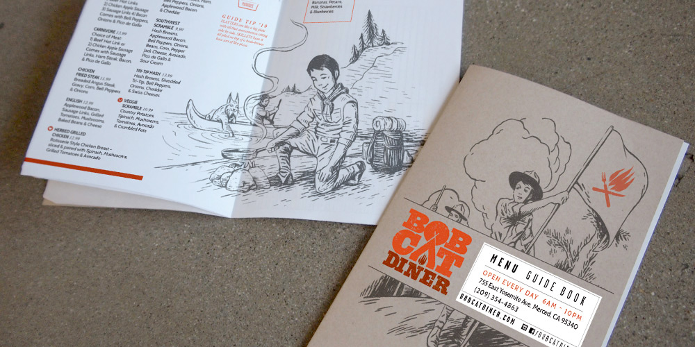
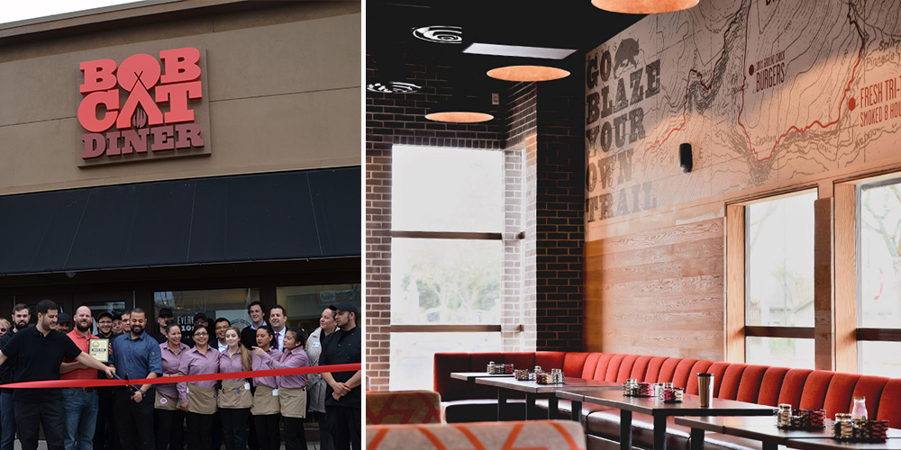
Recently, we had the chance to break out of our delicious Los Angeles foodie bubble and take a trip to the gateway of Yosemite: Merced, California. We created the brand identity for Bobcat Diner, a new restaurant concept with ambitious plans for growth. With the location and expansion plans in mind, we took inspiration from the iconic graphics of the National and State Parks to create a design that would resonate with the local Merced community, and work just as well in new locations across the country. We didn’t take it too seriously, though, with a tongue-in-cheek approach to the outdoors tucked away within the copy.
We were lucky to be brought in at the very beginning of construction, so you’ll find our graphic design work in the campfire logo, oversized trail maps on the walls (providing helpful directions to lunch and dinner over the mountainous milkshakes), and the guide to Bobcat Guide merit badges. The menus serve as a Guide Book, filled with hand-drawn illustrations for our Bobcat Guide Tips to accompany the menu of diner mainstays including breakfast skillets, burgers and sandwiches.
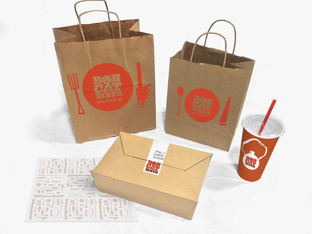
Once the design was complete and construction underway, our marketing team took over the restaurant’s pre-opening social media, bringing the brand’s outdoorsy voice to life and building anticipation for the opening. When California’s unexpected rain caused construction delays, we tackled the challenge of keeping interest high as the opening day changed, and changed again. When the grand opening finally arrived, we were there to capture the excitement before handing the social reins back to to the restaurant team.
All in all, we enjoyed our excursion into the wilds of Central California, and like the restaurant, we try to be true to the Bobcat Oath, even back here in Los Angeles.
