by Amanda, Marketing & Strategy
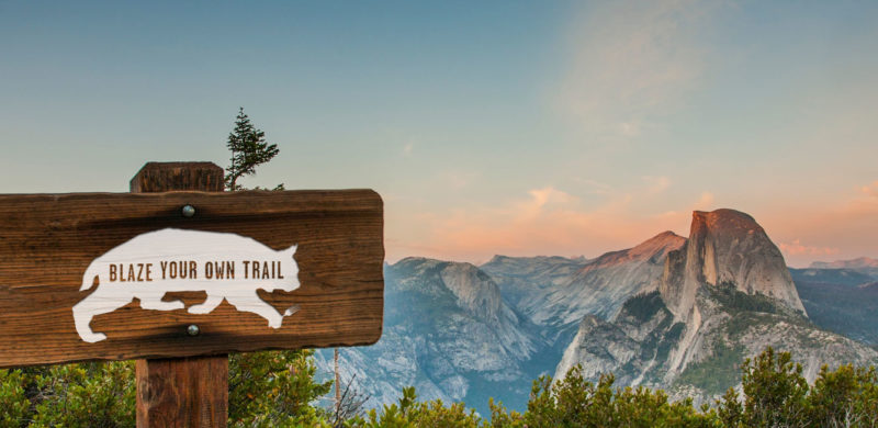
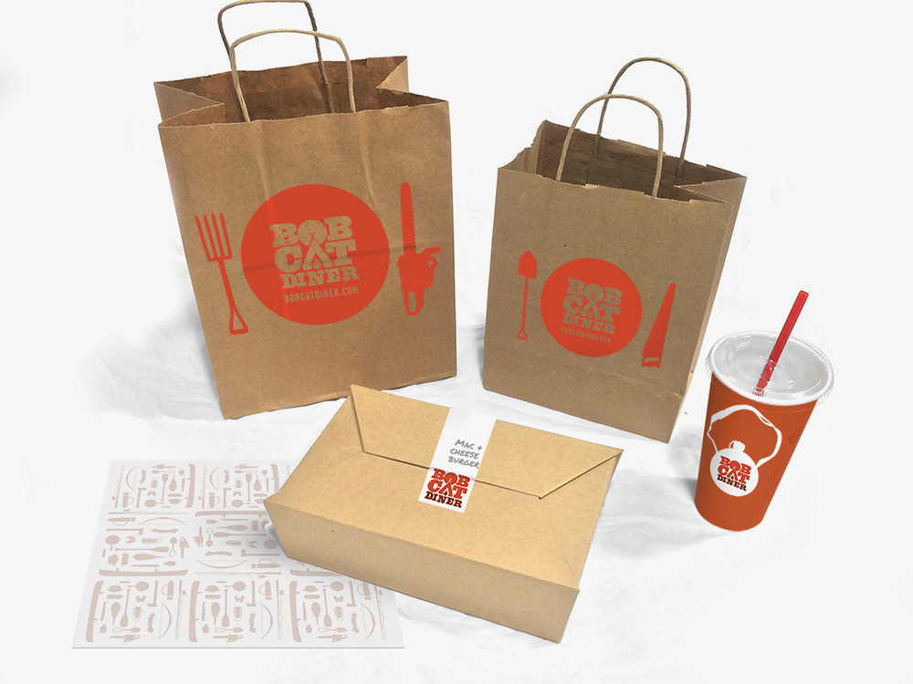
Recently, we had the chance to break out of our delicious Los Angeles foodie bubble and take a trip to the gateway of Yosemite: Merced, California. We created the brand identity for Bobcat Diner, a new restaurant concept with ambitious plans for growth. With the location and expansion plans in mind, we took inspiration from the iconic graphics of the National and State Parks to create a design that would resonate with the local Merced community, and work just as well in new locations across the country. We didn’t take it too seriously, though, with a tongue-in-cheek approach to the outdoors tucked away within the copy.
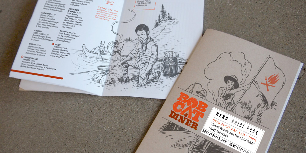
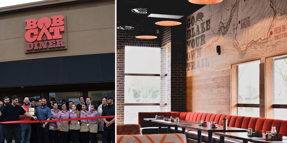
We were lucky to be brought in at the very beginning of construction, so you’ll find our graphic design work in the campfire logo, oversized trail maps on the walls (providing helpful directions to lunch and dinner over the mountainous milkshakes), and the guide to Bobcat Guide merit badges. The menus serve as a Guide Book, filled with hand-drawn illustrations for our Bobcat Guide Tips to accompany the menu of diner mainstays including breakfast skillets, burgers and sandwiches.
Once the design was complete and construction underway, our marketing team took over the restaurant’s pre-opening social media, bringing the brand’s outdoorsy voice to life and building anticipation for the opening. When California’s unexpected rain caused construction delays, we tackled the challenge of keeping interest high as the opening day changed, and changed again. When the grand opening finally arrived, we were there to capture the excitement before handing the social reins back to to the restaurant team.
All in all, we enjoyed our excursion into the wilds of Central California, and like the restaurant, we try to be true to the Bobcat Oath, even back here in Los Angeles.
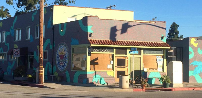
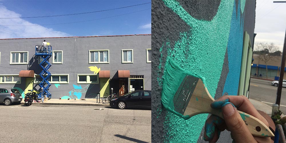
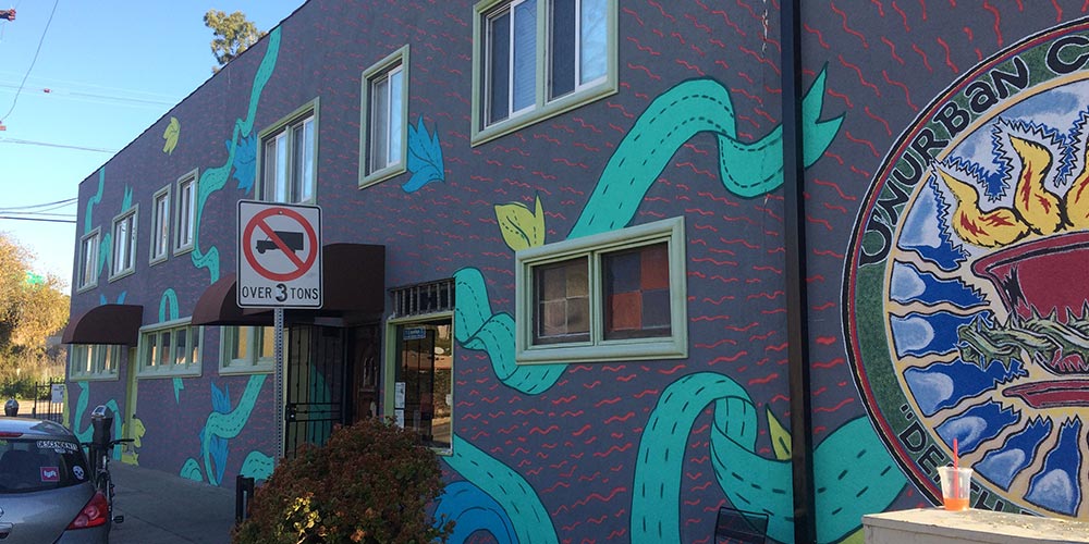
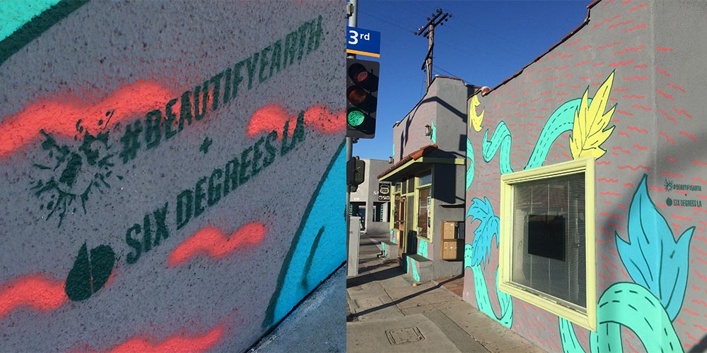
We want to make things look better. That’s what Beautify Earth wants, too. Their mission is to link up loving artists with unloved spaces to turn them into something everyone can love. Yeah, we used “love” 3 times because there is a lot needed right now and Pico Boulevard in Santa Monica was a great place to start.
Our lead designer, Uriel Bautista, took charge of the design, planning, and application. He also moonlighted as the mechanical lift operator (shhh…don’t tell OSHA). Literally, in the moonlight.
“Unurban Coffee House has one of the chillest vibes in Santa Monica. The owner, staff and regulars are filled with positive energy. They do open mic nights, it’s cozy and funky. This place’s atmosphere rejuvenates my hope in good people. The mission was to have the exterior match the spirit of the inside. So, I used their existing logo as a focal point and rays of energy radiating from it. With organic ribbons and leaves in visually-pleasing colors, the wall was filled with expanding love. It was an unforgettable experience.”
No thanks to furry walls or Jonah Hill, but we finally got into The Greek Theatre. We say “finally” because our first go was a few years back supporting AEG and Nederlander with new branding and environmental design as they bid against Live Nation. It got ugly. Lots of news articles, community uproar, council meetings, legalities and petitions – and the result was nobody got the contract.
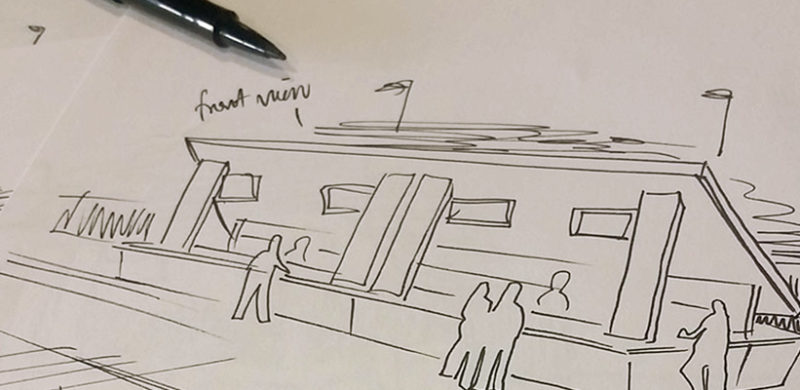
Well, when it comes to outdoor music venues in LA, THIS was our season (read about the Hollywood Bowl just a few swipes down). This time on the side of SMG and Premier with a monolithic bar concept as our Trojan horse. And it worked. The Greek really holds a special place in our hearts; where the Hollywood Bowl captures an elevated cultural evening of performance and food and wine pairing, The Greek has the soul of a club venue in a gorgeous setting; hip-flasks and hard-rock (harder rock at least…and then there’s Josh Groban).
