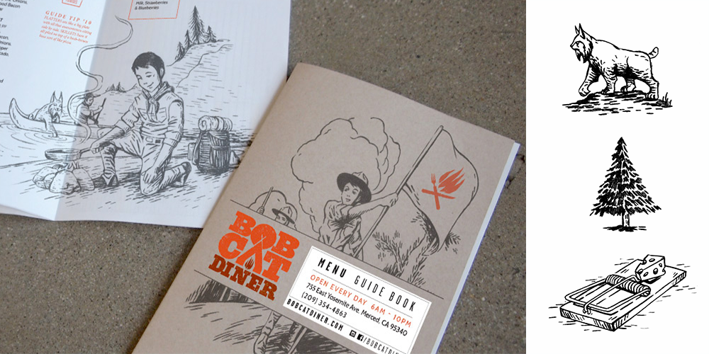
Every time you pick up a menu, it tells you a story. The feel of the pages in your hands, the way the items are described, and even the tiny details like the serifs on the type become a part of the story, even before a single word is read. It’s easy to create a menu that you love, but how do you craft a menu design that tells the story of your brand, while growing the bottom line? Because your menu isn’t just your story, it’s your sales tool. A well-designed menu both reinforces your brand to create loyalty and subtly directs guests to your best items.
When we tackle a brand new menu, we always start with the brand – so we know what story to tell. Then we create different ways to share that story through three key elements of the design.
1. The physical menu.
Plain paper or laminated? A leather-bound beast that should be filled with wine and steak, or a plastic tri-fold that makes you think of hash browns and homemade soup? Is it a printed menu board or a digital screen? The piece that people hold in their hands has a deep impact on their understanding of a restaurant – if the physical menu doesn’t match the surroundings, the brand or the advertising, it makes people uncomfortable. Unless you’re building the next Vespertine, that’s a really terrible start to a dining experience.
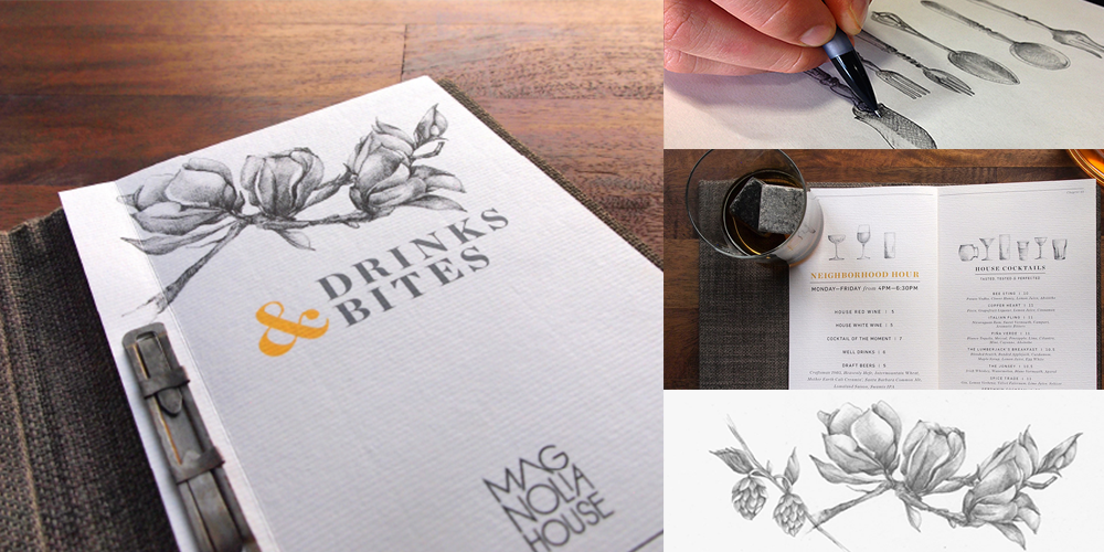
For instance, for our client Magnolia House, a comfortable and sophisticated bar concept with hospitality in its very name, we designed the menus to feel like a library book, substantial and fabric covered and more inviting than the expected vinyl.
2. The words on the page.
Like the format, the copy should fit your restaurant’s brand personality and voice. Strangely enough, there are two categories of restaurants that can get away with minimalistic descriptions: conceptual, high-end restaurants, and fast food chains that rely on photos. For the restaurants in the middle, names and descriptions are key to both the story and profitability. Guests are drawn to creative names and longer descriptions – within reason, adjectives are good, paragraphs are not. A family-owned trattoria that shares the origin of grandma’s meatball recipe reinforces their story, while a chef-driven restaurant should share a few details on the culinary techniques and unique preparations. Even the choice of “Appetizers” vs “Shared” will impact how guests see your restaurant.
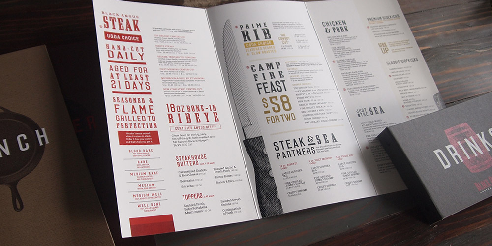
For our client Black Angus, injecting brand voice and mouthwatering, steakhouse-speak makes each item jump out at guests. Every word on the page has to reinforce your brand.

3. The graphic design.
Once you have the materials and copy, all that remains is the design–which we tend to think is the most important piece. Menu design must be legible, to your audience and in your space (romantic, dim lighting requires some special care). Legibility includes the choice of font, size of the type, color, white space and a plethora of other factors. A good design will establish a clear hierarchy, drawing attention to highly profitable items, and leading them away from the ones you need to have on there.
Great design brings your brand to life and creates value, and those two things are the first steps to creating loyalty.


